pacman::p_load(tidyverse, ggdist, ggridges,
               patchwork, ggthemes, hrbrthemes,
ggrepel, ggforce)Hands-on Exercise 2: Creating Elegant Graphics with ggplot2
1. Getting Started
Install and launching R packages.
The code chunk below uses p_load() of pacman package to check if packages are installed in the computer. If they are, then they will be launched into R.
Importing the data
exam_data <- read_csv("data/Exam_data.csv")2. Exercises
2.1 Working with ggrepel
ggrepel helps to repel overlapping text
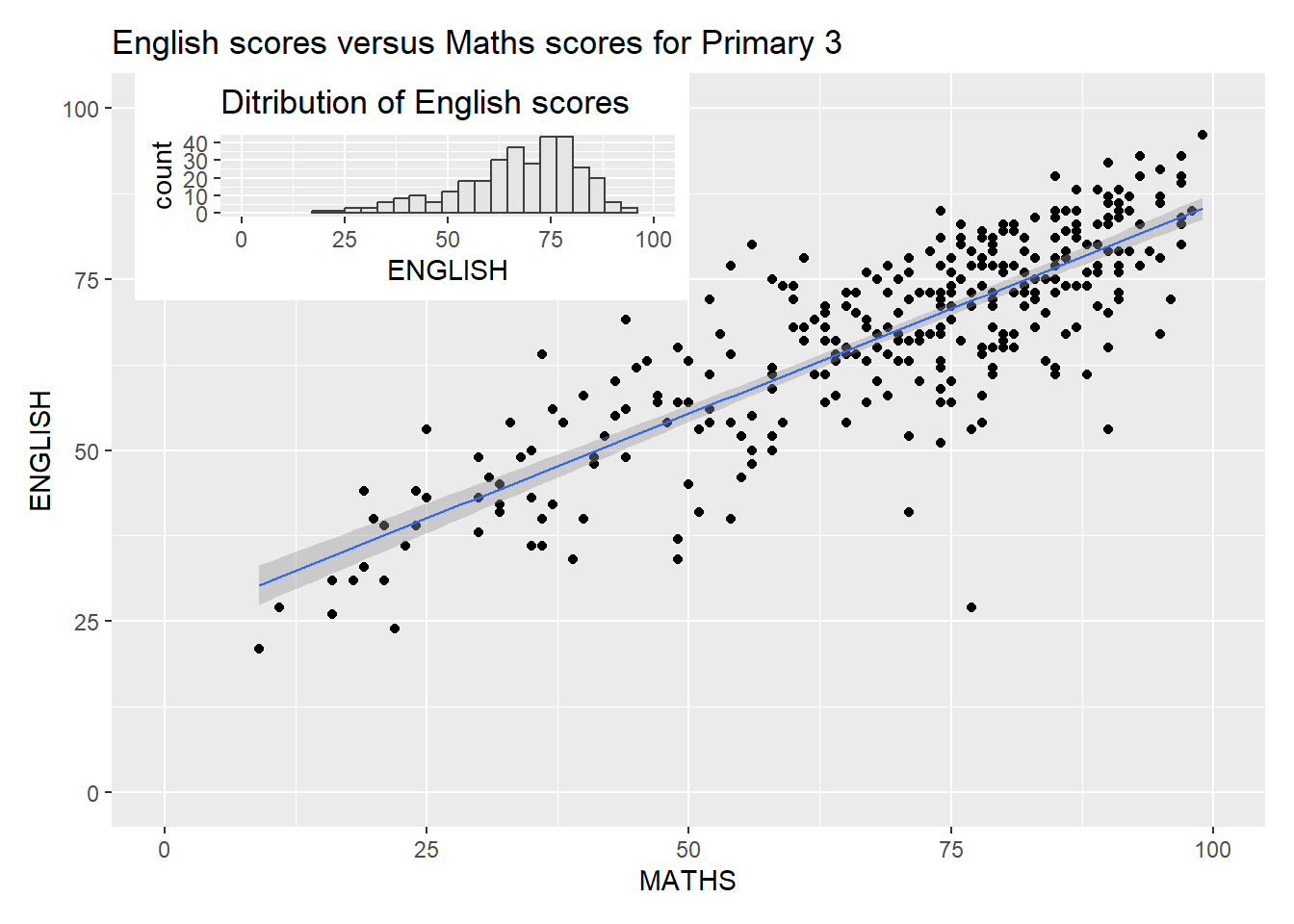
ggplot(data = exam_data,
       aes(x = MATHS,
           y = ENGLISH)) +
  geom_point() +
  geom_smooth(method = lm,
              linewidth = 0.5) +
  geom_label_repel(aes(label = ID),
                   fontface = "bold") +
  coord_cartesian(xlim = c(0,100),
                  ylim = c(0,100)) +
  ggtitle("English scores versus Maths scores for Primary 3")
`geom_smooth()` using formula = 'y ~ x'Warning: ggrepel: 317 unlabeled data points (too many overlaps). Consider
increasing max.overlaps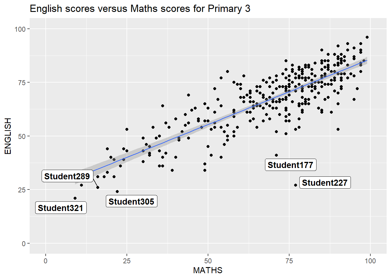
2.2 Working with themes
8 Built-in themes: theme_gray(), theme_bw(), theme_classic(), theme_dark(), theme_light(), theme_linedraw(), theme_minimal(), and theme_void(). Refer to here Example below
ggplot(data = exam_data,
       aes(x = MATHS)) +
  geom_histogram(bins = 20,
                 boundary = 100,
                 color = "grey25",
                 fill = "grey90") +
  theme_gray() +
  ggtitle("Ditribution of Maths scores")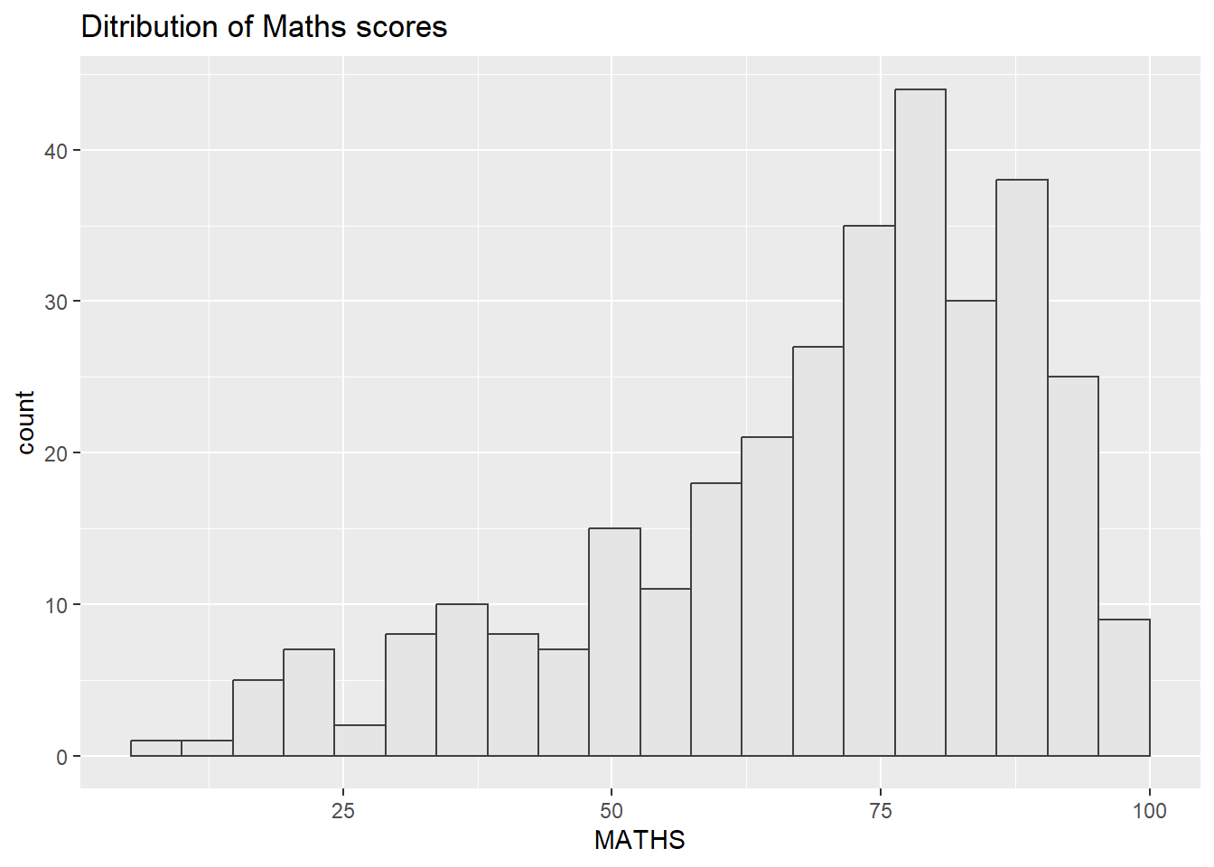
Unique ggtheme packages. Refer to here for more details on ggthemes package
ggplot(data = exam_data,
       aes(x = MATHS)) +
  geom_histogram(bins = 20,
                 boundary = 100,
                 color = "grey25",
                 fill = "grey90") +
  theme_economist() +
  ggtitle("Ditribution of Maths scores")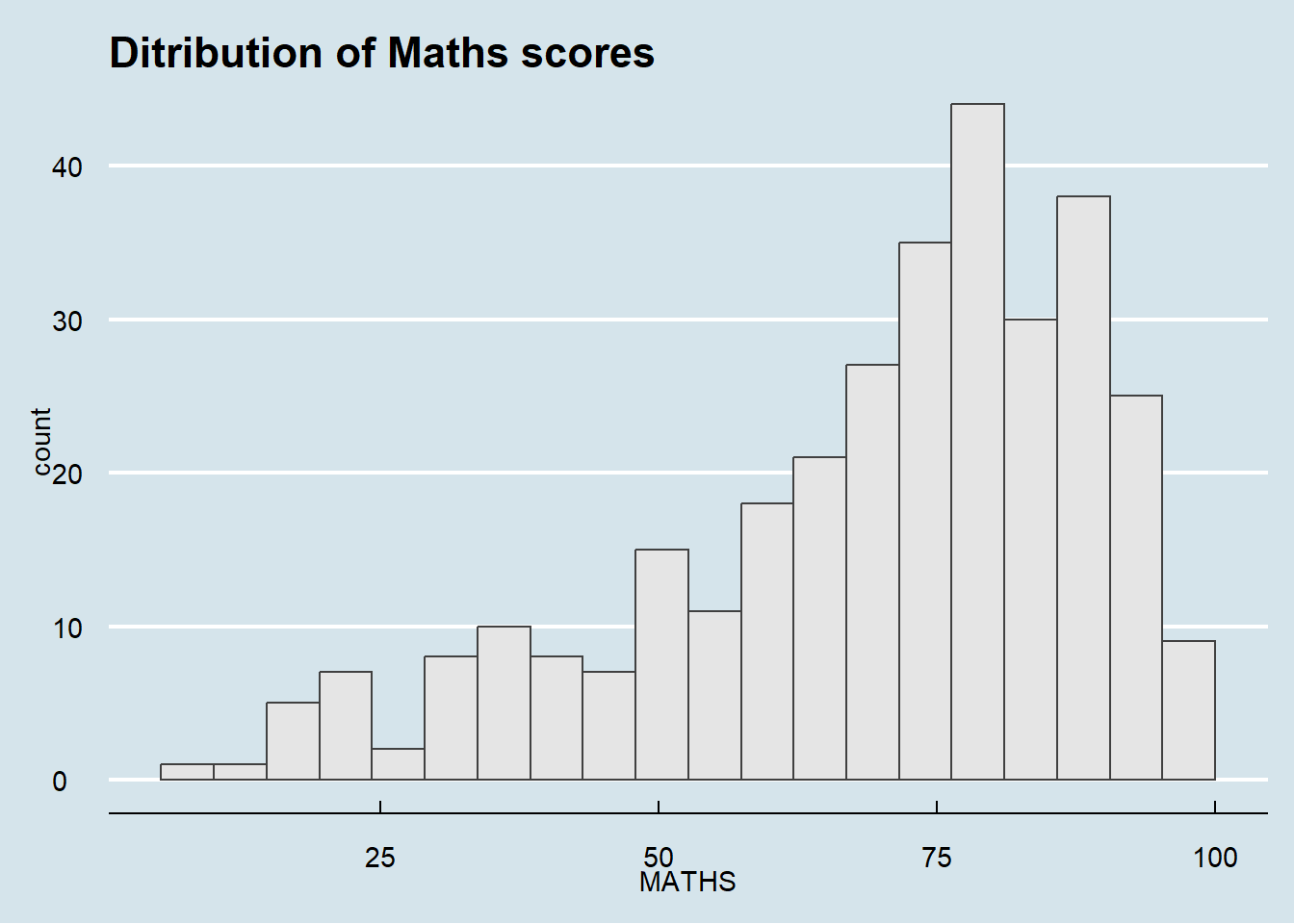
Unique hrbrthemes packages. This focuses more on the typographic elements, labels and fonts. However, it is mostly used for “production workflow”, where the intent is for the output of your work to be put into a publication of some kind, whether it be a blog post, academic paper, presentation, internal report or industry publication.
Refer to here for more details on hrbrthemes package
ggplot(data = exam_data,
       aes(x = MATHS)) +
  geom_histogram(bins = 20,
                 boundary = 100,
                 color = "grey25",
                 fill = "grey90") +
  theme_ipsum(axis_title_size = 18,          #increase font size of the axis title to 18
              base_size = 15,                #increase the default axis label to 15
              grid = "Y") +                  #only keep the y-axis grid line -> remove the x-axis grid lines
  ggtitle("Ditribution of Maths scores")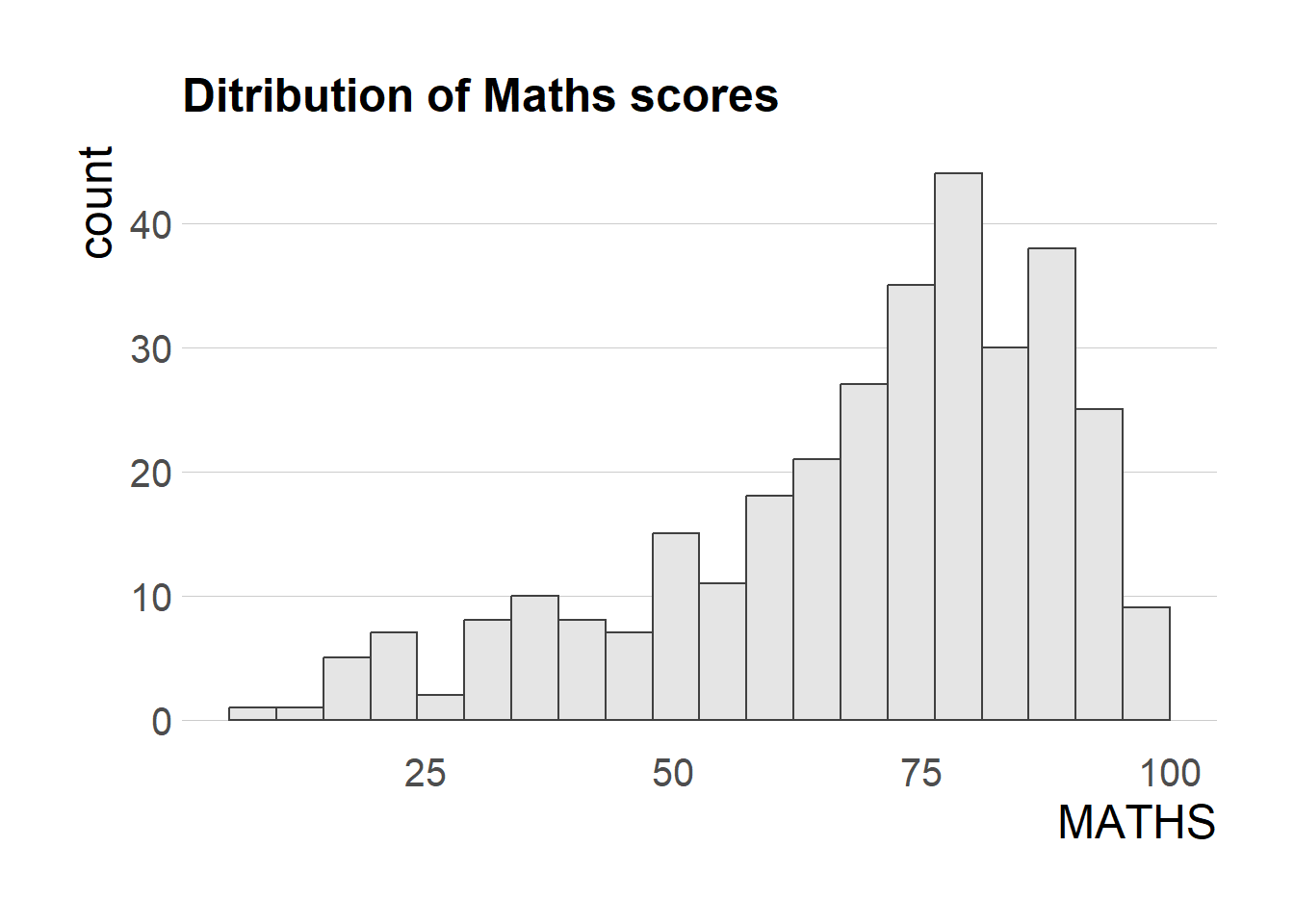
2.3 Working with patchwork
Creating composite plot by combining multiple graphs.
Start with creating three statistical graphics below
#creating histogram
p1 <- ggplot(data = exam_data,
       aes(x = MATHS)) +
  geom_histogram(bins = 20,
                 boundary = 100,
                 color = "grey25",
                 fill = "grey90") +
  coord_cartesian(xlim = c(0,100)) +
  ggtitle("Ditribution of Maths scores")

p2 <- ggplot(data = exam_data,
       aes(x = ENGLISH)) +
  geom_histogram(bins = 20,
                 boundary = 100,
                 color = "grey25",
                 fill = "grey90") +
  coord_cartesian(xlim = c(0,100)) +
  ggtitle("Ditribution of English scores")

#creating scatterplot
p3 <- ggplot(data = exam_data,
       aes(x = MATHS,
           y = ENGLISH)) +
  geom_point() +
  geom_smooth(method = lm,
              linewidth = 0.5) +
  coord_cartesian(xlim = c(0,100),
                  ylim = c(0,100)) +
  ggtitle("English scores versus Maths scores for Primary 3")
Creating patchwork.
Use ‘+’ sign to create two columns layout
Use ‘/’ sign to create two row layout (stack)
Use ‘()’ sign to create subplot group
Use ‘|’ sign to place the plots besisde each other
Refer to here for more details. Examples below
p1 + p2 / p3`geom_smooth()` using formula = 'y ~ x'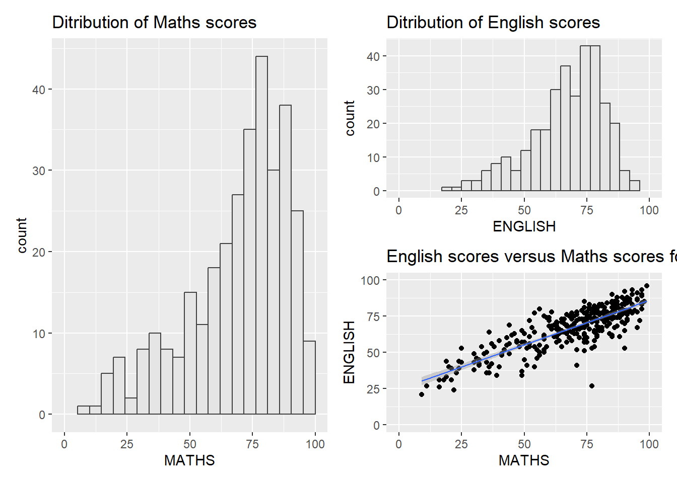
(p1 / p2) | p3`geom_smooth()` using formula = 'y ~ x'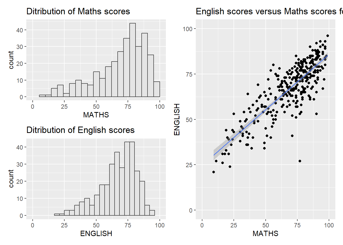
((p1 / p2) | p3) +
  plot_annotation(tag_levels = 'I')
`geom_smooth()` using formula = 'y ~ x'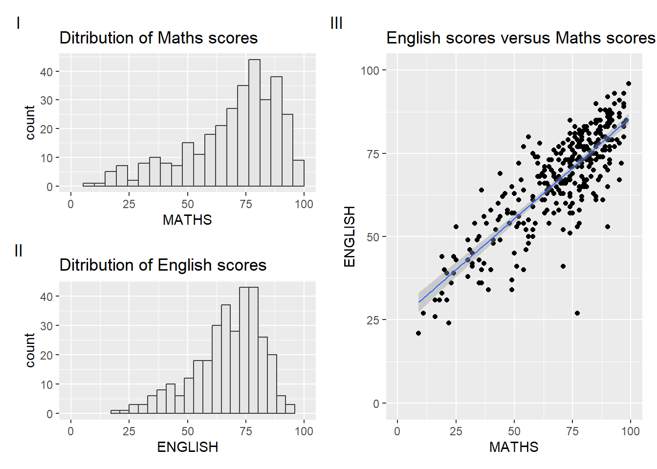
#this will auto-tag the subplots in textCombining patchwork and themes
((p1 / p2) | p3) & theme_economist()`geom_smooth()` using formula = 'y ~ x'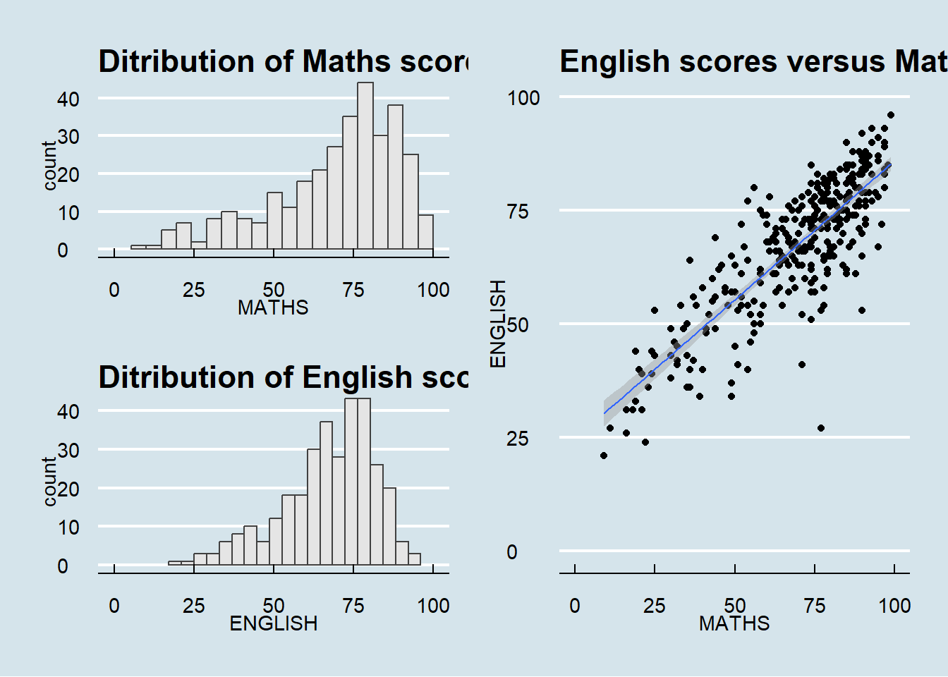
#this will auto-tag the subplots in textInsert another plot in a plot
p3 + inset_element(p2,
                   left = 0.02,
                   bottom = 0.7,
                   right = 0.5,
                   top = 1)
`geom_smooth()` using formula = 'y ~ x'