pacman::p_load(ggstatsplot, tidyverse)Hands-on Exercise 4: Fundamentals of Visual Analytics
1. Getting Started
Install and launching R packages.
The code chunk below uses p_load() of pacman package to check if packages are installed in the computer. If they are, then they will be launched into R. The R packages installed are:
- ggstatsplot is an extension of ggplot2 package for creating graphics with details from statistical tests included in the information-rich plots themselves.
Importing the data
exam_data <- read_csv("data/Exam_data.csv")2. Visual Statistical Analysis
2.1 One-sample test using gghistostats for
set.seed(1234)

gghistostats(
  data = exam_data,
  x = ENGLISH,
  type = "bayes",
  test.value = 60,
  xlab = "English scores"
)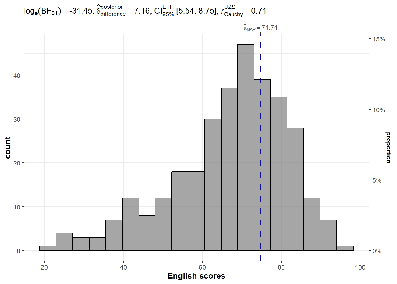
Default information: - statistical details - Bayes Factor - sample sizes - distribution summary
A Bayes factor is the ratio of the likelihood of one particular hypothesis to the likelihood of another. It can be interpreted as a measure of the strength of evidence in favor of one theory among two competing theories.
2.2 Two-sample mean test using ggbetweenstats
ggbetweenstats(
  data = exam_data,
  x = GENDER,
  y = MATHS,
  type = "np",
  messages = FALSE
)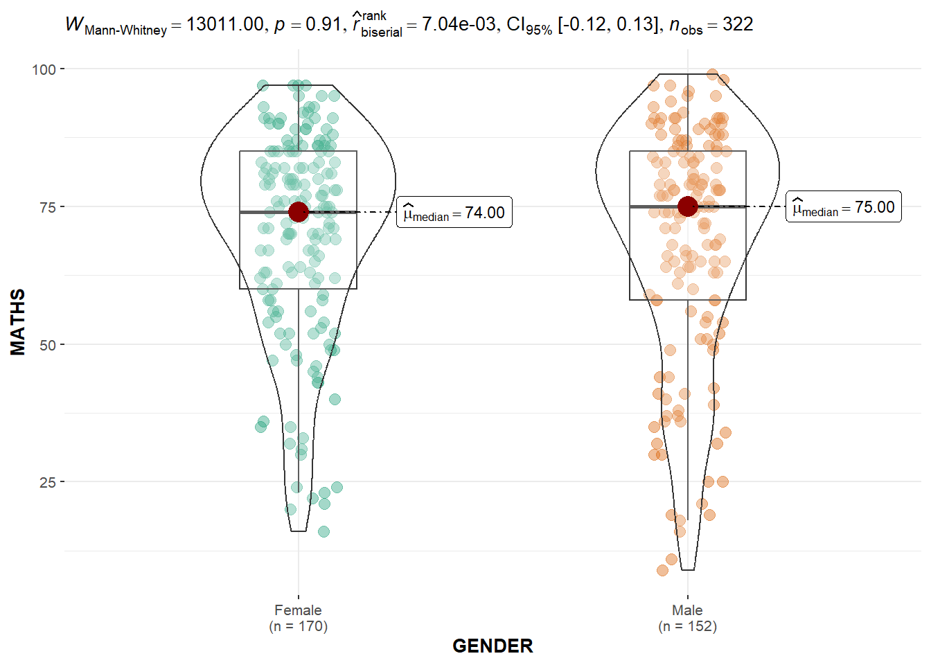
Default information: - statistical details - Bayes Factor - sample sizes - distribution summary
2.3 Oneway ANOVA Test using ggbetweenstats
ggbetweenstats(
  data = exam_data,
  x = RACE,
  y = ENGLISH,
  type = "p",
  mean.ci = TRUE,
  pairwise.comparisons = TRUE,
  #"ns" for only non-significant, "s" for only significant, "all" for everything
  pairwise.display = "s",
  p.adjust.method = "fdr",
  messages = FALSE
  )
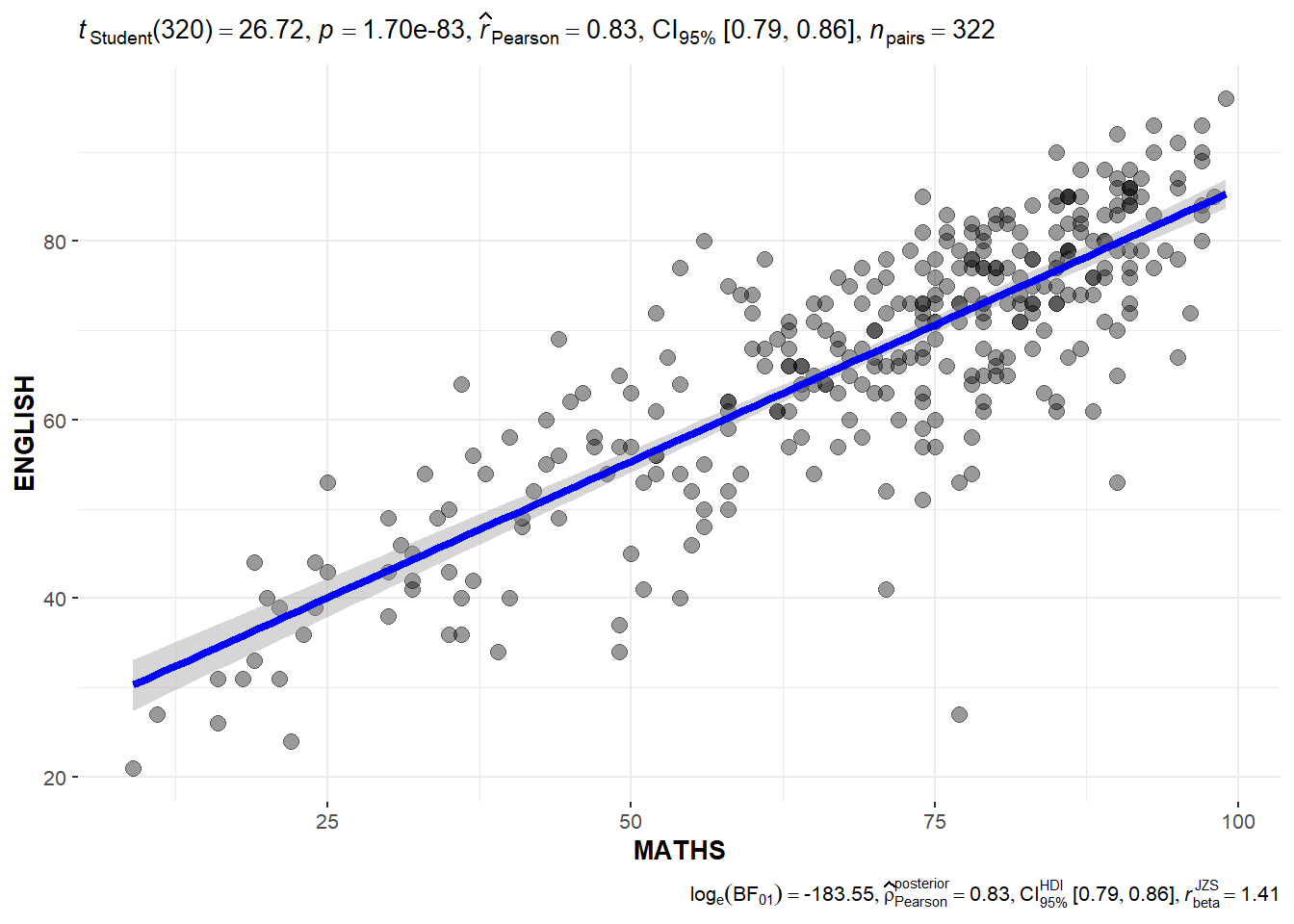
2.4 Significant Test of Correlation using ggscatterstats
ggscatterstats(
  data = exam_data,
  x = MATHS,
  y = ENGLISH,
  marginal = FALSE
)
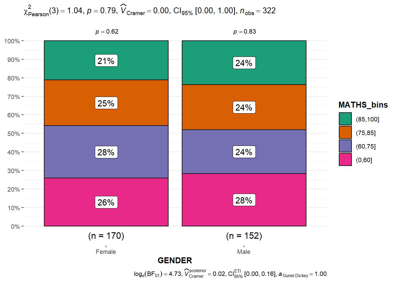
2.5 Significant Test of Association (Dependence) using ggbarstats
#Binning Maths scores to 4-class variable
exam1 <- exam_data |>
  mutate(MATHS_bins =
           cut(MATHS,
breaks = c(0, 60, 75, 85, 100)))ggbarstats(
data = exam1,
x = MATHS_bins,
y = GENDER
)
3. Visualising Models
3.1 Preparation
pacman::p_load(readxl, performance, parameters, see)car_resale <- read_xls("data/ToyotaCorolla.xls",
"data")3.2 Multiple Regression Model using lm()
Calibrate a multiple linear regression model by using lm() of Base Stats of R.
model <- lm(Price ~ Age_08_04 + Mfg_Year + KM +
              Weight + Guarantee_Period, data = car_resale)
model
Call:
lm(formula = Price ~ Age_08_04 + Mfg_Year + KM + Weight + Guarantee_Period,
    data = car_resale)

Coefficients:
     (Intercept)         Age_08_04          Mfg_Year                KM
      -2.637e+06        -1.409e+01         1.315e+03        -2.323e-02
          Weight  Guarantee_Period
       1.903e+01         2.770e+01
3.3 Checking for multicollinearity using check_collinearity()
check_collinearity(model)# Check for Multicollinearity
Low Correlation
Term VIF VIF 95% CI Increased SE Tolerance Tolerance 95% CI
Guarantee_Period 1.04 [1.01, 1.17] 1.02 0.97 [0.86, 0.99]
Age_08_04 31.07 [28.08, 34.38] 5.57 0.03 [0.03, 0.04]
Mfg_Year 31.16 [28.16, 34.48] 5.58 0.03 [0.03, 0.04]
High Correlation
Term VIF VIF 95% CI Increased SE Tolerance Tolerance 95% CI
KM 1.46 [1.37, 1.57] 1.21 0.68 [0.64, 0.73]
Weight 1.41 [1.32, 1.51] 1.19 0.71 [0.66, 0.76]#plot the collinearity
plot(check_collinearity(model))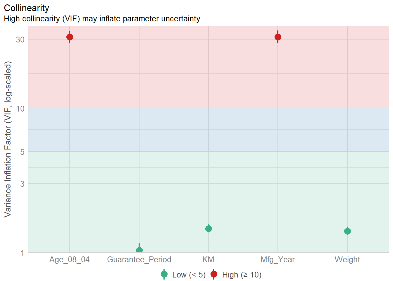
Age_08_04 and Mfg_Year are highly correlated. Remove Mfg_Year
3.4 Checking for normality assumption using check_normality()
#Remove Mfg_Year from model
model1 <- lm(Price ~ Age_08_04 + KM +
              Weight + Guarantee_Period, data = car_resale)
check_n <- check_normality(model1)
plot(check_n)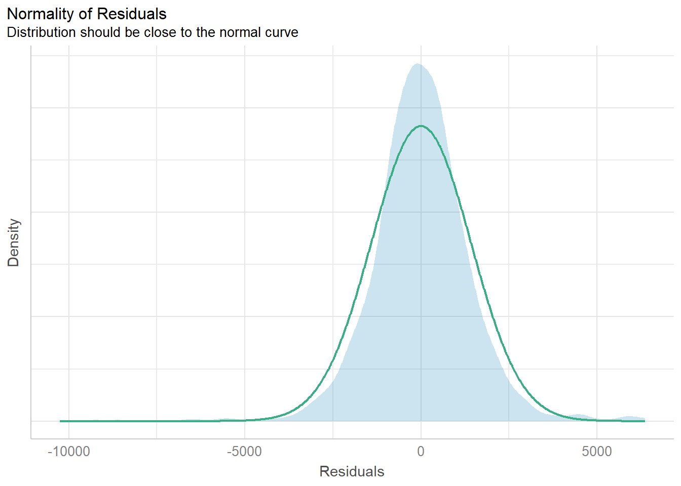
The analytical histogram above is specially designed for normality assumption test. When the residual histogram (in cyan colour) is not closed to the theoretical histogram (i.e in green), then we will reject the Null hypothesis and infer that the model residual failed to conform to normality assumption.
3.5 Checking for homogeneity of variances using check_heteroscedasticity()
check_h <- check_heteroscedasticity(model1)
plot(check_h)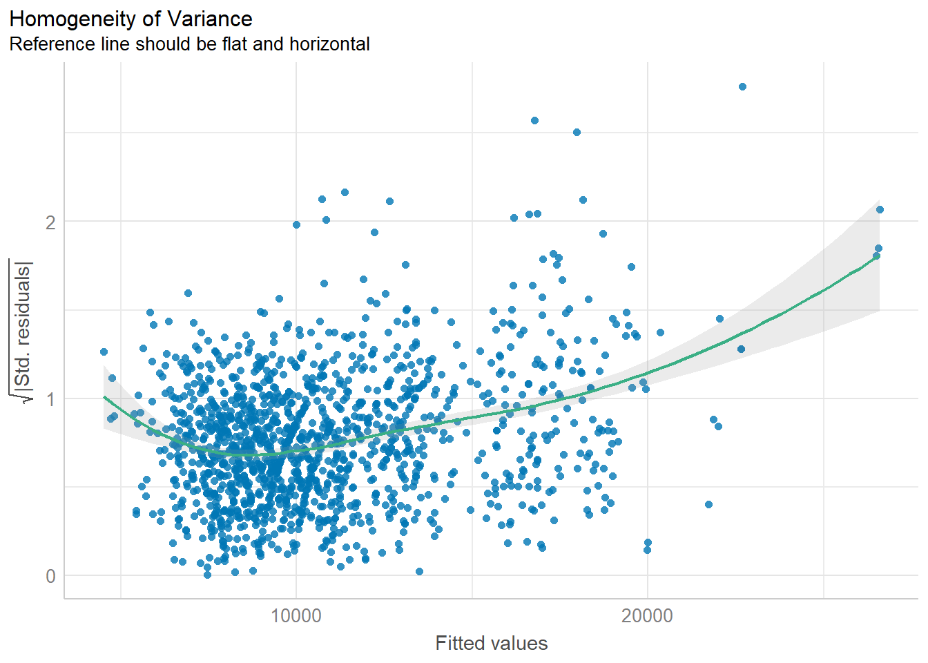
The analytical scatter plot is used to perform homogeneity of Variance assumption test. A constant variance distribution should be flat and horizontal and the data points should be scattered around the fit line. The chart above shows clear sign of heteroscedasticity.
3.6 Complete check using check_model()
check_model(model1)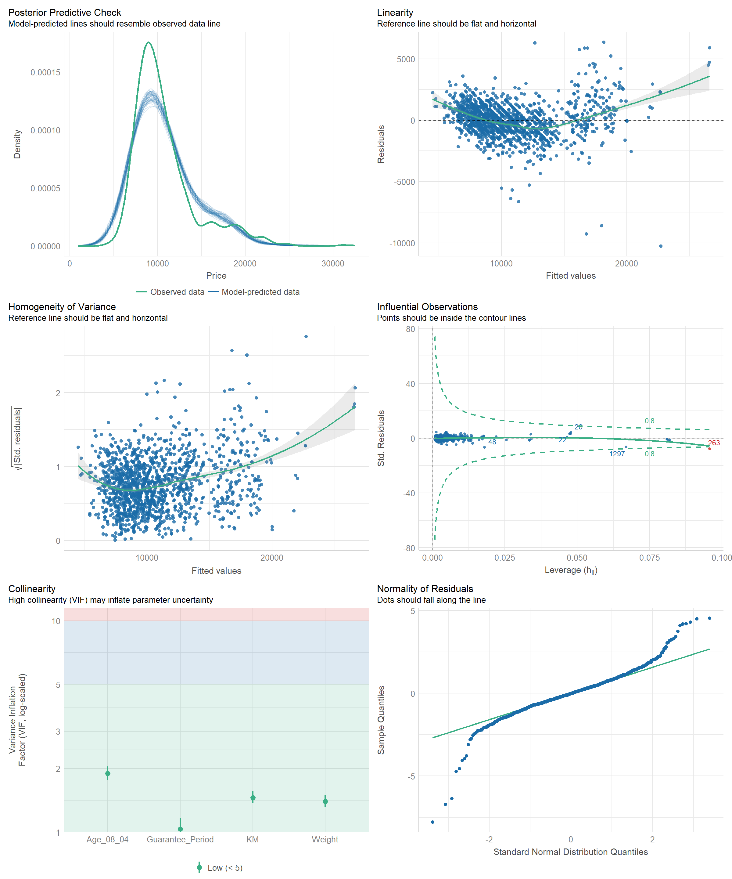
3.7 Visualising Regression Parameters
Using plot() and parameters()
plot(parameters(model1))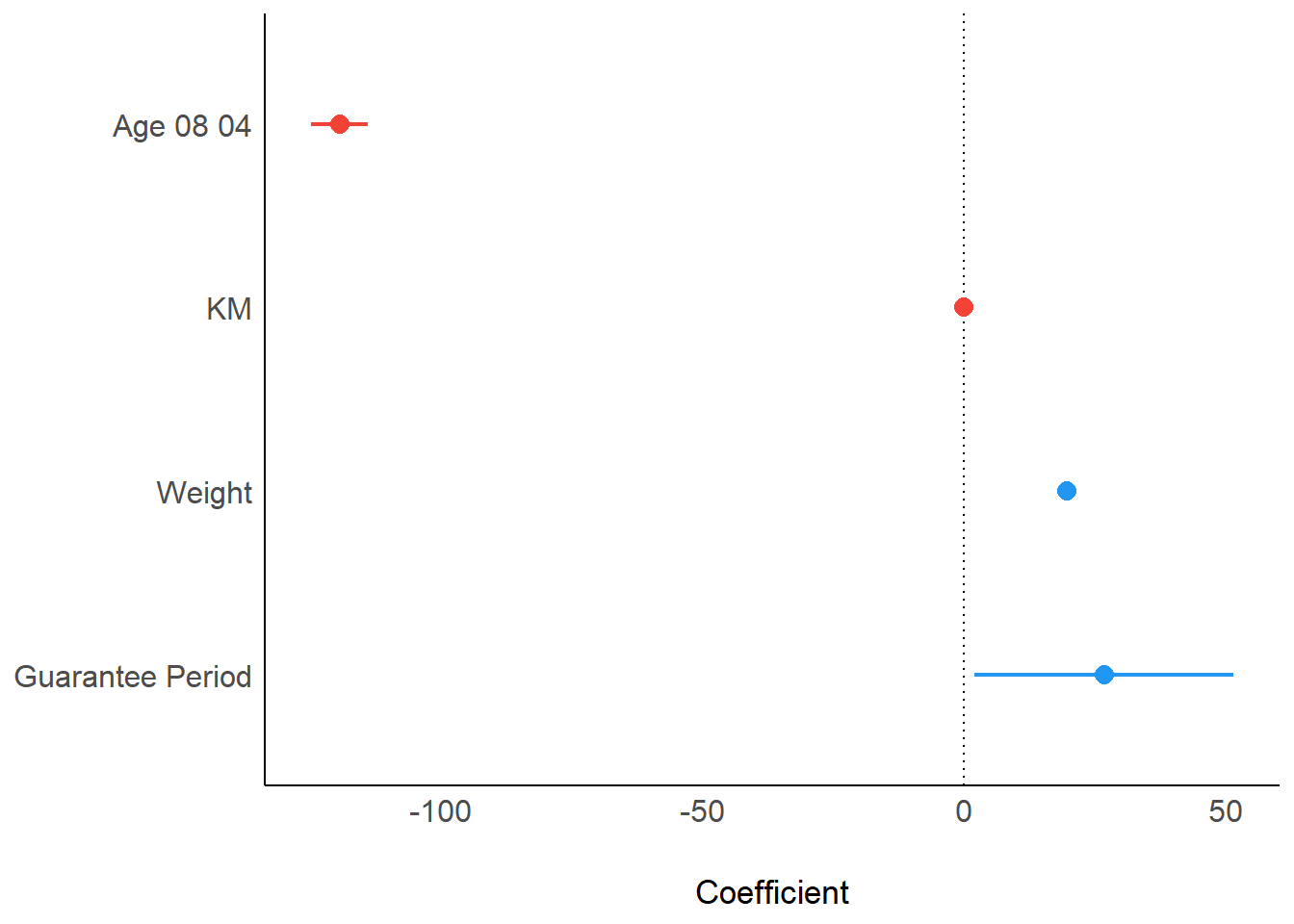
Using ggcoefstats() of ggstatsplot package
ggcoefstats(model1,
            output = "plot")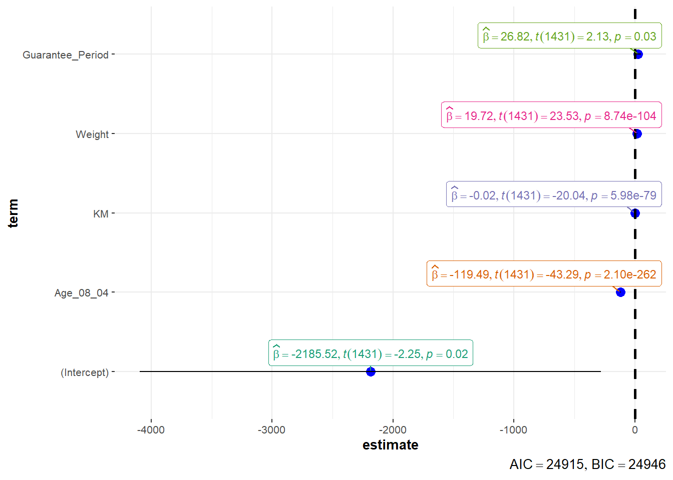
4. Visualising Uncertainty
4.1 Preparation
pacman::p_load(tidyverse, plotly, crosstalk, DT, ggdist, gganimate)4.2 Visualizing uncertainty of point estimates using ggplot2
- A point estimate is a single number, such as a mean.
- Uncertainty is expressed as standard error, confidence interval, or credible interval
- Don’t confuse the uncertainty of a point estimate with the variation in the sample
#group by RACE and calculate mean, sd, and se of MATHS score
my_sum <- exam_data |>
  group_by(RACE) |>
  summarize(
    n = n(),
    mean = mean(MATHS),
    sd = sd(MATHS)) |>
  mutate(se = sd/sqrt(n-1))
my_sum$RACE  <- fct_reorder(my_sum$RACE, my_sum$mean, .desc = TRUE)
showing the tibble in html format
knitr::kable(head(my_sum), format = 'html')| RACE | n | mean | sd | se |
|---|---|---|---|---|
| Chinese | 193 | 76.50777 | 15.69040 | 1.132357 |
| Indian | 12 | 60.66667 | 23.35237 | 7.041005 |
| Malay | 108 | 57.44444 | 21.13478 | 2.043177 |
| Others | 9 | 69.66667 | 10.72381 | 3.791438 |
Using ggplot2 to reveal the standard error of mean maths score by race
ggplot(my_sum) +

  geom_errorbar(
    aes(x = RACE,
        ymin = mean - se,
        ymax = mean + se),
    width = 0.2,
    colour = "black",
    alpha = 0.9,
    linewidth = 0.5) +

  geom_point(
    aes(x = RACE,
        y = mean),
    stat = "identity",
    colour = "red",
    size = 1.5,
    alpha = 1) +

  ggtitle("Standard error of mean
          maths score by race")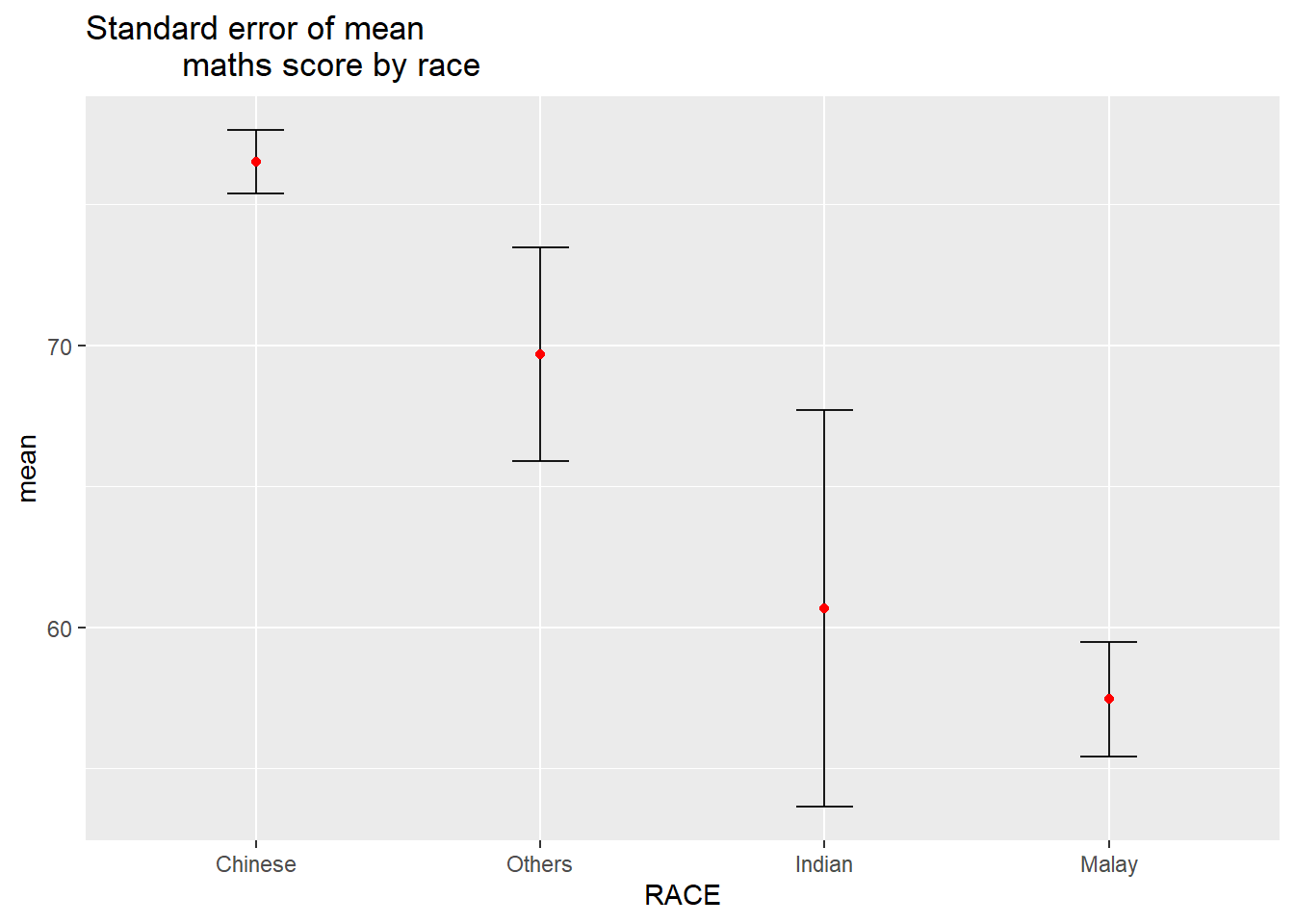
Using ggplot2 to reveal the 95% confidence interval of mean maths score by race
ggplot(my_sum) +

  geom_errorbar(
    aes(x = RACE,
        ymin = mean - 1.96*se,
        ymax = mean + 1.96*se),
    width = 0.2,
    colour = "black",
    alpha = 0.9,
    linewidth = 0.5) +

  geom_point(
    aes(x = RACE,
        y = mean),
    stat = "identity",
    colour = "red",
    size = 1.5,
    alpha = 1) +

  ggtitle("95% confidence interval of mean maths score by race")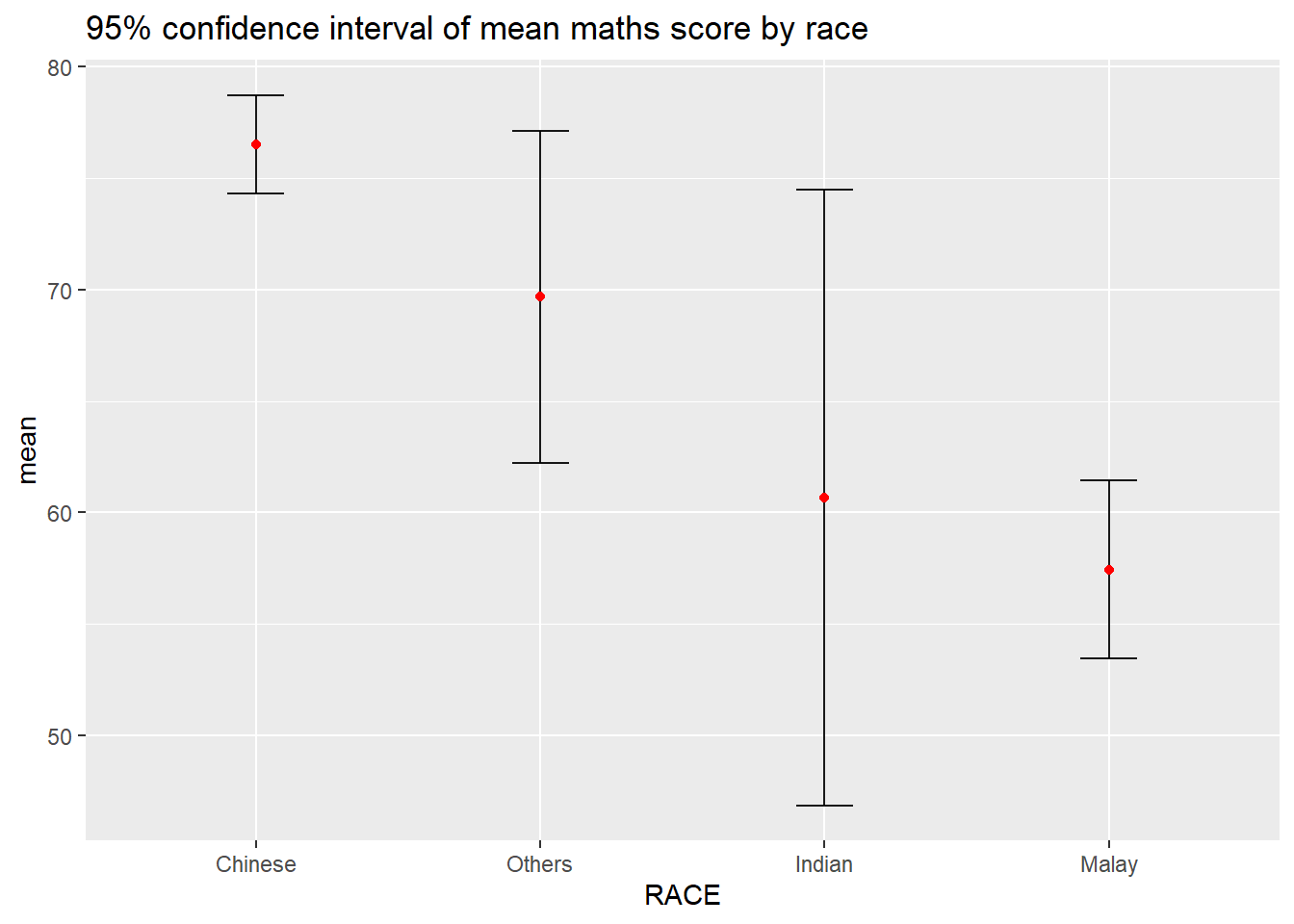
Visualizing the uncertainty of point estimates with interactive error bars
d <- highlight_key(my_sum)

p <- ggplot(d) +
  geom_errorbar(
    aes(x = RACE,
        ymin = mean - 2.58*se,
        ymax = mean + 2.58*se),
    width = 0.2,
    colour = "black",
    alpha = 0.9,
    linewidth = 0.5) +
  geom_point(
    aes(x = RACE,
        y = mean,
        text = paste("Race:", RACE,
                     "<br>N:", n,
                     "<br>Avg. Scores:", round(mean, digits = 2),
                     "<br>99% CI:[", round(mean - 2.58*se, digits = 2), ", ", round(mean + 2.58*se, digits = 2), "]")),
    stat = "identity",
    colour = "red",
    size = 1.5,
    alpha = 1) +

  ggtitle("99% confidence interval of mean maths score by race")

gg <- highlight(ggplotly(p, tooltip = "text"),
                "plotly_selected")

dt <- DT::datatable(d,
                    colnames = c("","No. of pupils", "Avg Scores", "Std Dev", "Std Error")) |>
  formatRound(columns = c("mean", "sd", "se"), digits = 2)

crosstalk::bscols(gg,
                  dt,
                  widths = 5)
4.3 Visualizing uncertainty of point estimates using ggdist
ggdist is an R package that provides a flexible set of ggplot2 geoms and stats designed especially for visualising distributions and uncertainty.
It is designed for both frequentist and Bayesian uncertainty visualization, taking the view that uncertainty visualization can be unified through the perspective of distribution visualization:
for frequentist models, one visualises confidence distributions or bootstrap distributions (see vignette(“freq-uncertainty-vis”));
for Bayesian models, one visualises probability distributions (see the tidybayes package, which builds on top of ggdist).
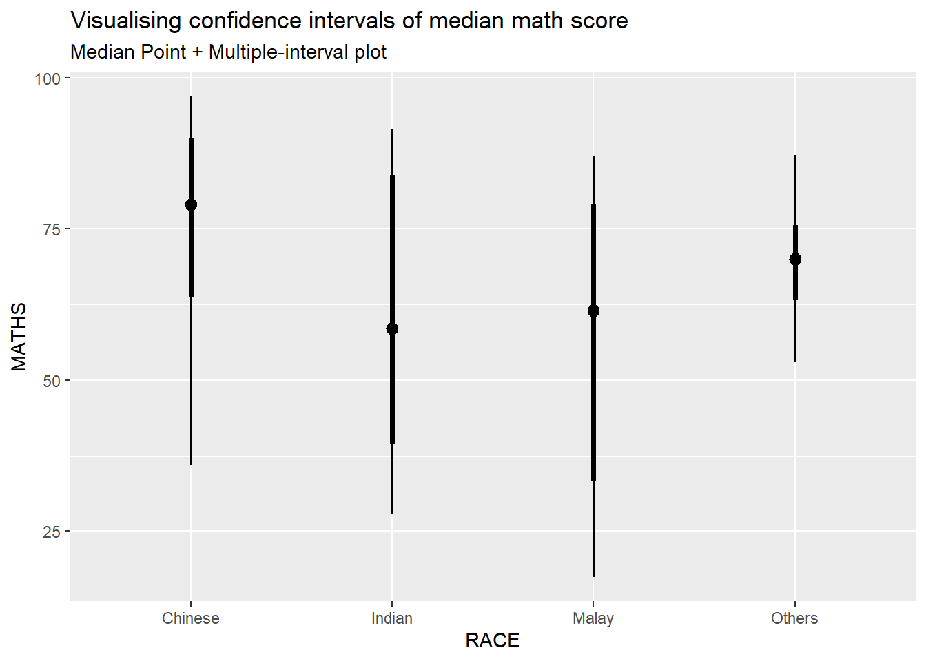
Using stat_pointinterval() of ggdist to build a visual displaying distribution of math scores by race
exam_data |>
  ggplot(aes(x = RACE,
             y = MATHS)) +

  #refer to point_interval argument in stat_pointinterval() help
  stat_pointinterval(
    .point = median,
    .interval = qi
  ) +

  labs(
    title = "Visualising confidence intervals of median math score",
    subtitle = "Median Point + Multiple-interval plot"
  )
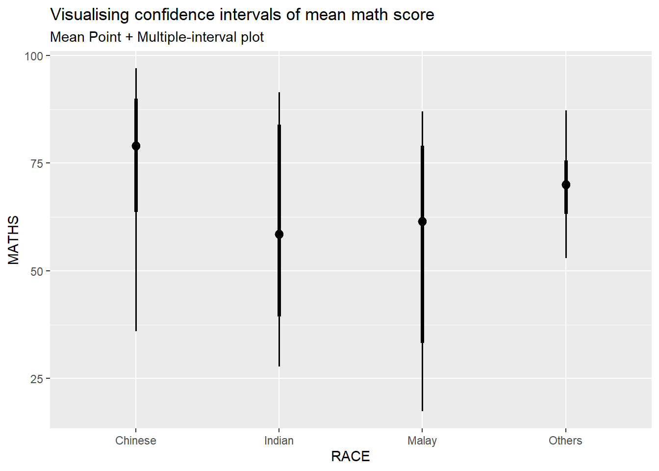
Showing 95% and 99% confidence interval with mean
exam_data |>
  ggplot(aes(x = RACE,
             y = MATHS)) +

  #refer to point_interval argument in stat_pointinterval() help
  stat_pointinterval(
    .point = mean,
    .interval = c(qi(0.05), qi(0.01))
  ) +

  labs(
    title = "Visualising confidence intervals of mean math score",
    subtitle = "Mean Point + Multiple-interval plot"
  )
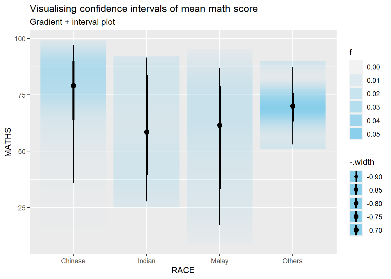
Using stat_gradientinterval() of ggdist to build a visual for displaying distribution of maths scores by race.
exam_data |>
  ggplot(aes(x = RACE,
             y = MATHS)) +

  #refer to point_interval argument in stat_pointinterval() help
  stat_gradientinterval(
    .point = mean,
    fill = "skyblue",
    show.legend = TRUE
  ) +

  labs(
    title = "Visualising confidence intervals of mean math score",
    subtitle = "Gradient + interval plot"
  )
5. Building Funnel Plot with R
Funnel plot is a specially designed data visualisation for conducting unbiased comparison between outlets, stores or business entities.
5.1 Preparation
Five R packages will be used. They are:
readrfor importing csv into R.FunnelPlotRfor creating funnel plot.ggplot2for creating funnel plot manually.knitrfor building static html table.plotlyfor creating interactive funnel plot.
pacman::p_load(tidyverse, FunnelPlotR, plotly, knitr)Importing data
covid19 <- read_csv("data/COVID-19_DKI_Jakarta.csv") |>
  mutate_if(is.character, as.factor)

head(covid19)
# A tibble: 6 × 7
`Sub-district ID` City District Sub-d…¹ Posit…² Recov…³ Death
<dbl> <fct> <fct> <fct> <dbl> <dbl> <dbl>
1 3172051003 JAKARTA UTARA PADEMANGAN ANCOL 1776 1691 26
2 3173041007 JAKARTA BARAT TAMBORA ANGKE 1783 1720 29
3 3175041005 JAKARTA TIMUR KRAMAT JATI BALE K… 2049 1964 31
4 3175031003 JAKARTA TIMUR JATINEGARA BALI M… 827 797 13
5 3175101006 JAKARTA TIMUR CIPAYUNG BAMBU … 2866 2792 27
6 3174031002 JAKARTA SELATAN MAMPANG PRAPA… BANGKA 1828 1757 26
# … with abbreviated variable names ¹`Sub-district`, ²Positive, ³Recovered5.2 FunnelPlotR methods
FunnelPlotR package uses ggplot to generate funnel plots. It requires a numerator (events of interest), denominator (population to be considered) and group. The key arguments selected for customisation are:
limit: plot limits (95 or 99).label_outliers: to label outliers (true or false).Poisson_limits: to add Poisson limits to the plot.OD_adjust: to add overdispersed limits to the plot.xrangeandyrange: to specify the range to display for axes, acts like a zoom function.Other aesthetic components such as graph title, axis labels etc.
Basic plot
funnel_plot(
  numerator = covid19$Death,
  denominator = covid19$Positive,
  #group determines the level of points to e plotted
  group = covid19$`Sub-district`,
  #change from defaut 'SR' to 'PR'
  data_type = "PR",
  x_range = c(0, 6500),
  y_range = c(0, 0.05),
  #label = NA removes the default label outliers feature
  label = NA,
  title = "Cumulative COVID-19 Fatality Rate by Cumulative Total Number of COVID-19 Positive Cases",
  x_label = "Cumulative COVID-19 Positive Cases",
  y_label = "Cumulative Fatality Rate"
  )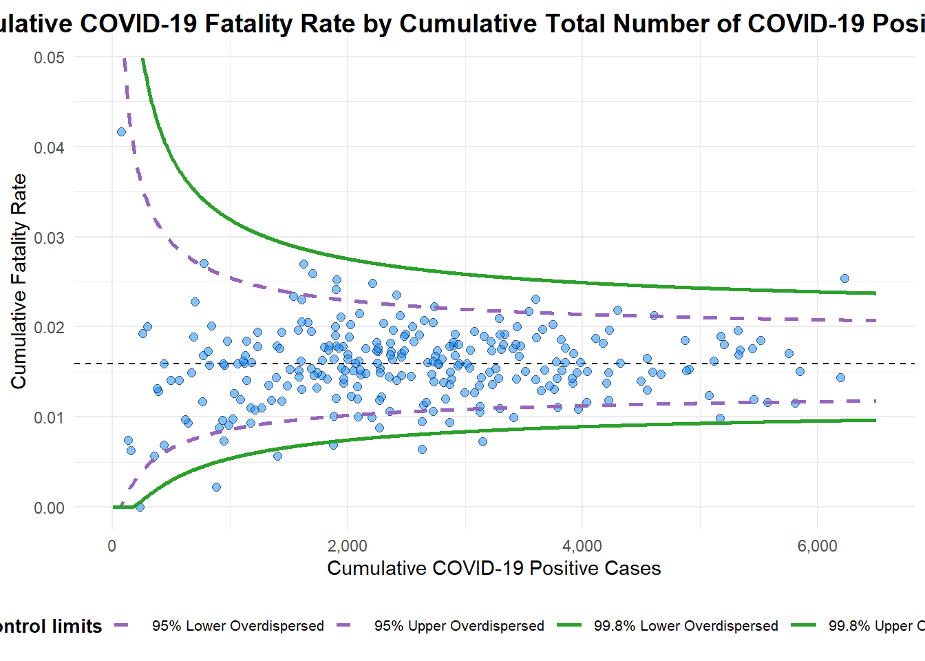
A funnel plot object with 267 points of which 7 are outliers.
Plot is adjusted for overdispersion.
5.3 ggplot2 method
Data preparation
df <- covid19 |>
  mutate(rate = Death/Positive) |>
  mutate(rate.se = sqrt((rate*(1-rate)) / (Positive))) |>
  filter(rate > 0)
Next, the fit.mean is computed by using the code chunk below.
fit.mean <- weighted.mean(df$rate, 1/df$rate.se^2)Calculate the lower an upper limits for 95% and 99% CI
number.seq <- seq(1, max(df$Positive), 1)
number.ll95 <- fit.mean - 1.96 * sqrt((fit.mean*(1-fit.mean)) / (number.seq))
number.ul95 <- fit.mean + 1.96 * sqrt((fit.mean*(1-fit.mean)) / (number.seq))
number.ll999 <- fit.mean - 3.29 * sqrt((fit.mean*(1-fit.mean)) / (number.seq))
number.ul999 <- fit.mean + 3.29 * sqrt((fit.mean*(1-fit.mean)) / (number.seq))
dfCI <- data.frame(number.ll95, number.ul95, number.ll999, number.ul999, number.seq, fit.mean)
Plotting static funnel plot
p <- ggplot(df, aes(x = Positive, y = rate)) +
  geom_point(aes(label=`Sub-district`),
             alpha=0.4) +
  geom_line(data = dfCI,
            aes(x = number.seq,
                y = number.ll95),
            linewidth = 0.4,
            colour = "grey40",
            linetype = "dashed") +
  geom_line(data = dfCI,
            aes(x = number.seq,
                y = number.ul95),
            linewidth = 0.4,
            colour = "grey40",
            linetype = "dashed") +
  geom_line(data = dfCI,
            aes(x = number.seq,
                y = number.ll999),
            linewidth = 0.4,
            colour = "grey40") +
  geom_line(data = dfCI,
            aes(x = number.seq,
                y = number.ul999),
            linewidth = 0.4,
            colour = "grey40") +
  geom_hline(data = dfCI,
             aes(yintercept = fit.mean),
             linewidth = 0.4,
             colour = "grey40") +
  coord_cartesian(ylim=c(0,0.05)) +
  annotate("text", x = 1, y = -0.13, label = "95%", size = 3, colour = "grey40") +
  annotate("text", x = 4.5, y = -0.18, label = "99%", size = 3, colour = "grey40") +
  ggtitle("Cumulative Fatality Rate by Cumulative Number of COVID-19 Cases") +
  xlab("Cumulative Number of COVID-19 Cases") +
  ylab("Cumulative Fatality Rate") +
  theme_light() +
  theme(plot.title = element_text(size=12),
        legend.position = c(0.91,0.85),
        legend.title = element_text(size=7),
        legend.text = element_text(size=7),
        legend.background = element_rect(colour = "grey60", linetype = "dotted"),
        legend.key.height = unit(0.3, "cm"))
p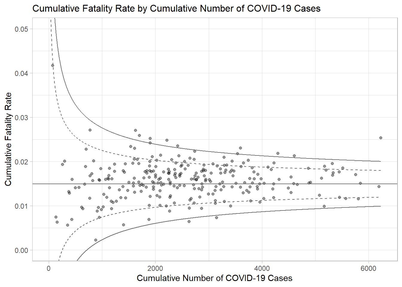
Pass this to ggplotly
fp_ggplotly <- ggplotly(p,
  tooltip = c("label",
              "x",
              "y"))
fp_ggplotly