pacman::p_load(corrplot, ggstatsplot, heatmaply, GGally, parallelPlot, tidyverse)In-class Exercise 5
1. Install and loading R packages
Packages will be installed and loaded.
2. Importing Data
wine <- read_csv("data/wine_quality.csv")
wine
# A tibble: 6,497 × 13
fixed…¹ volat…² citri…³ resid…⁴ chlor…⁵ free …⁶ total…⁷ density pH sulph…⁸
<dbl> <dbl> <dbl> <dbl> <dbl> <dbl> <dbl> <dbl> <dbl> <dbl>
1 7.4 0.7 0 1.9 0.076 11 34 0.998 3.51 0.56
2 7.8 0.88 0 2.6 0.098 25 67 0.997 3.2 0.68
3 7.8 0.76 0.04 2.3 0.092 15 54 0.997 3.26 0.65
4 11.2 0.28 0.56 1.9 0.075 17 60 0.998 3.16 0.58
5 7.4 0.7 0 1.9 0.076 11 34 0.998 3.51 0.56
6 7.4 0.66 0 1.8 0.075 13 40 0.998 3.51 0.56
7 7.9 0.6 0.06 1.6 0.069 15 59 0.996 3.3 0.46
8 7.3 0.65 0 1.2 0.065 15 21 0.995 3.39 0.47
9 7.8 0.58 0.02 2 0.073 9 18 0.997 3.36 0.57
10 7.5 0.5 0.36 6.1 0.071 17 102 0.998 3.35 0.8
# … with 6,487 more rows, 3 more variables: alcohol <dbl>, quality <dbl>,
# type <chr>, and abbreviated variable names ¹`fixed acidity`,
# ²`volatile acidity`, ³`citric acid`, ⁴`residual sugar`, ⁵chlorides,
# ⁶`free sulfur dioxide`, ⁷`total sulfur dioxide`, ⁸sulphatespop_data <- read_csv("data/respopagsex2000to2018_tidy.csv") wh <- read_csv("data/WHData-2018.csv")3. Data Preparation
Data preparation for population data
agpop_mutated <- pop_data %>%
  mutate(`Year` = as.character(Year))%>%
  spread(AG, Population) %>%
  mutate(YOUNG = rowSums(.[4:8]))%>%
  mutate(ACTIVE = rowSums(.[9:16]))  %>%
  mutate(OLD = rowSums(.[17:21])) %>%
  mutate(TOTAL = rowSums(.[22:24])) %>%
  filter(Year == 2018)%>%
  filter(TOTAL > 0)

agpop_mutated
# A tibble: 234 × 25
PA SZ Year AGE0-…¹ AGE05…² AGE10…³ AGE15…⁴ AGE20…⁵ AGE25…⁶ AGE30…⁷
<chr> <chr> <chr> <dbl> <dbl> <dbl> <dbl> <dbl> <dbl> <dbl>
1 Ang Mo K… Ang … 2018 180 270 320 300 260 300 270
2 Ang Mo K… Chen… 2018 1060 1080 1080 1260 1400 1880 1940
3 Ang Mo K… Chon… 2018 900 900 1030 1220 1380 1760 1830
4 Ang Mo K… Kebu… 2018 720 850 1010 1120 1230 1460 1330
5 Ang Mo K… Semb… 2018 220 310 380 500 550 500 300
6 Ang Mo K… Shan… 2018 550 630 670 780 950 1080 990
7 Ang Mo K… Tago… 2018 260 340 430 500 640 690 440
8 Ang Mo K… Town… 2018 830 930 930 860 1020 1400 1350
9 Ang Mo K… Yio … 2018 160 160 220 260 350 340 230
10 Ang Mo K… Yio … 2018 810 1070 1300 1450 1500 1590 1390
# … with 224 more rows, 15 more variables: `AGE35-39` <dbl>, `AGE40-44` <dbl>,
# `AGE45-49` <dbl>, `AGE50-54` <dbl>, `AGE55-59` <dbl>, `AGE60-64` <dbl>,
# `AGE65-69` <dbl>, `AGE70-74` <dbl>, `AGE75-79` <dbl>, `AGE80-84` <dbl>,
# AGE85over <dbl>, YOUNG <dbl>, ACTIVE <dbl>, OLD <dbl>, TOTAL <dbl>, and
# abbreviated variable names ¹`AGE0-4`, ²`AGE05-9`, ³`AGE10-14`, ⁴`AGE15-19`,
# ⁵`AGE20-24`, ⁶`AGE25-29`, ⁷`AGE30-34`Data preparation for WHData. Transform the data into matrix. Note that wh_matrix is in matrix format.
This is required to plot the heatmap
#change the country name to row number
row.names(wh) <- wh$Country

#select the relevant columns to be selected in the matrix
wh1 <- select(wh, c(3, 7:12))
wh_matrix <- data.matrix(wh)
4. Correlation Matrix
Creating matrix from column 1 to 11 from wine dataset. Note that we should only use numerical data in the correlation matrix and not categorical data.
pairs(wine[,1:11])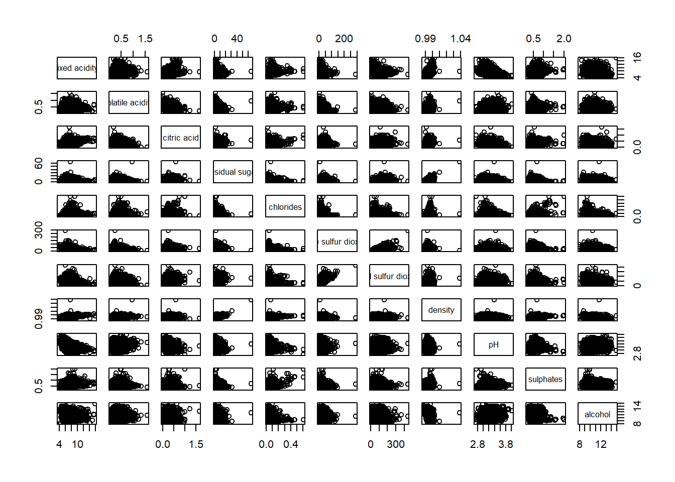
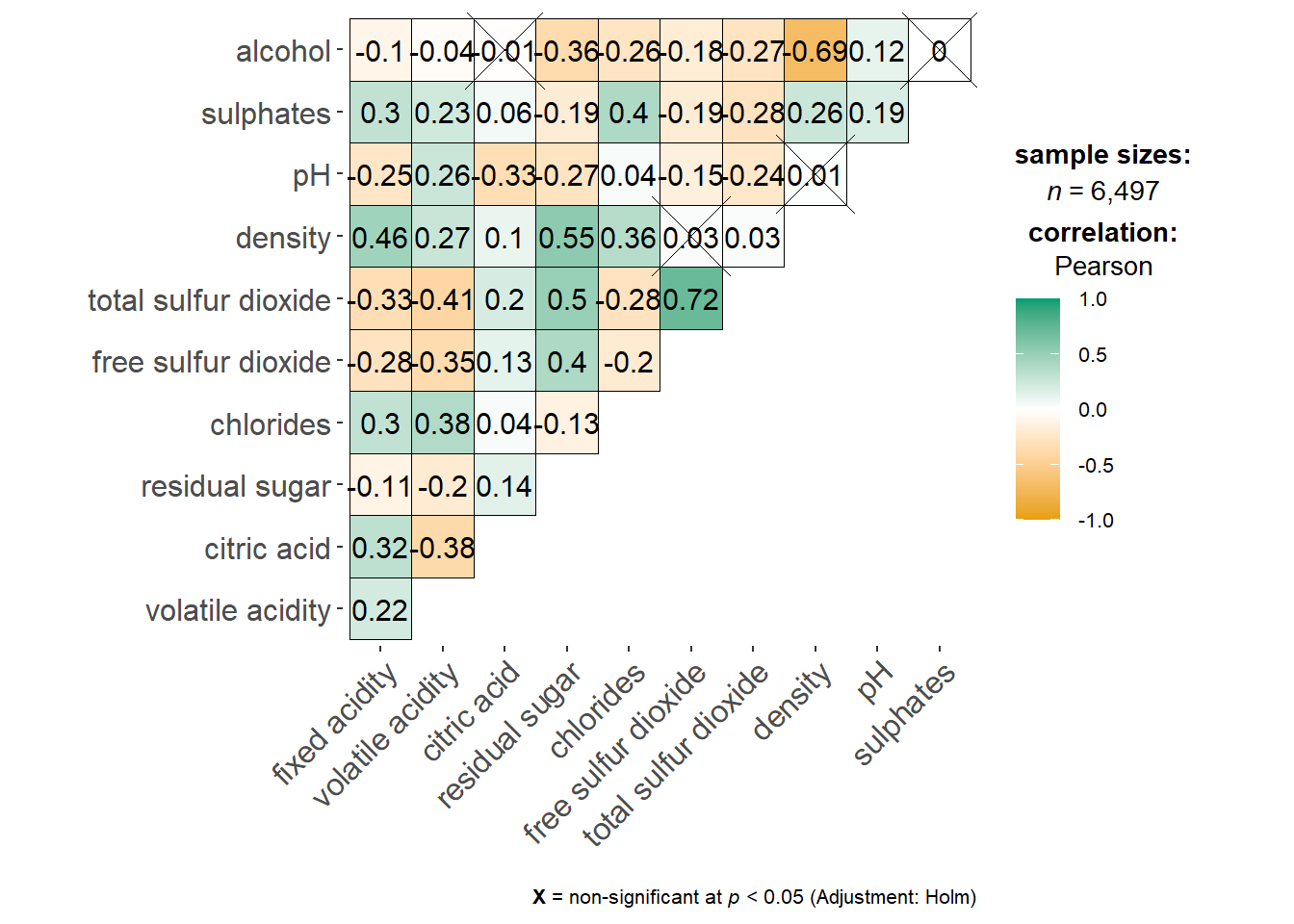
Using ggcorrmat() to provide a comprehensive and yet professional statistical report.
#|fig-width: 7
#|fig-height: 7
ggstatsplot::ggcorrmat(
  data = wine,
  cor.vars = 1:11
)
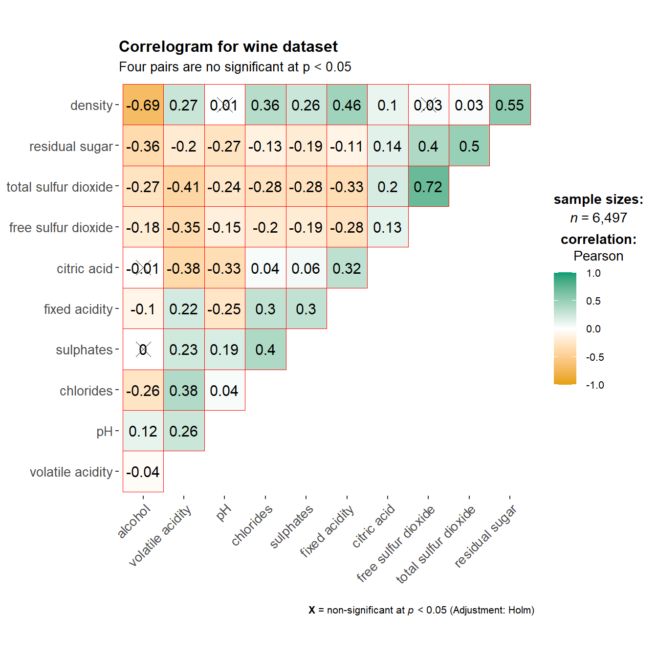
We can specify ggcorrplot.args as a list as below. Adding the title and subtitle as well
ggstatsplot::ggcorrmat(
  data = wine,
  cor.vars = 1:11,
                         #change the color of the outlines
  ggcorrplot.args = list(outline.color = "red",

                         #order based on hierarchical clustering
                         hc.order = TRUE,

                         #change the cross smaller
                         tl.cex = 10),
  title    = "Correlogram for wine dataset",
  subtitle = "Four pairs are no significant at p < 0.05"
)
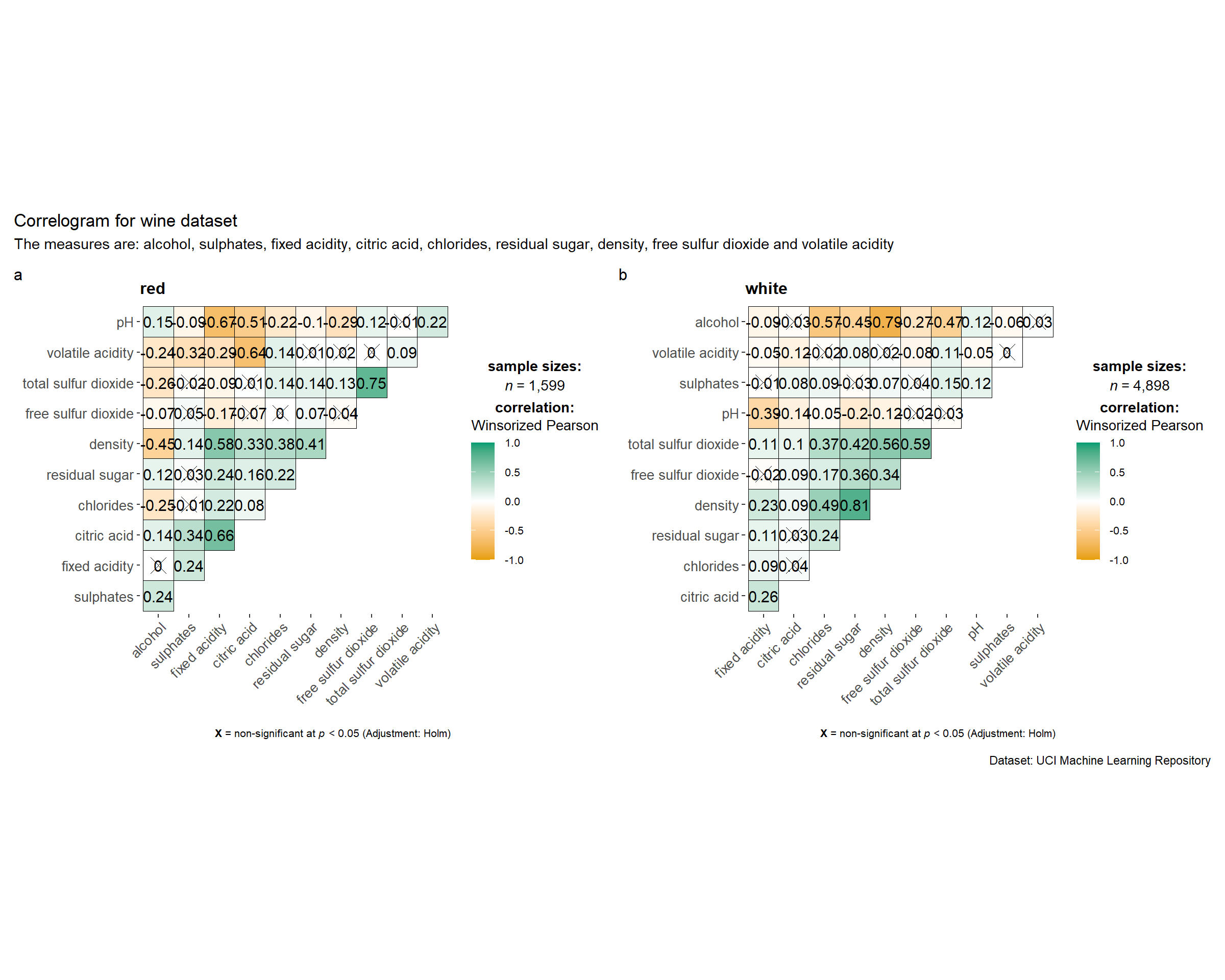
Creating facet correlogram between red and white wine (grouping.var = type)
grouped_ggcorrmat(
  data = wine,
  cor.vars = 1:11,
  grouping.var = type,        #to build facet plot
  type = "robust",
  p.adjust.method = "holm",

  #provides list of additional arguments
  plotgrid.args = list(ncol = 2),
  ggcorrplot.args = list(outline.color = "black",
                         hc.order = TRUE,
                         tl.cex = 10),

  #calling plot annotations arguments of patchwork
  annotation.args = list(
    tag_levels = "a",
    title = "Correlogram for wine dataset",
    subtitle = "The measures are: alcohol, sulphates, fixed acidity, citric acid, chlorides, residual sugar, density, free sulfur dioxide and volatile acidity",
    caption = "Dataset: UCI Machine Learning Repository"
  )
)
Using corrplot() is used to build ordered correlation matrix (by hclust)
Note: we need to compute correlation matrix of the wine data frame first
wine.cor <- cor(wine[, 1:11])#ordering using hierarchical clustering using ward
corrplot(wine.cor,
method = "ellipse",
tl.pos = "lt",
tl.col = "black",
order="hclust",
hclust.method = "ward.D",
addrect = 3)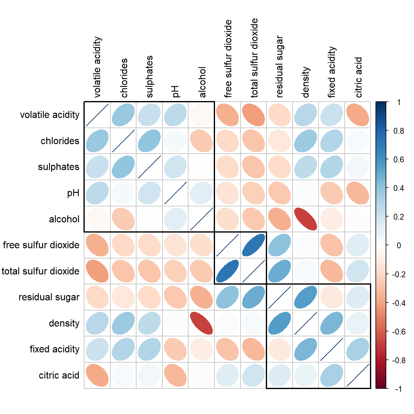
Mixing corrgram and numerical matrix together using corrplot.mixed()
corrplot.mixed(wine.cor,
               lower = "ellipse",
               upper = "number",
               tl.pos = "lt",   #placement of the axis label
               diag = "l",      #specify glyph on the principal diagonal
               tl.col = "black")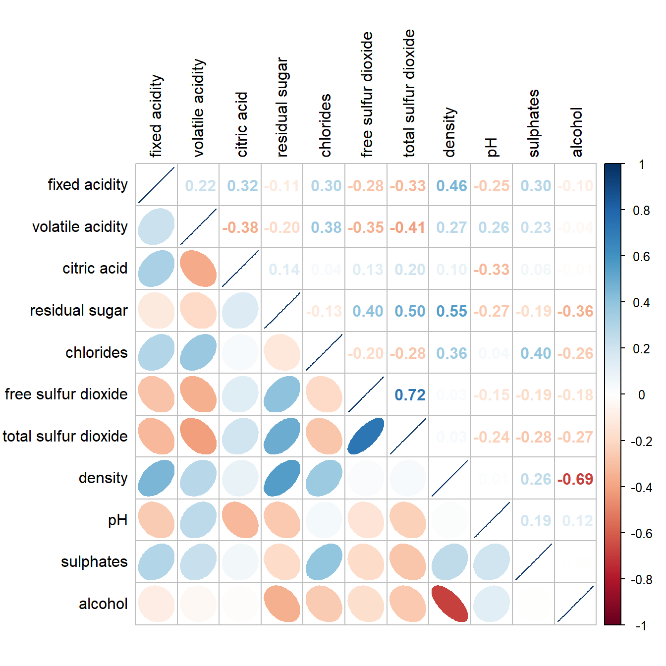
5. Heatmap
This is mainly used for visualising hierarchical clustering.
Basic interactive heatmap using heatmaply , excluding column 1,2,4,5
heatmaply(wh_matrix[, -c(1,2,4,5)])Data standardisation might be required by scaling (scale argument), normalising(normalize()), percentising(percentize()) to ensure the variable values are not so different. The clustering methods can also be customised
heatmaply(normalize(wh_matrix[, -c(1, 2, 4, 5)]),
          dist_method = "euclidean",
          hclust_method = "ward.D")
6. Parallel Plot
Parallel coordinates plot is a data visualisation specially designed for visualising and analysing multivariate, numerical data. It is ideal for comparing multiple variables together and seeing the relationships between them.
wh_i <- wh |>
  select("Happiness score", c(7:12))
histo <- rep(TRUE, ncol(wh_i))
parallelPlot(wh_i,
continuousCS = "YlOrRd",
rotateTitle = TRUE,
histoVisibility = histo)