pacman::p_load(ggiraph, plotly, gganimate, DT, tidyverse, patchwork, gifski, gapminder, readxl, rPackedBar)Hands-on Exercise 3: Programming Interactive Data Visualisation with R
1. Getting Started
Install and launching R packages.
The code chunk below uses p_load() of pacman package to check if packages are installed in the computer. If they are, then they will be launched into R. The R packages installed are:
ggiraph for making ‘ggplot’ graphics interactive.
plotly, R library for plotting interactive statistical graphs.
gganimate, an ggplot extension for creating animated statistical graphs.
DT provides an R interface to the JavaScript library DataTables that create interactive table on html page.
tidyverse, a family of modern R packages specially designed to support data science, analysis and communication task including creating static statistical graphs.
patchwork for compising multiple plots.
gifski converts video frames to GIF animations using pngquant’s fancy features for efficient cross-frame palettes and temporal dithering. It produces animated GIFs that use thousands of colors per frame.
gapminder: An excerpt of the data available at Gapminder.org. We just want to use its country_colors scheme.
Importing the data
exam_data <- read_csv("data/Exam_data.csv")2. Exercises
2.1 Using ggiraph for interactive data visualization
ggiraph is an htmlwidget and a ggplot2 extension. It allows ggplot graphics to be interactive. The interactivity is made with ggplot geometries that can understand three arguments:
Tooltip: a column of data-sets that contain tooltips to be displayed when the mouse is over elements.
Data_id: a column of data-sets that contain an id to be associated with elements.
Onclick: a column of data-sets that contain a JavaScript function to be executed when elements are clicked.
If it is used within a shiny application, elements associated with an id (data_id) can be selected and manipulated on client and server sides.
2.1.1 Using tooltip (tooltip effect)
There are two parts of the codes: 1. creating ggplot object, 2. girafe() of ggiraph will be used to create an interactive svg object.
my_plot <- ggplot(data = exam_data,
            aes(x = MATHS)) +

  #geom_dotplot_interactive still takes argument of original geom_dotplot but with tooltip enabled in aes()
  geom_dotplot_interactive(
    aes(tooltip = ID),
    stackgroups = TRUE,
    binwidth = 1,
    method = "histodot") +
  scale_y_continuous(NULL,
                     breaks = NULL)

girafe(
  ggobj = my_plot,
  width_svg = 6,
  height_svg = 6*0.618
)
Interactivity: By hovering the mouse pointer on an data point of interest, the student’s ID will be displayed.
2.1.2 Displaying multiple information on tooltip
What if we want to display Student ID and Class while hovering with tooltip?
#Creating new field called tooltip
exam_data$tooltip <- c(paste0(
  "Name = ", exam_data$ID,
  "\n Class", exam_data$CLASS
))

my_plot2 <- ggplot(data = exam_data,
            aes(x = MATHS)) +

  geom_dotplot_interactive(
    aes(tooltip = exam_data$tooltip),         #refer to the tooltip field above
    stackgroups = TRUE,
    binwidth = 1,
    method = "histodot") +
  scale_y_continuous(NULL,
                     breaks = NULL)

girafe(
  ggobj = my_plot2,
  width_svg = 8,
  height_svg = 8*0.618
)
Interactivity: By hovering the mouse pointer on an data point of interest, the student’s ID and Class will be displayed.
2.1.3 Customising tooltip style
Using opts_tooltip to customise tooltip rendering by adding css declaration
tooltip_css <- "background-color:white; font-style:bold; color:red;"

my_plot3 <- ggplot(data = exam_data,
            aes(x = MATHS)) +

  geom_dotplot_interactive(
    aes(tooltip = ID),
    stackgroups = TRUE,
    binwidth = 1,
    method = "histodot") +
  scale_y_continuous(NULL,
                     breaks = NULL)

girafe(
  ggobj = my_plot3,
  width_svg = 6,
  height_svg = 6*0.618,
  options = list(
    opts_tooltip(
      css = tooltip_css)
  )
)
Note: Background color is now white and the font color is red and bold
2.1.4 Displaying statistics on tooltip
In this example, a function is used to compute 90% confident interval of the mean. The derived statistics are then displayed in the tooltip. This is created by creating a function
tooltip_fn <- function(y, ymax, accuracy = .01) {
  mean <- scales::number(y, accuracy = accuracy)
  sem <- scales::number(ymax - y, accuracy = accuracy)
  paste("Mean maths scores:", mean, "+/-", sem)
}

gg_point <- ggplot(data = exam_data,
            aes(x = RACE)) +

  stat_summary(
    aes(y = MATHS,
        tooltip = after_stat(
          tooltip_fn(y, ymax))),
    fun.data = "mean_se",
    geom = GeomInteractiveCol,
    fill = "lightblue"
    ) +

  stat_summary(
    aes(y = MATHS),
    fun.data = "mean_se",
    geom = "errorbar", width = 0.2, size = 0.2
  )

girafe(
  ggobj = gg_point,
  width_svg = 8,
  height_svg = 8*0.618,
  )
2.1.5 Using data_id (hover effect)
my_plot <- ggplot(data = exam_data,
            aes(x = MATHS)) +

  geom_dotplot_interactive(
    aes(data_id = CLASS),
    stackgroups = TRUE,
    binwidth = 1,
    method = "histodot") +
  scale_y_continuous(NULL,
                     breaks = NULL)

girafe(
  ggobj = my_plot,
  width_svg = 6,
  height_svg = 6*0.618
)
Interactivity: Elements associated with a data_id (i.e CLASS) will be highlighted upon mouse over. Note that the default value of the hover css is hover_css = “fill:orange;”.
2.1.6 Customising hover effect style
Using css declaration to change the highlighting effect
my_plot2 <- ggplot(data = exam_data,
            aes(x = MATHS)) +

  geom_dotplot_interactive(
    aes(data_id = CLASS),
    stackgroups = TRUE,
    binwidth = 1,
    method = "histodot") +
  scale_y_continuous(NULL,
                     breaks = NULL)

girafe(
  ggobj = my_plot2,
  width_svg = 6,
  height_svg = 6*0.618,
  options = list(
    opts_hover(css = "fill: pink;"),
    opts_hover_inv(css = "opacity:0.2;")
  )
)
Interactivity: Elements associated with a data_id (i.e CLASS) will be highlighted upon mouse over. Notice opts_hover refers to the selected data and opts_hover_inv refers to the non-selected data. Different from section 2.1.3 above, the css customisation request are encoded directly.
2.1.7 Combining tooltip and hover effect
my_plot_comb <- ggplot(data = exam_data,
            aes(x = MATHS)) +

  geom_dotplot_interactive(
    aes(tooltip = CLASS,
        data_id = CLASS),
    stackgroups = TRUE,
    binwidth = 1,
    method = "histodot") +
  scale_y_continuous(NULL,
                     breaks = NULL)

girafe(
  ggobj = my_plot_comb,
  width_svg = 6,
  height_svg = 6*0.618,
  options = list(
    opts_tooltip(css = "background-color:white; font-style:bold; color:green;"),
    opts_hover(css = "fill: pink;"),
    opts_hover_inv(css = "opacity:0.2;")
  )
)
Interactivity: Elements associated with a data_id (i.e CLASS) will be highlighted upon mouse over. At the same time, the tooltip will show the CLASS.
2.1.8 Using onclick (click effect)
onclick argument of ggiraph provides hotlink interactivity on the web.
exam_data$onclick <- sprintf("window.open(\"%s%s\")",
"https://www.moe.gov.sg/schoolfinder?journey=Primary%20school",
as.character(exam_data$ID))

my_plot <- ggplot(data = exam_data,
            aes(x = MATHS)) +

  geom_dotplot_interactive(
    aes(onclick = onclick),
    stackgroups = TRUE,
    binwidth = 1,
    method = "histodot") +
  scale_y_continuous(NULL,
                     breaks = NULL)

girafe(
  ggobj = my_plot,
  width_svg = 6,
  height_svg = 6*0.618
)
Interactivity: Web document link with a data object will be displayed on the web browser upon mouse click. Note that click actions must be a string column in the dataset containing valid javascript instructions.
2.1.9 Coordinated multiple views with ggiraph
Coordinated multiple views methods is interactive in which when a data point of one of the dotplot is selected, the corresponding data point ID on the second data visualisation will be highlighted too.
In order to build a coordinated multiple views, the following programming strategy will be used:
Appropriate interactive functions of ggiraph will be used to create the multiple views.
patchwork function of patchwork package will be used inside girafe function to create the interactive coordinated multiple views.
p1 <- ggplot(data = exam_data,
            aes(x = MATHS)) +

  geom_dotplot_interactive(
    aes(tooltip = ID,
        data_id = ID),
    stackgroups = TRUE,
    binwidth = 1,
    method = "histodot") +
  coord_cartesian(xlim = c(0,100)) +
  scale_y_continuous(NULL,
                     breaks = NULL)

p2 <- ggplot(data = exam_data,
            aes(x = ENGLISH)) +

  geom_dotplot_interactive(
    aes(tooltip = ID,
        data_id = ID),
    stackgroups = TRUE,
    binwidth = 1,
    method = "histodot") +
  coord_cartesian(xlim = c(0,100)) +
  scale_y_continuous(NULL,
                     breaks = NULL)

girafe(
  code = print(p1 / p2),
  width_svg = 6,
  height_svg = 6,
  options = list(
    opts_hover(css = "fill: blue;"),
    opts_hover_inv(css = "opacity:0.2;")
  )
)
The data_id aesthetic is critical to link observations between plots and the tooltip aesthetic is optional but nice to have when mouse over a point.
2.2 Using plotly method for interactive data visualization
Plotly’s R graphing library create interactive web graphics from ggplot2 graphs and/or a custom interface to the (MIT-licensed) JavaScript library plotly.js inspired by the grammar of graphics.
Different from other plotly platform, plot.R is free and open source.
There are two ways to create interactive graph by using plotly, they are:
by using plot_ly(), and
by using ggplotly()
2.2.1 Using plot_ly
Creating basic interactive scatterplot
plot_ly(data = exam_data,
        x = ~MATHS,
        y = ~ENGLISH,
        color = ~RACE)
Changing the default color pallete to ColorBrewel colour palette
plot_ly(data = exam_data,
        x = ~MATHS,
        y = ~ENGLISH,
        color = ~RACE,
        colors = "Set1")
Customising the color scheme manually
pal <- c("red", "purple", "blue", "green")

plot_ly(data = exam_data,
        x = ~MATHS,
        y = ~ENGLISH,
        color = ~RACE,
        colors = pal)
Customising tooltip
plot_ly(data = exam_data,
        x = ~MATHS,
        y = ~ENGLISH,
        text = ~paste("Student ID:", ID,
                      "<br>Class:", CLASS),
        color = ~RACE,
        colors = "Set1")
Working with layout. To learn more about layout, visit this link.
plot_ly(data = exam_data,
        x = ~MATHS,
        y = ~ENGLISH,
        text = ~paste("Student ID:", ID,
                      "<br>Class:", CLASS),
        color = ~RACE,
        colors = "Set1") |>

  layout(title = 'English Score versus Maths Score',
         xaxis = list(range = c(0,100)),
         yaxis = list(range = c(0,100)))
2.2.2 Using ggplotly
Creating basic interactive scatterplot. With ggplotly, we can use the original ggplot2 and add ggplotly at the end as extra line
p <- ggplot(data=exam_data,
            aes(x = MATHS,
                y = ENGLISH)) +
  geom_point(dotsize = 1) +
  coord_cartesian(xlim=c(0,100),
                  ylim=c(0,100))
ggplotly(p)
Creating Multiple Views using highlight_key and subplot of plotly package
d <- highlight_key(exam_data)

p1 <- ggplot(data=d,
              aes(x = MATHS,
                  y = ENGLISH)) +
  geom_point(size=1) +
  coord_cartesian(xlim=c(0,100),
                  ylim=c(0,100))

p2 <- ggplot(data=d,
            aes(x = MATHS,
                y = SCIENCE)) +
  geom_point(size=1) +
  coord_cartesian(xlim=c(0,100),
                  ylim=c(0,100))

subplot(ggplotly(p1),
        ggplotly(p2))
Click on a data point of one of the scatterplot and see how the corresponding point on the other scatterplot is selected.
2.3 Using crosstalk method for interactive data visualization
Crosstalk is an add-on to the htmlwidgets package. It extends htmlwidgets with a set of classes, functions, and conventions for implementing cross-widget interactions (currently, linked brushing and filtering).
2.3.1 Interactive Data Table: DT package
A wrapper of the JavaScript Library DataTables
Data objects in R can be rendered as HTML tables using the JavaScript library ‘DataTables’ (typically via R Markdown or Shiny).
DT::datatable(exam_data, class= "compact")2.3.2 Linked brushing using crosstalk method
Things to learn from the code chunk:
highlight() is a function of plotly package. It sets a variety of options for brushing (i.e., highlighting) multiple plots. These options are primarily designed for linking multiple plotly graphs, and may not behave as expected when linking plotly to another htmlwidget package via crosstalk. In some cases, other htmlwidgets will respect these options, such as persistent selection in leaflet.
bscols() is a helper function of crosstalk package. It makes it easy to put HTML elements side by side. It can be called directly from the console but is especially designed to work in an R Markdown document. Warning: This will bring in all of Bootstrap!.
d <- highlight_key(exam_data)

p <- ggplot(data=d,
              aes(x = MATHS,
                  y = ENGLISH)) +
  geom_point(size=1) +
  coord_cartesian(xlim=c(0,100),
                  ylim=c(0,100))

gg <- highlight(ggplotly(p),
                "plotly_selected")

crosstalk::bscols(gg,
                  DT::datatable(d),
                  widths = 5)
2.4 Using gganimate method for creating animation
gganimate extends the grammar of graphics as implemented by ggplot2 to include the description of animation. It does this by providing a range of new grammar classes that can be added to the plot object in order to customise how it should change with time.
transition_*()defines how the data should be spread out and how it relates to itself across time.view_*()defines how the positional scales should change along the animation.shadow_*()defines how data from other points in time should be presented in the given point in time.enter_*()/exit_*()defines how new data should appear and how old data should disappear during the course of the animation.ease_aes()defines how different aesthetics should be eased during transitions.
Import data from the Data worksheet from GlobalPopulation Excel workbook.
col <- c("Country", "Continent")
globalPop <- read_xls("data/GlobalPopulation.xls",
                      sheet="Data") %>%
  mutate_each_(funs(factor(.)), col) %>%
  mutate(Year = as.integer(Year))
Basic ggplot function to create static bubble plot
ggplot(globalPop, aes(x = Old, y = Young,
                      size = Population,
                      colour = Country)) +

  geom_point(alpha = 0.7,
             show.legend = FALSE) +
  scale_colour_manual(values = country_colors) +

  scale_size(range = c(2, 12)) +

  labs(title = 'Year: {frame_time}',
       x = '% Aged',
y = '% Young') 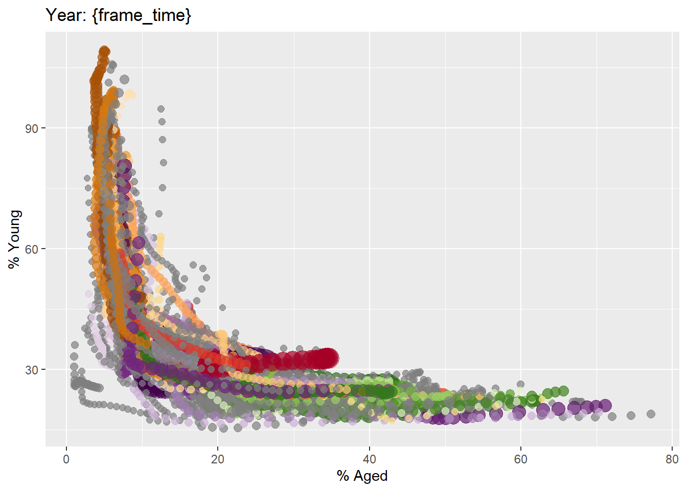
Building animated bubble plot
ggplot(globalPop, aes(x = Old, y = Young,
                      size = Population,
                      colour = Country)) +

  geom_point(alpha = 0.7,
             show.legend = FALSE) +

  scale_colour_manual(values = country_colors) +

  scale_size(range = c(2, 12)) +

  labs(title = 'Year: {frame_time}',
       x = '% Aged',
       y = '% Young') +
  transition_time(Year) +
ease_aes('linear') 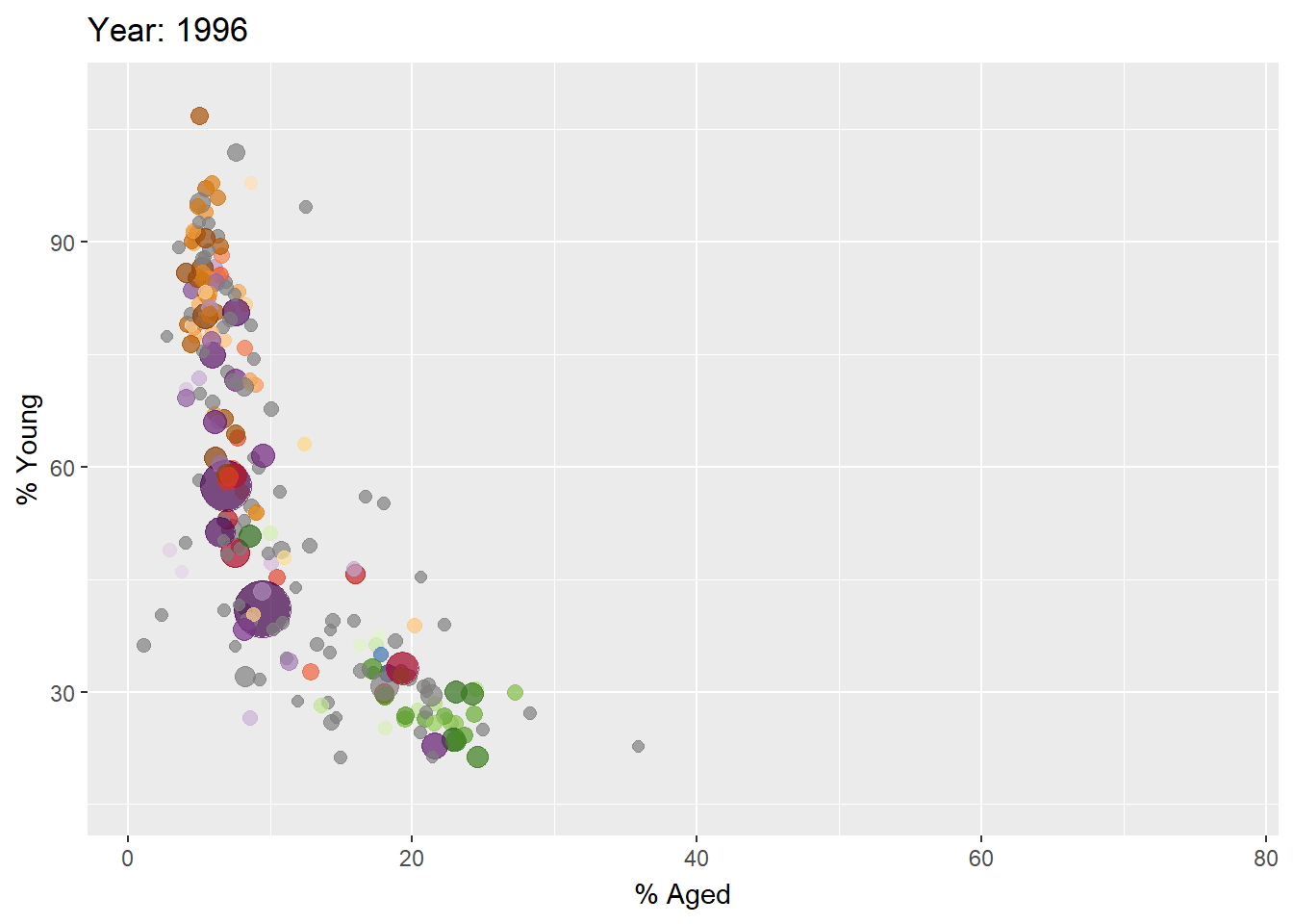
2.5 Using packed_bar method for visualizing large data interatively
Packed bar aims to support the need of visualising skewed data over hundreds of categories.
Importing data
GDP <- read_csv("data/GDP.csv")
WorldCountry <- read_csv("data/WorldCountry.csv")
Data preparation
GDP_selected <- GDP %>%
  mutate(Values = as.numeric(`2020`)) %>%
  select(1:3, Values) %>%
  pivot_wider(names_from = `Series Name`,
              values_from = `Values`) %>%
  left_join(y=WorldCountry, by = c("Country Code" = "ISO-alpha3 Code"))
Data preparation for packed bar
GDP_selected_pb <- GDP %>%
  mutate(GDP = as.numeric(`2020`)) %>%
  filter(`Series Name` == "GDP (current US$)") %>%
  select(1:2, GDP) %>%
  na.omit()
In the code chunk below, plotly_packed_bar() of rPackedBar package is used to create an interactive packed bar. Refer to this Vignettes and the user guide to learn more about the package.
p = plotly_packed_bar(
  input_data = GDP_selected_pb,
  label_column = "Country Name",
  value_column = "GDP",
  number_rows = 10,
  plot_title = "Top 10 countries by GDP, 2020",
  xaxis_label = "GDP (US$)",
  hover_label = "GDP",
  min_label_width = 0.018,
  color_bar_color = "#00aced",
  label_color = "white")
plotly::config(p, displayModeBar = FALSE)