pacman::p_load(corrplot, ggstatsplot, seriation, dendextend, heatmaply, GGally, parallelPlot, tidyverse)Hands-on Exercise 5: Visual Multivariate Analysis
Install and launching R packages.
The code chunk below uses p_load() of pacman package to check if packages are installed in the computer. If they are, then they will be launched into R. The R packages installed are:
corrplot. A graphical display of a correlation matrix or general matrix. It also contains some algorithms to do matrix reordering. In addition, corrplot is good at details, including choosing color, text labels, color labels, layout, etc.
corrgram calculates correlation of variables and displays the results graphically. Included panel functions can display points, shading, ellipses, and correlation values with confidence intervals.
heatmaply is an R package for building interactive cluster heatmap that can be shared online as a stand-alone HTML file
ggparcoord() of GGally package
parallelPlotis an R package specially designed to plot a parallel coordinates plot by using ‘htmlwidgets’ package and d3.js
1. Visualising Correlation Matrices
1.1 Importing the data
wine <- read_csv("data/wine_quality.csv")
wine
# A tibble: 6,497 × 13
fixed…¹ volat…² citri…³ resid…⁴ chlor…⁵ free …⁶ total…⁷ density pH sulph…⁸
<dbl> <dbl> <dbl> <dbl> <dbl> <dbl> <dbl> <dbl> <dbl> <dbl>
1 7.4 0.7 0 1.9 0.076 11 34 0.998 3.51 0.56
2 7.8 0.88 0 2.6 0.098 25 67 0.997 3.2 0.68
3 7.8 0.76 0.04 2.3 0.092 15 54 0.997 3.26 0.65
4 11.2 0.28 0.56 1.9 0.075 17 60 0.998 3.16 0.58
5 7.4 0.7 0 1.9 0.076 11 34 0.998 3.51 0.56
6 7.4 0.66 0 1.8 0.075 13 40 0.998 3.51 0.56
7 7.9 0.6 0.06 1.6 0.069 15 59 0.996 3.3 0.46
8 7.3 0.65 0 1.2 0.065 15 21 0.995 3.39 0.47
9 7.8 0.58 0.02 2 0.073 9 18 0.997 3.36 0.57
10 7.5 0.5 0.36 6.1 0.071 17 102 0.998 3.35 0.8
# … with 6,487 more rows, 3 more variables: alcohol <dbl>, quality <dbl>,
# type <chr>, and abbreviated variable names ¹`fixed acidity`,
# ²`volatile acidity`, ³`citric acid`, ⁴`residual sugar`, ⁵chlorides,
# ⁶`free sulfur dioxide`, ⁷`total sulfur dioxide`, ⁸sulphatesColumn 1 to 11 are all numerical and continuous variables, while the last two are categorical
1.2 Building with pairs() method
Syntax description of pairs function
Plotting the column 1 to 11. Note this can be adjusted to selected columns
pairs(wine[,1:11])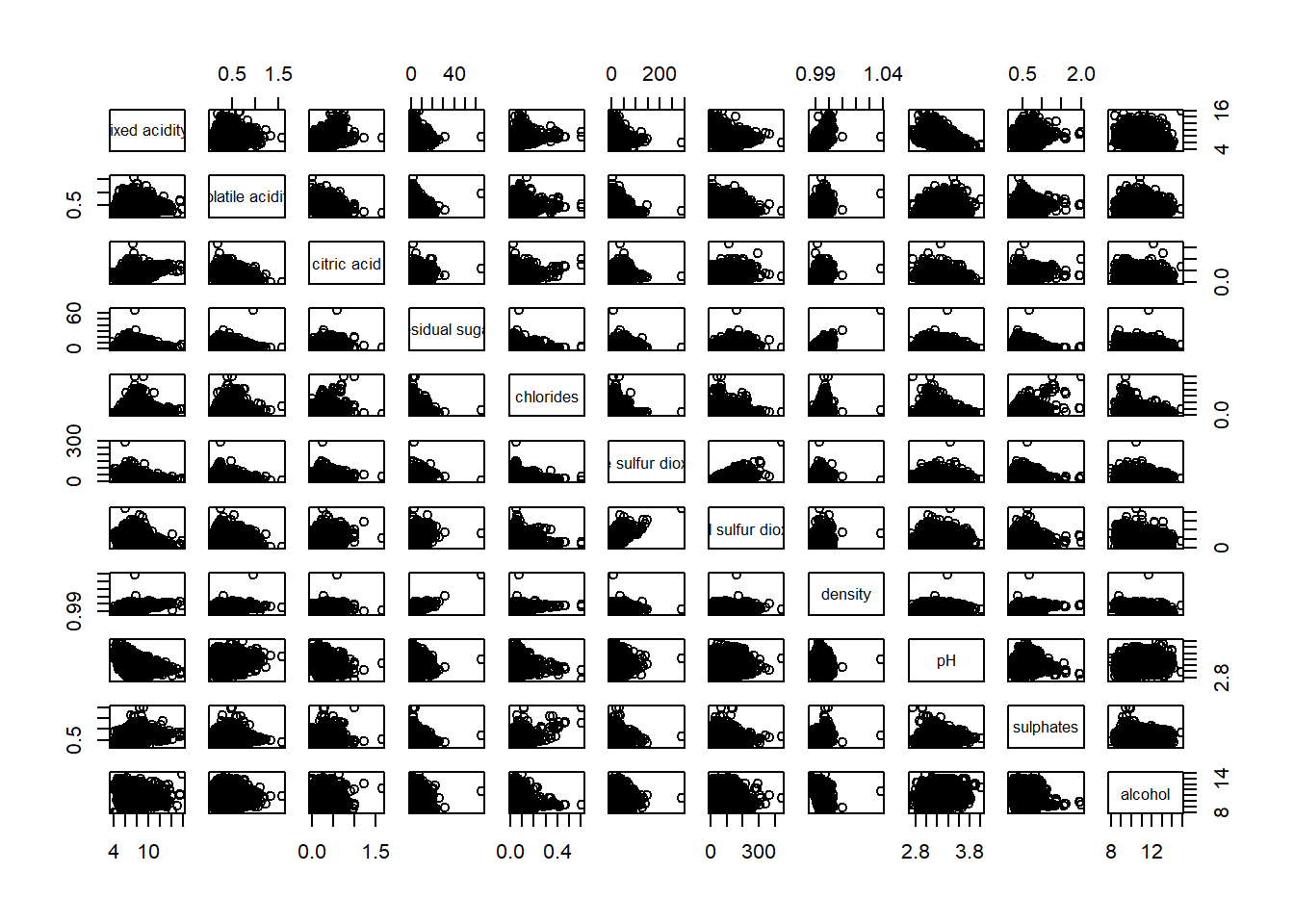
Sometimes we only want to show the upper or lower half of the correlation matrix as they are symmetric. Change the argument upper.panel = NULL to lower.panel = NULL to get the opposite impact.
pairs(wine[,2:12], upper.panel = NULL)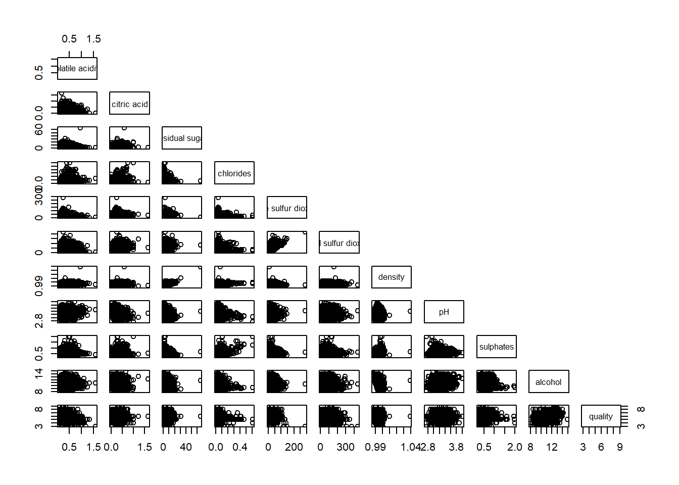
Showing the correlation coefficient of each pair of variables using panel.cor function
#|warning: false
panel.cor <- function(x, y, digits = 2, prefix = "", cex.cor, ...) {
  usr <- par("usr")
  on.exit(par(usr))
  par(usr = c(0,1,0,1))
  r <- abs(cor(x, y, use = "complete.obs"))
  txt <- format(c(r, 0.123456789), digits = digits)[1]
  txt <- paste(prefix, txt, sep="")
  if(missing(cex.cor)) cex.cor <- 0.8/strwidth(txt)
  text(0.5, 0.5, txt, cex = cex.cor * (1 + r)/2)
}

pairs(wine[,2:12], upper.panel = panel.cor)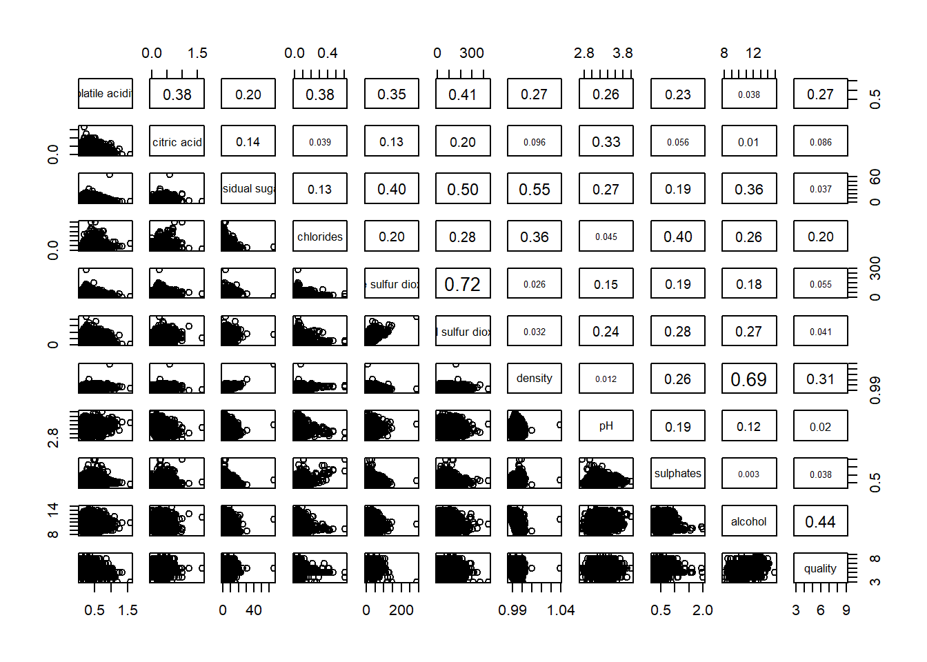
1.3 Building with ggcormat() method
Visualising correlation matrix by using ggcorrmat() of ggstatsplot package provides a comprehensive and yet professional statistical report.
ggstatsplot::ggcorrmat(
  data = wine,
  cor.vars = 1:11,
  ggcorrplot.args = list(outline.color = "black",
                         hc.order = TRUE,
                         tl.cex = 10),
  title    = "Correlogram for wine dataset",
  subtitle = "Four pairs are no significant at p < 0.05"
)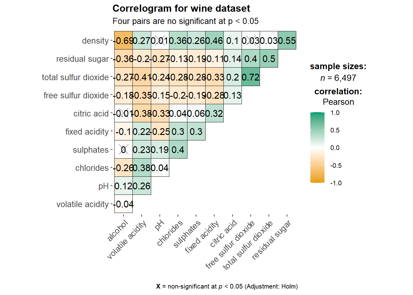
ggcorrplot.args argument provide additional (mostly aesthetic) arguments that will be passed to ggcorrplot::ggcorrplot function. The list should avoid any of the following arguments since they are already internally being used: corr, method, p.mat, sig.level, ggtheme, colors, lab, pch, legend.title, digits.
The sample sub-code chunk can be used to control specific component of the plot such as the font size of the x-axis, y-axis, and the statistical report.
ggplot.component = list(
    theme(text=element_text(size=5),
      axis.text.x = element_text(size = 8),
      axis.text.y = element_text(size = 8)))
Building multiple plots is possible using grouped_ggcorrmat() of ggstatsplot.
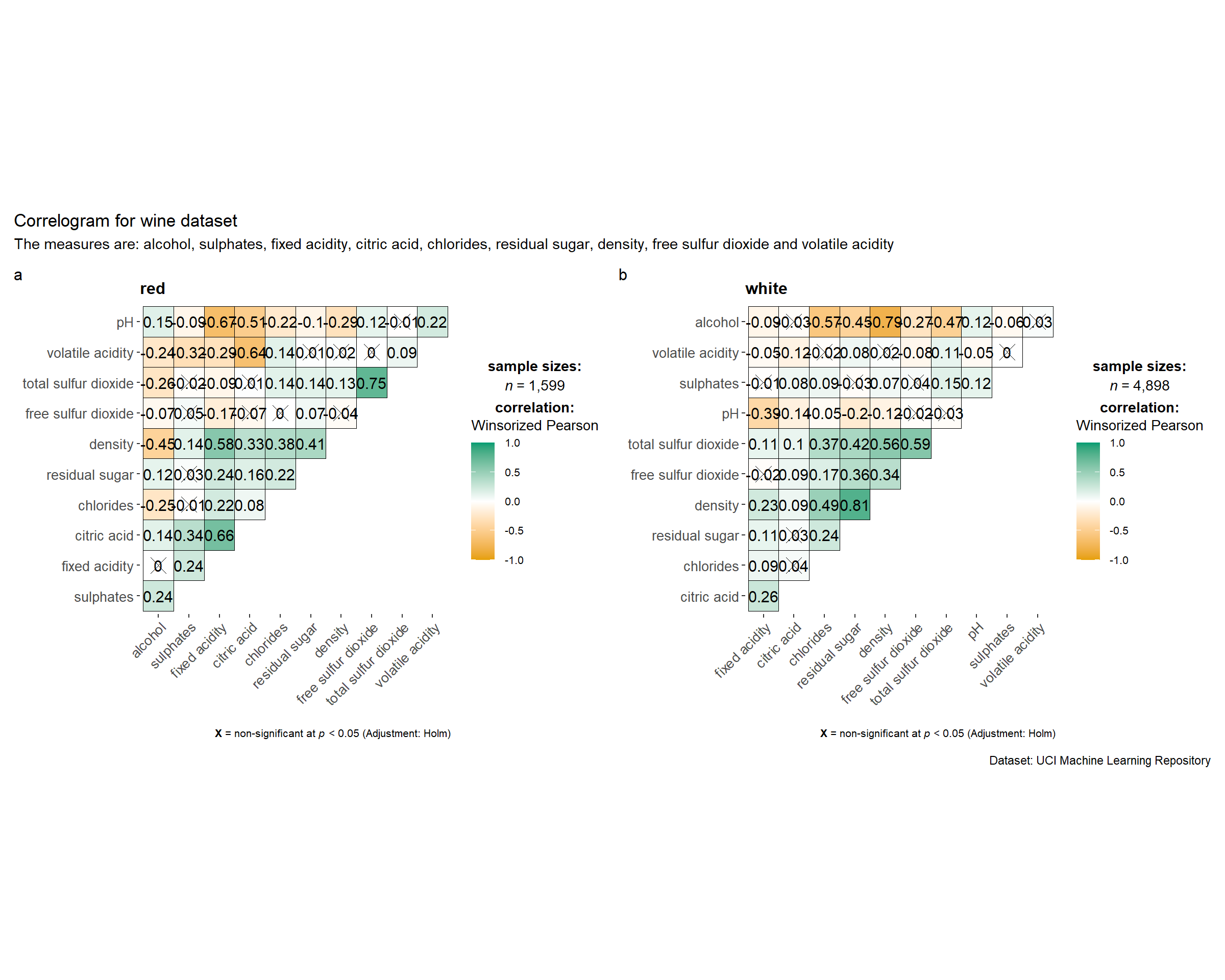
grouped_ggcorrmat(
  data = wine,
  cor.vars = 1:11,
  grouping.var = type,        #to build facet plot
  type = "robust",
  p.adjust.method = "holm",

  #provides list of additional arguments
  plotgrid.args = list(ncol = 2),
  ggcorrplot.args = list(outline.color = "black",
                         hc.order = TRUE,
                         tl.cex = 10),

  #calling plot annotations arguments of patchwork
  annotation.args = list(
    tag_levels = "a",
    title = "Correlogram for wine dataset",
    subtitle = "The measures are: alcohol, sulphates, fixed acidity, citric acid, chlorides, residual sugar, density, free sulfur dioxide and volatile acidity",
    caption = "Dataset: UCI Machine Learning Repository"
  )
)
1.4 Building with corrplot package
Full documentations on corrplot package - An Introduction to corrplot Package
Before we can plot a corrgram using corrplot(), we need to compute the correlation matrix of wine data frame.
wine.cor <- cor(wine[, 1:11])Next, corrplot() is used to plot the corrgram by using all the default setting as shown in the code chunk below.
corrplot(wine.cor)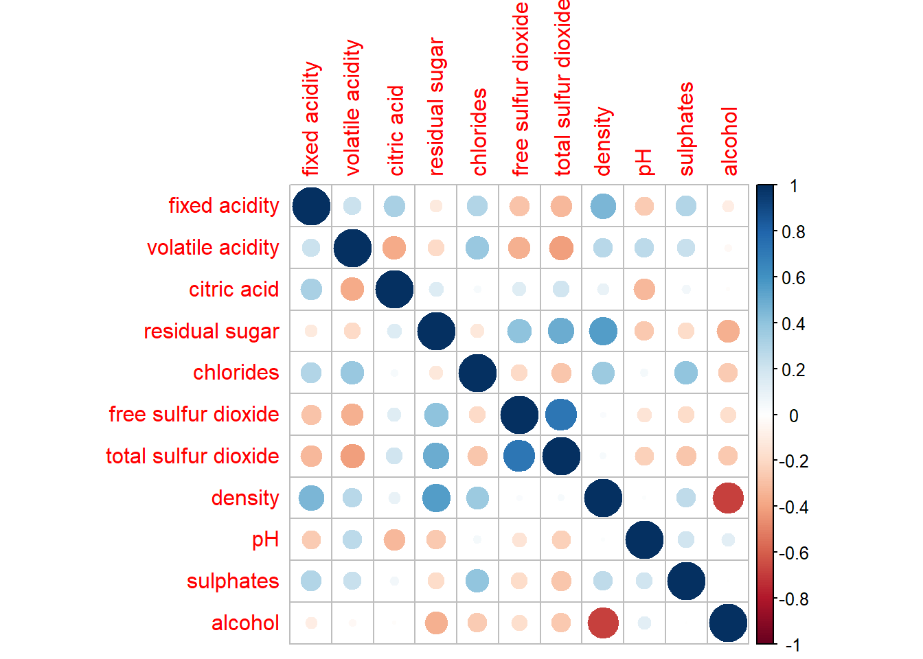
Further Customisation below.
Other layout design argument such as tl.pos, tl.cex, tl.offset, cl.pos, cl.cex and cl.offset
corrplot(wine.cor,
         method = "ellipse",
         type="lower",
         diag = FALSE,      #turn off diagonal cells
         tl.col = "black")  #change the axis text label color to black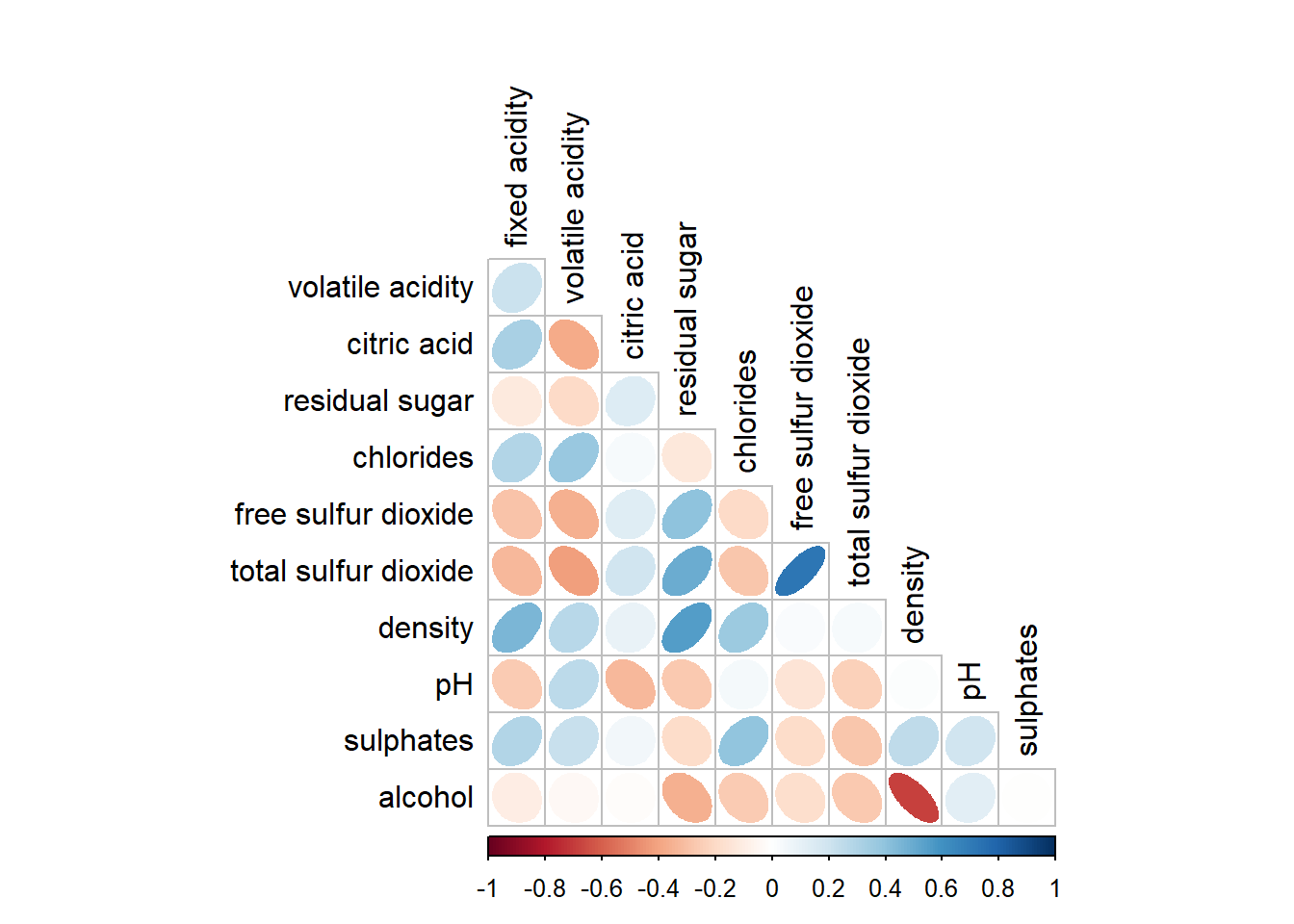
We can design corrgram with mixed visual matrix of one half and numerical matrix on the other half. In order to create a coorgram with mixed layout, the corrplot.mixed(), a wrapped function for mixed visualisation style will be used.
corrplot.mixed(wine.cor,
               lower = "ellipse",
               upper = "number",
               tl.pos = "lt",   #placement of the axis label
               diag = "l",      #specify glyph on the principal diagonal
               tl.col = "black")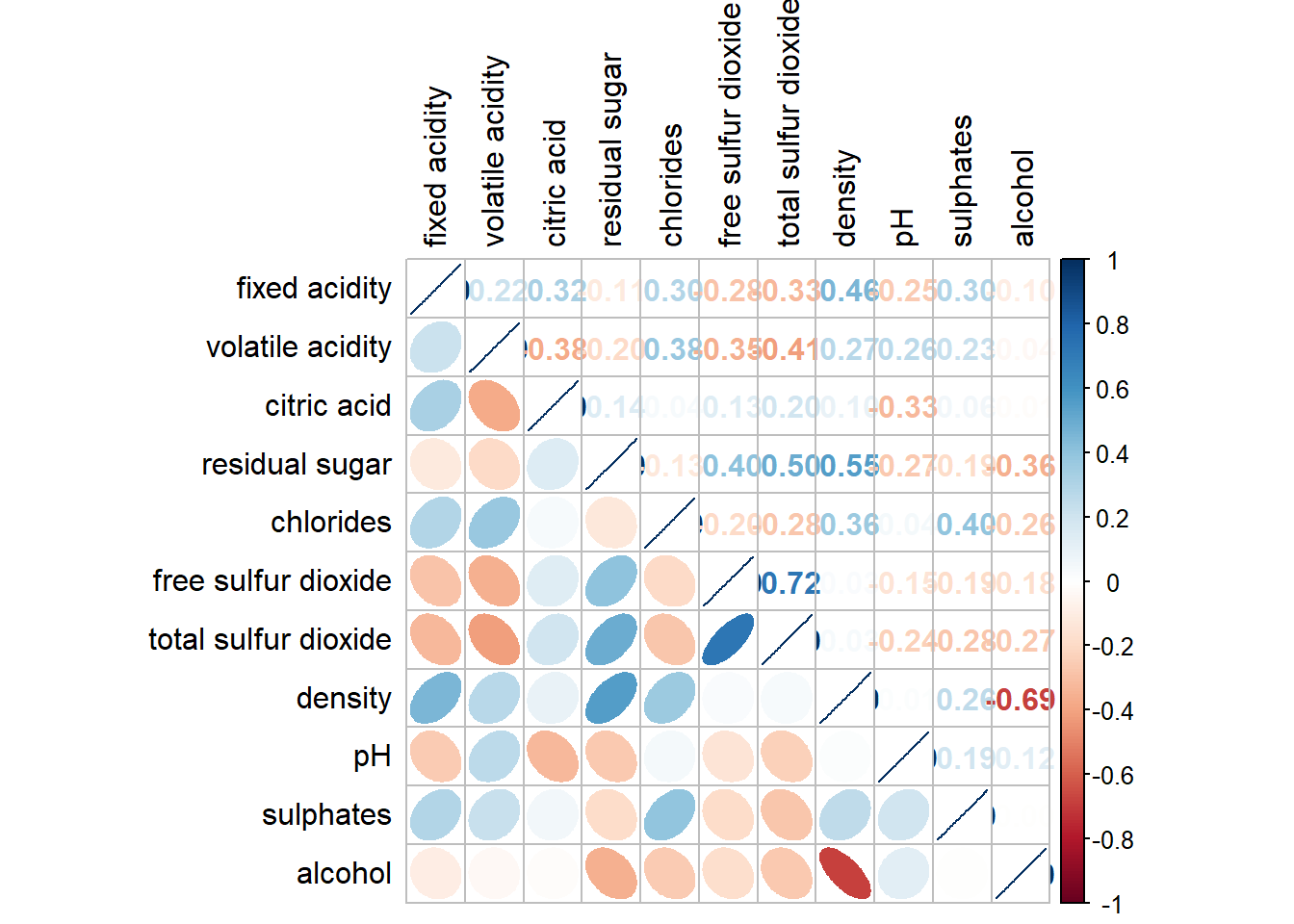
Figure below shows a corrgram combined with the significant test. The corrgram reveals that not all correlation pairs are statistically significant. For example the correlation between total sulfur dioxide and free surfur dioxide is statistically significant at significant level of 0.1 but not the pair between total sulfur dioxide and citric acid.
With corrplot package, we can use the cor.mtest() to compute the p-values and confidence interval for each pair of variables.
wine.sig = cor.mtest(wine.cor, conf.level= .95)corrplot(wine.cor,
method = "number",
type = "lower",
diag = FALSE,
tl.col = "black",
tl.srt = 45,
p.mat = wine.sig$p, #input the calculated conf.level
sig.level = .05)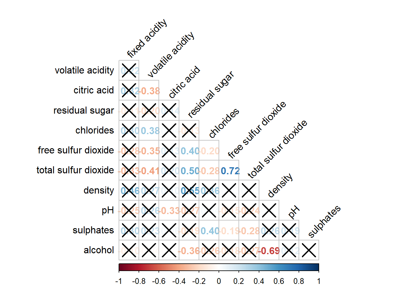
Matrix reorder is very important for mining the hiden structure and pattern in a corrgram. By default, the order of attributes of a corrgram is sorted according to the correlation matrix (i.e. “original”). The default setting can be over-write by using the order argument of corrplot(). Currently, corrplot package support four sorting methods, they are:
“AOE” is for the angular order of the eigenvectors. See Michael Friendly (2002) for details.
“FPC” for the first principal component order.
“hclust” for hierarchical clustering order, and “hclust.method” for the agglomeration method to be used.
- “hclust.method” should be one of “ward”, “single”, “complete”, “average”, “mcquitty”, “median” or “centroid”.
“alphabet” for alphabetical order.
#ordering using AOE
corrplot.mixed(wine.cor,
               lower = "ellipse",
               upper = "number",
               tl.pos = "lt",
               diag = "l",
               order="AOE",
               tl.col = "black")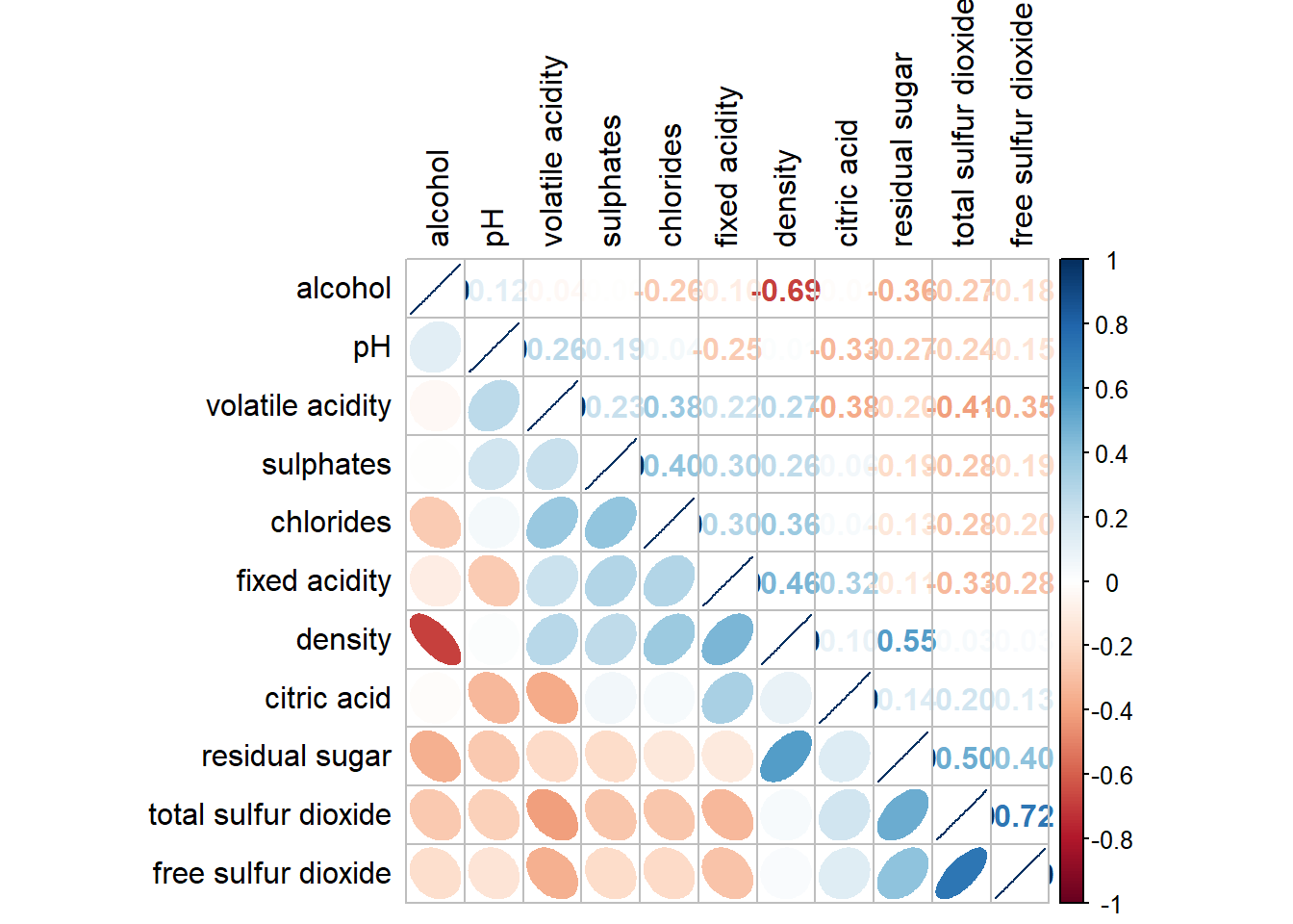
#ordering using hierarchical clustering using ward
corrplot(wine.cor,
         method = "ellipse",
         tl.pos = "lt",
         tl.col = "black",
         order="hclust",
         hclust.method = "ward.D",
         addrect = 3)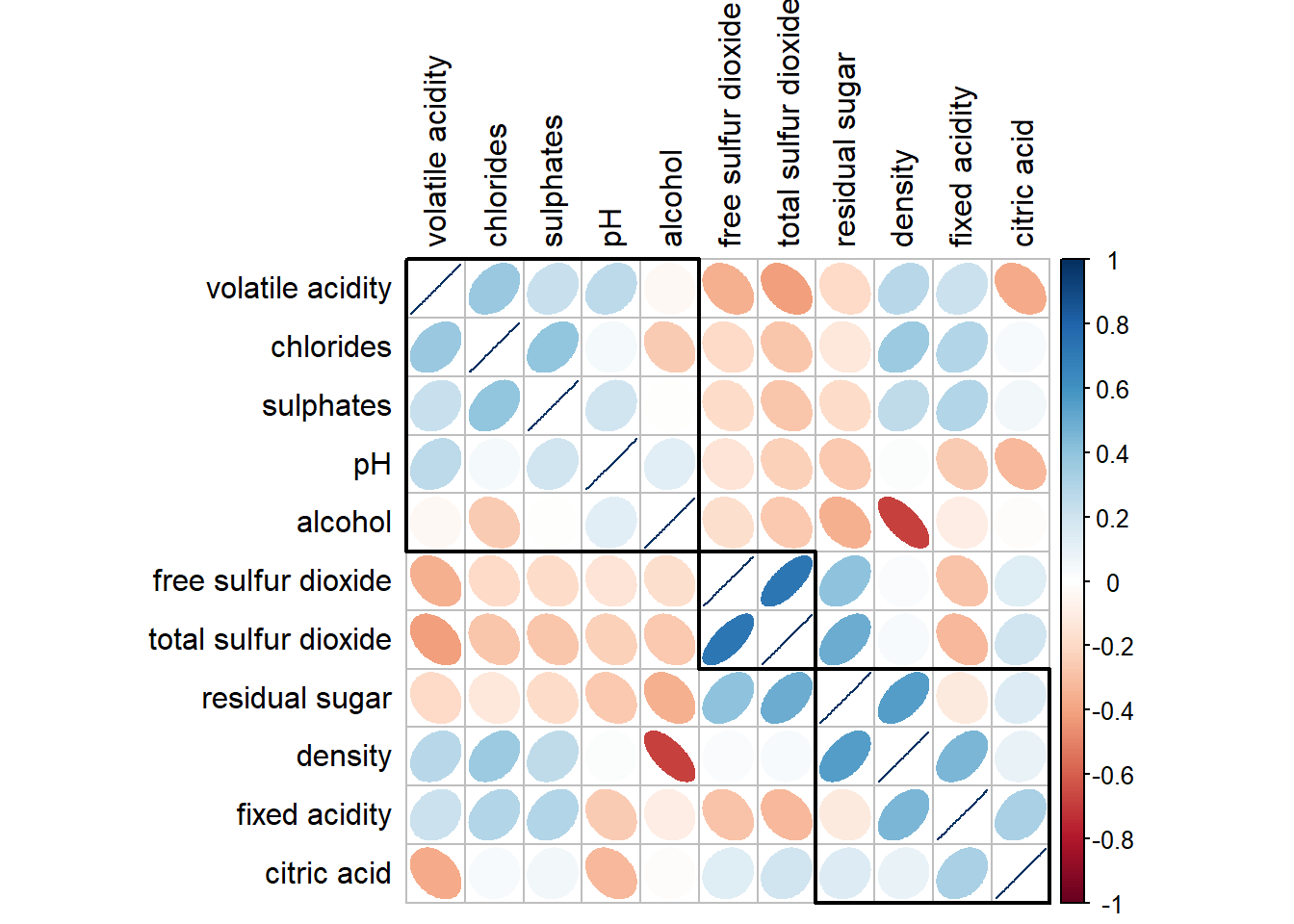
2. Heatmap for visualising and analysing multivariate data
Heatmaps are good for showing variance across multiple variables, revealing any patterns, displaying whether any variables are similar to each other, and for detecting if any correlations exist in-between them.
2.1 Data import and preparation
wh <- read_csv("data/WHData-2018.csv")row.names(wh) <- wh$CountryTransforming the data frame into a matrix to make heatmap
wh1 <- select(wh, c(3, 7:12))
wh_matrix <- data.matrix(wh)
2.2 Static heatmap
Using heatmap() of R stats package. It draws a simple heatmap which is not very informative as the variables are not normalized (i.e., happiness score values are higher than other variables).
wh_heatmap <- heatmap(wh_matrix,
                      #the Rowv and Colv below are to switch off the option of plotting the row and column dendograms (cluster)
                      Rowv=NA, Colv=NA)
Normalising using scale argument
wh_heatmap <- heatmap(wh_matrix,
                      scale="column",

                      #define font size for y-axis and x-axis labels
                      cexRow = 0.6,
                      cexCol = 0.8,

                      #margins ensure entire x-axis labels are displayed completely
                      margins = c(10, 4))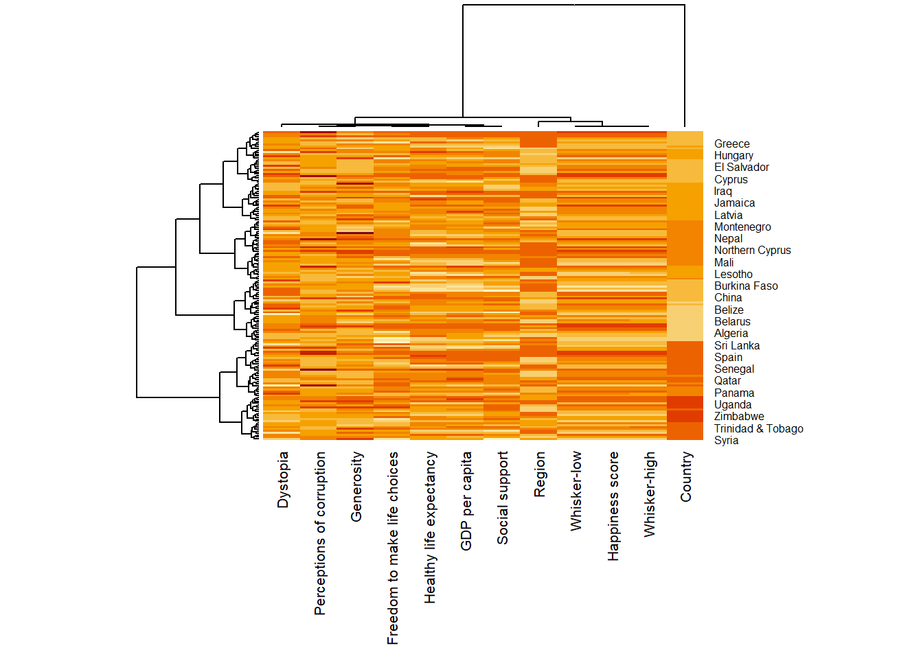
2.3 Interactive heatmap
heatmaply is an R package for building interactive cluster heatmap that can be shared online as a stand-alone HTML file. It is designed and maintained by Tal Galili.
Review the Introduction to Heatmaply to have an overall understanding of the features and functions of Heatmaply package.
User manualof the package
Basic heatmap using heatmaply, excluding column 1,2,4,5
heatmaply(wh_matrix[, -c(1,2,4,5)])Scaling method
When all variables are came from or assumed to come from some normal distribution, then scaling (i.e.: subtract the mean and divide by the standard deviation) would bring them all close to the standard normal distribution.
In such a case, each value would reflect the distance from the mean in units of standard deviation.
The scale argument in heatmaply() supports column and row scaling.
heatmaply(wh_matrix[, -c(1, 2, 4, 5)],
          scale = "column")
Normalising method
When variables in the data comes from possibly different (and non-normal) distributions, the normalize function can be used to bring data to the 0 to 1 scale by subtracting the minimum and dividing by the maximum of all observations.
This preserves the shape of each variable’s distribution while making them easily comparable on the same “scale”.
heatmaply(normalize(wh_matrix[, -c(1, 2, 4, 5)]))Percentising method
This is similar to ranking the variables, but instead of keeping the rank values, divide them by the maximal rank.
This is done by using the ecdf of the variables on their own values, bringing each value to its empirical percentile.
The benefit of the percentize function is that each value has a relatively clear interpretation, it is the percent of observations that got that value or below it.
heatmaply(percentize(wh_matrix[, -c(1, 2, 4, 5)]))Clustering
Manual approach
In the code chunk below, the heatmap is plotted by using hierachical clustering algorithm with “Euclidean distance” and “ward.D” method.
heatmaply(normalize(wh_matrix[, -c(1, 2, 4, 5)]),
          dist_method = "euclidean",
          hclust_method = "ward.D")
Statistical approach
In order to determine the best clustering method and number of cluster the dend_expend() and find_k() functions of dendextend package will be used.
Use dend_expend() to determine the recommended clustering method with Euclidean distance
wh_d <- dist(normalize(wh_matrix[, -c(1, 2, 4, 5)]), method = "euclidean")
dend_expend(wh_d)[[3]]
dist_methods hclust_methods optim
1 unknown ward.D 0.6137851
2 unknown ward.D2 0.6289186
3 unknown single 0.4774362
4 unknown complete 0.6434009
5 unknown average 0.6701688
6 unknown mcquitty 0.5020102
7 unknown median 0.5901833
8 unknown centroid 0.6338734The output above shows that average method should be used as it gives the high optimum value.
Next, find_k() is used to determine the optimal number of cluster. Figure below shows k = 3 is optimal
wh_clust <- hclust(wh_d, method = "average")
num_k <- find_k(wh_clust)
plot(num_k)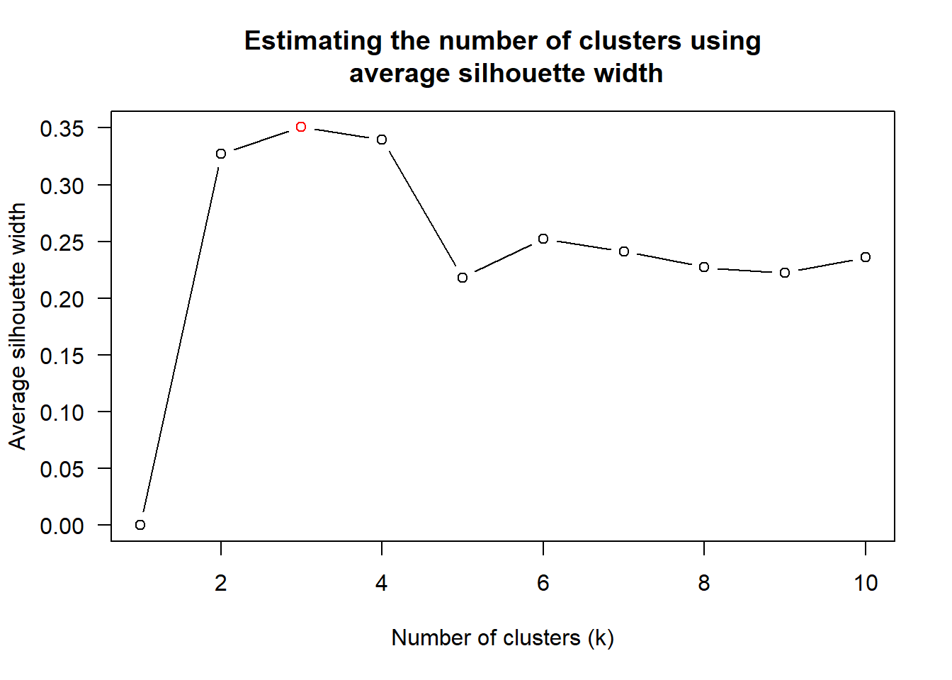
Using above results, plot using heatmaply()
heatmaply(normalize(wh_matrix[, -c(1, 2, 4, 5)]),
          dist_method = "euclidean",
          hclust_method = "average",
          k_row = 3)
Seriation
heatmaply uses the seriation package to find an optimal ordering of rows and columns. Optimal means to optimize the Hamiltonian path length that is restricted by the dendrogram structure. This, in other words, means to rotate the branches so that the sum of distances between each adjacent leaf (label) will be minimized. This is related to a restricted version of the travelling salesman problem.
Different algorithms : Optimal Leaf Ordering (OLO), Gruvaeus and Wainer (GW), or “mean” which gives the output we would get by default from heatmap functions in other packages such as gplots::heatmap.2. The option “none” gives us the dendrograms without any rotation that is based on the data matrix. Example:
heatmaply(normalize(wh_matrix[, -c(1, 2, 4, 5)]),
          seriate = "OLO")
Putting all together
heatmaply(normalize(wh_matrix[, -c(1, 2, 4, 5)]),
          Colv=NA,
          seriate = "none",
          colors = Blues,

          #cluster k = 5
          k_row = 5,

          #change the top margin to 60 and row margin to 200
          margins = c(NA,200,60,NA),

          #change fontsize for row and column labels
          fontsize_row = 4,
          fontsize_col = 5,
          main="World Happiness Score and Variables by Country, 2018 \nDataTransformation using Normalise Method",
          xlab = "World Happiness Indicators",
          ylab = "World Countries"
          )
3. Parallel Coordinates
Parallel coordinates plot is a data visualisation specially designed for visualising and analysing multivariate, numerical data. It is ideal for comparing multiple variables together and seeing the relationships between them.
The strength of parallel coordinates isn’t in their ability to communicate some truth in the data to others, but rather in their ability to bring meaningful multivariate patterns and comparisons to light when used interactively for analysis.
Parallel coordinates plot can be used to characterise clusters detected during customer segmentation.
3.1 Static Parallel Coordinates Plot
Enhance visualisation with boxplot
ggparcoord(data = wh,
           columns = c(7:12),

           #group observations using single variable (Region - column 2) and color
           groupColumn = 2,

           #scale the variables using uniminmax method
           scale = "uniminmax",
           alphaLines = 0.2,
           boxplot = TRUE,
           title = "Parallel Coordinates Plot of World Happines Variables")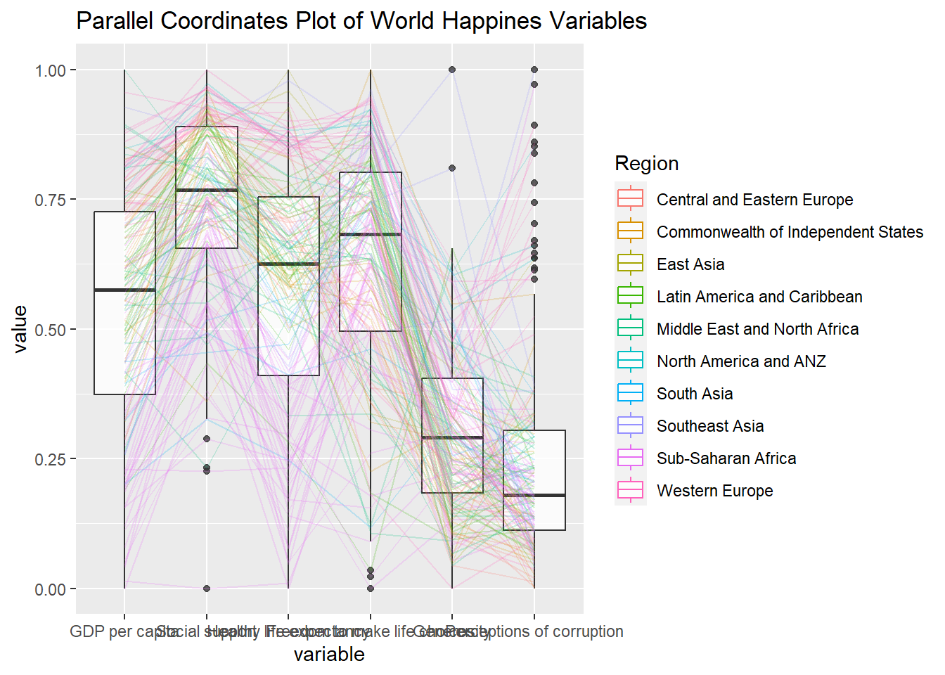
Working with facet_wrap()
ggparcoord(data = wh,
           columns = c(7:12),
           groupColumn = 2,
           scale = "uniminmax",
           alphaLines = 0.2,
           boxplot = TRUE,
           title = "Multiple Parallel Coordinates Plots of World Happines Variables by Region") +
  facet_wrap(~ Region) +

  #rotating the x-axis label to improve readability
  theme(axis.text.x = element_text(angle = 30, hjust = 1))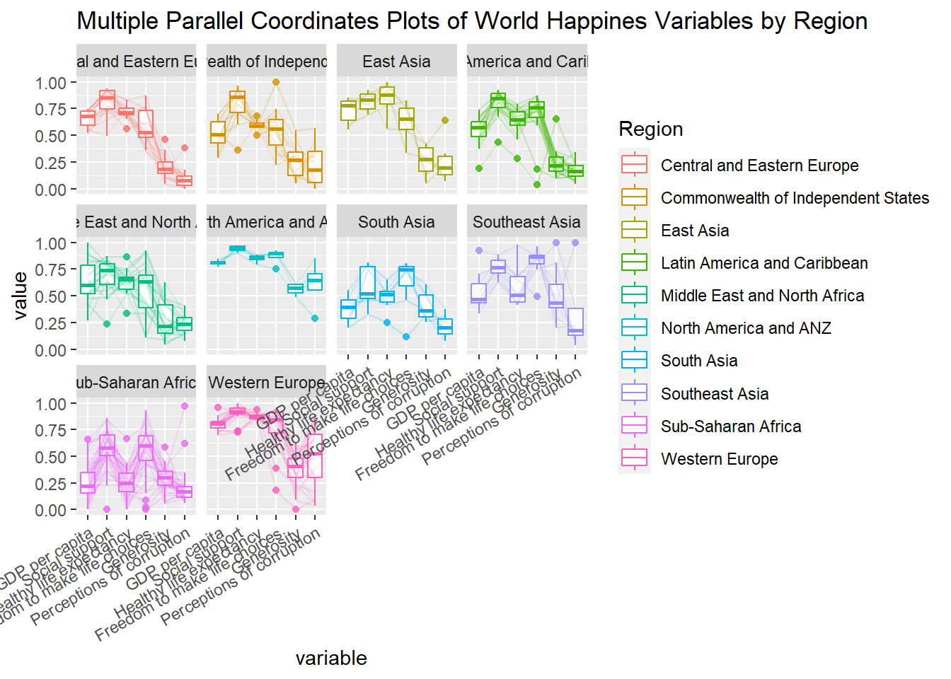
3.1 Interactive Parallel Coordinates Plot
parallelPlot is an R package specially designed to plot a parallel coordinates plot by using ‘htmlwidgets’ package and d3.js.
wh_i <- wh |>
  select("Happiness score", c(7:12))
histo <- rep(TRUE, ncol(wh_i))
parallelPlot(wh_i,
continuousCS = "YlOrRd",
rotateTitle = TRUE,
histoVisibility = histo)