pacman::p_load(scales, viridis, lubridate, ggthemes, gridExtra, readxl, knitr, data.table, tidyverse)Hands-on Exercise 6: Time-Series Visualisation
1. Install and launching R packages
The code chunk below uses p_load() of pacman package to check if packages are installed in the computer. If they are, then they will be launched into R. The R packages installed are:
- lubridate package to work with date and time
2. Plotting Calendar Heatmap
2.1 Importing the data
For the purpose of this hands-on exercise, eventlog.csv file will be used. This data file consists of 199,999 rows of time-series cyber attack records by country.
attacks <- read_csv("data/eventlog.csv")Check data structure below
kable(head(attacks))| timestamp | source_country | tz |
|---|---|---|
| 2015-03-12 15:59:16 | CN | Asia/Shanghai |
| 2015-03-12 16:00:48 | FR | Europe/Paris |
| 2015-03-12 16:02:26 | CN | Asia/Shanghai |
| 2015-03-12 16:02:38 | US | America/Chicago |
| 2015-03-12 16:03:22 | CN | Asia/Shanghai |
| 2015-03-12 16:03:45 | CN | Asia/Shanghai |
2.2 Data Wrangling
2.2.1 Deriving weekday and hour of day fields
Before we can plot the calender heatmap, two new fields namely wkday and hour need to be derived. In this step, we will write a function to perform the task. We will use lubridate::ymd_hms() and lubridate::hour() to format the time. weekdays() is a base R function.
make_hr_wkday <- function(ts, sc, tz){
  real_times <- ymd_hms(ts,
                        tz = tz[1],
                        quiet = TRUE)
  dt <- data.table(source_country = sc,
                   wkday = weekdays(real_times),
                   hour = hour(real_times))
  return(dt)
}
2.2.2 Deriving the attacks tibble data frame
Note: Convert the wkday and hour fields into factor to ensure ordering
wkday_levels <- c('Saturday', 'Friday',
                  'Thursday', 'Wednesday',
                  'Tuesday', 'Monday',
                  'Sunday')

attacks <- attacks |>
  group_by(tz) |>

  #call the function in Step 2.2.1
  do(make_hr_wkday(.$timestamp,
                   .$source_country,
                   .$tz)) |>

  ungroup() |>
  mutate(wkday = factor(wkday, levels = wkday_levels),
         hour = factor(hour, levels = 0:23)
  )
Visualising the tidy tibble table after processing
kable(head(attacks))| tz | source_country | wkday | hour |
|---|---|---|---|
| Africa/Cairo | BG | Saturday | 20 |
| Africa/Cairo | TW | Sunday | 6 |
| Africa/Cairo | TW | Sunday | 8 |
| Africa/Cairo | CN | Sunday | 11 |
| Africa/Cairo | US | Sunday | 15 |
| Africa/Cairo | CA | Monday | 11 |
2.3 Building Calendar Heatmap
2.3.1 Basic calendar heatmap
#Building grouped by aggregating attacks by wkday and hour fields. Using count(), new field called n is derived to calculate the frequency. na.omit() excludes the missing value
grouped <- attacks |>
  count(wkday, hour) |>
  ungroup() |>
  na.omit()

ggplot(data = grouped,
       aes(x = hour,
           y = wkday,
           fill = n)) +

  #plot the tiles (grids) at each x and y position, color and size arguments specify the border color and line size of the tiles
  geom_tile(color = "white",
            size = 0.1) +

  #remove border, axis lines, grids using theme_tufte
  theme_tufte(base_family = "serif") +

  #ensure the plot has aspect ratio of 1:1
  coord_equal() +

  #create gradient color scheme
  scale_fill_gradient(name = '# of attacks',
                      low = 'skyblue',
                      high = 'darkblue') +
  labs(x = NULL,
       y = NULL,
       title = "Attacks by weekday and time of day") +

  theme(axis.ticks = element_blank(),
      plot.title = element_text(hjust = 0.5),
      legend.title = element_text(size = 8),
      legend.text = element_text(size = 6) )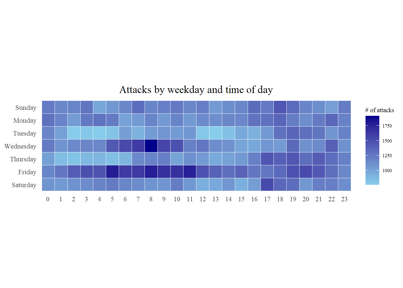
2.3.2 Multiple calendar heatmap by source_country
Step 1: Identify top 4 countries with highest number of attacks
#count the number of attacks by country
attacks_by_country <- count(
  attacks, source_country) |>

  #calculate the percent of attacks by country
  mutate(percent = percent(n/sum(n))) |>

  #arrange it in descending order
  arrange(desc(n))
Step 2: Preparing the tidy data frame
#select the top 4 countries in c() format
top4 <- attacks_by_country$source_country[1:4]


top4_attacks <- attacks |>

  #filter by top 4 countries
  filter(source_country %in% top4) |>

  #group by source_country, wkday, hour and countr frequencies
  count(source_country, wkday, hour) |>
  ungroup() |>

  #convert source_country to factor with levels of top4
  mutate(source_country = factor(
    source_country, levels = top4)) |>

  #remove missing data
  na.omit()
Step 3: Plotting
ggplot(top4_attacks,
       aes(hour,
           wkday,
           fill = n)) +
  geom_tile(color = "white",
          size = 0.1) +
  theme_tufte(base_family = "serif") +
  coord_equal() +
  scale_fill_gradient(name = "# of attacks",
                    low = "sky blue",
                    high = "dark blue") +
  facet_wrap(~source_country, ncol = 2) +
  labs(x = NULL, y = NULL,
     title = "Attacks on top 4 countries by weekday and time of day") +
  theme(axis.ticks = element_blank(),
        axis.text.x = element_text(size = 7),
        plot.title = element_text(hjust = 0.5),
        legend.title = element_text(size = 8),
        legend.text = element_text(size = 6) )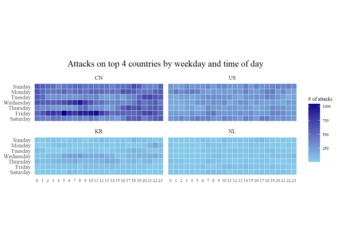
3. Plotting Cycle Plot
3.1 Importing the data
For the purpose of this hands-on exercise, arrivals_by_air.xlsx will be used.
air <- read_excel("data/arrivals_by_air.xlsx")3.2 Data Wrangling
3.2.1 Deriving month and year fields
Create two new fields called month and year from Month-Year field
air$month <- factor(month(air$`Month-Year`),
                    levels=1:12,
                    labels=month.abb,
                    ordered=TRUE)
air$year <- year(ymd(air$`Month-Year`))
3.2.2 Select the target country
Vietnam <- air |>
  select(Vietnam,
         month,
         year) |>
  filter(year >= 2010)
3.2.3 Compute year average arrivals by month
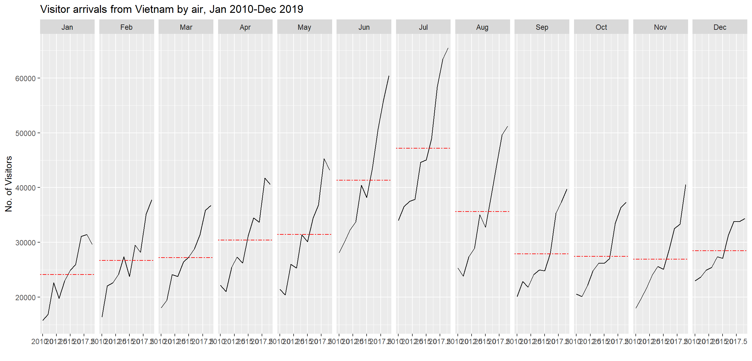
hline.data <- Vietnam |>
  group_by(month) |>
  summarise(avgvalue = mean(Vietnam))
3.3 Building Cycle Plot
ggplot() +
  geom_line(data = Vietnam,
            aes(x = year,
                y = Vietnam,
                group = month),
            color = "black") +
  geom_hline(aes(yintercept=avgvalue),
             data = hline.data,
             linetype = 6,
             color = "red",
             size = 0.5) +
  facet_grid(~month) +
  labs(axis.text.x = element_blank(),
       title = "Visitor arrivals from Vietnam by air, Jan 2010-Dec 2019") +
  xlab("") +
  ylab("No. of Visitors")