pacman::p_load(sf, tmap, tidyverse)Hands-on Exercise 7: Visualising and Analysing Geographic Data
1. Install and launching R packages
The code chunk below uses p_load() of pacman package to check if packages are installed in the computer. If they are, then they will be launched into R. The R packages installed are:
2. Plotting Choropleth Map
Choropleth mapping involves the symbolisation of enumeration units, such as countries, provinces, states, counties or census units, using area patterns or graduated colors. For example, a social scientist may need to use a choropleth map to portray the spatial distribution of aged population of Singapore by Master Plan 2014 Subzone Boundary.
2.1 Importing the data
Two data set will be used to create the choropleth map. They are:
Master Plan 2014 Subzone Boundary (Web) (i.e.
MP14_SUBZONE_WEB_PL) in ESRI shapefile format. It can be downloaded at data.gov.sg This is a geospatial data. It consists of the geographical boundary of Singapore at the planning subzone level. The data is based on URA Master Plan 2014.Singapore Residents by Planning Area / Subzone, Age Group, Sex and Type of Dwelling, June 2011-2020 in csv format (i.e.
respopagesextod2011to2020.csv). This is an aspatial data fie. It can be downloaded at Department of Statistics, Singapore Although it does not contain any coordinates values, but it’s PA and SZ fields can be used as unique identifiers to geocode toMP14_SUBZONE_WEB_PLshapefile.
mpsz <-  sf::st_read(dsn = "data/geospatial",
                     layer = "MP14_SUBZONE_WEB_PL")
Reading layer `MP14_SUBZONE_WEB_PL' from data source
`C:\michaeldjo\ISSS608-VAA\Hands-on_Ex\Hands-on_Ex07\data\geospatial'
using driver `ESRI Shapefile'
Simple feature collection with 323 features and 15 fields
Geometry type: MULTIPOLYGON
Dimension: XY
Bounding box: xmin: 2667.538 ymin: 15748.72 xmax: 56396.44 ymax: 50256.33
Projected CRS: SVY21mpszSimple feature collection with 323 features and 15 fields
Geometry type: MULTIPOLYGON
Dimension: XY
Bounding box: xmin: 2667.538 ymin: 15748.72 xmax: 56396.44 ymax: 50256.33
Projected CRS: SVY21
First 10 features:
OBJECTID SUBZONE_NO SUBZONE_N SUBZONE_C CA_IND PLN_AREA_N
1 1 1 MARINA SOUTH MSSZ01 Y MARINA SOUTH
2 2 1 PEARL'S HILL OTSZ01 Y OUTRAM
3 3 3 BOAT QUAY SRSZ03 Y SINGAPORE RIVER
4 4 8 HENDERSON HILL BMSZ08 N BUKIT MERAH
5 5 3 REDHILL BMSZ03 N BUKIT MERAH
6 6 7 ALEXANDRA HILL BMSZ07 N BUKIT MERAH
7 7 9 BUKIT HO SWEE BMSZ09 N BUKIT MERAH
8 8 2 CLARKE QUAY SRSZ02 Y SINGAPORE RIVER
9 9 13 PASIR PANJANG 1 QTSZ13 N QUEENSTOWN
10 10 7 QUEENSWAY QTSZ07 N QUEENSTOWN
PLN_AREA_C REGION_N REGION_C INC_CRC FMEL_UPD_D X_ADDR
1 MS CENTRAL REGION CR 5ED7EB253F99252E 2014-12-05 31595.84
2 OT CENTRAL REGION CR 8C7149B9EB32EEFC 2014-12-05 28679.06
3 SR CENTRAL REGION CR C35FEFF02B13E0E5 2014-12-05 29654.96
4 BM CENTRAL REGION CR 3775D82C5DDBEFBD 2014-12-05 26782.83
5 BM CENTRAL REGION CR 85D9ABEF0A40678F 2014-12-05 26201.96
6 BM CENTRAL REGION CR 9D286521EF5E3B59 2014-12-05 25358.82
7 BM CENTRAL REGION CR 7839A8577144EFE2 2014-12-05 27680.06
8 SR CENTRAL REGION CR 48661DC0FBA09F7A 2014-12-05 29253.21
9 QT CENTRAL REGION CR 1F721290C421BFAB 2014-12-05 22077.34
10 QT CENTRAL REGION CR 3580D2AFFBEE914C 2014-12-05 24168.31
Y_ADDR SHAPE_Leng SHAPE_Area geometry
1 29220.19 5267.381 1630379.3 MULTIPOLYGON (((31495.56 30...
2 29782.05 3506.107 559816.2 MULTIPOLYGON (((29092.28 30...
3 29974.66 1740.926 160807.5 MULTIPOLYGON (((29932.33 29...
4 29933.77 3313.625 595428.9 MULTIPOLYGON (((27131.28 30...
5 30005.70 2825.594 387429.4 MULTIPOLYGON (((26451.03 30...
6 29991.38 4428.913 1030378.8 MULTIPOLYGON (((25899.7 297...
7 30230.86 3275.312 551732.0 MULTIPOLYGON (((27746.95 30...
8 30222.86 2208.619 290184.7 MULTIPOLYGON (((29351.26 29...
9 29893.78 6571.323 1084792.3 MULTIPOLYGON (((20996.49 30...
10 30104.18 3454.239 631644.3 MULTIPOLYGON (((24472.11 29...popdata <- read_csv("data/aspatial/respopagesextod2011to2020.csv")2.2 Data wrangling
Creating new variables called YOUNG, ECONOMY ACTIVE, and AGED
popdata2020 <- popdata %>%
  filter(Time == 2020) %>%
  group_by(PA, SZ, AG) %>%
  summarise(`POP` = sum(`Pop`)) %>%
  ungroup() %>%

  pivot_wider(names_from=AG,
              values_from=POP) %>%

  mutate(YOUNG = rowSums(.[3:6])
         +rowSums(.[12])) %>%
  mutate(`ECONOMY ACTIVE` = rowSums(.[7:11])+rowSums(.[13:15]))%>%
  mutate(`AGED`=rowSums(.[16:21])) %>%
  mutate(`TOTAL`=rowSums(.[3:21])) %>%
  mutate(`DEPENDENCY` = (`YOUNG` + `AGED`)/`ECONOMY ACTIVE`) %>%
  select(`PA`, `SZ`, `YOUNG`,
       `ECONOMY ACTIVE`, `AGED`,
       `TOTAL`, `DEPENDENCY`)
Before ioining the attribute and geospatial data, one extra step is required to convert the values in PA and SZ fields to uppercase. This is because the values of PA and SZ fields are made up of upper- and lowercase. On the other, hand the SUBZONE_N and PLN_AREA_N are in uppercase
popdata2020 <- popdata2020 |>
  mutate_at(.vars = vars(PA, SZ),
            .funs = funs(toupper)) |>

  filter(`ECONOMY ACTIVE` > 0)
Next, left_join() of dplyr is used to join the geographical data and attribute table using planning subzone name e.g. SUBZONE_N and SZ as the common identifier
mpsz_pop2020 <- left_join(mpsz, popdata2020,
by = c("SUBZONE_N" = "SZ"))write_rds(mpsz_pop2020, "data/rds/mpszpop2020.rds")2.3 Plotting the map
2.3.1 Using qtm()
Plotting standard choropleth map using qtm()
#tmap_mode() with “plot” option is used to produce a static map. For interactive mode, “view” option should be used.
tmap_mode("plot")

#fill argument is used to map the attribute (i.e. DEPENDENCY)
qtm(mpsz_pop2020,
    fill = "DEPENDENCY")
2.3.2 Using tmap() elements
tmap provides a total ten data classification methods, namely: fixed, sd, equal, pretty (default), quantile, kmeans, hclust, bclust, fisher, and jenks. To specify the method, the style argument of tm_fill() or tm_polygons() should be used. We can also specify n argument to specify the number of classes (i.e., n = 5).
We can also specify the category breaks manually by specifying the breaks argument of the tm_fill(). It is important to note that, in tmap the breaks include a minimum and maximum. As a result, in order to end up with n categories, n+1 elements must be specified in the breaks option (the values must be in increasing order). Example would be breaks = c(0, 0.60, 0.70, 0.80, 0.90, 1.00)
#tm_shape defines the input data. We can use tm_polygons() to draw the planning subzone polygons
tm_shape(mpsz_pop2020)+

#We can assign variable to tm_polygons() like below
  #tm_polygons("DEPENDENCY")

  #tm_fill() ONLY shadses the polygons by using a color scheme
  tm_fill("DEPENDENCY",
          style = "quantile",

          #This is using colorbrewer palette. if We want to reverse the color order, we can add '-' in front of the palette (i.e., "-Blues")
          palette = "Blues",
          title = "Dependency ratio") +

  #set the layout
  tm_layout(main.title = "Distribution of Dependency Ratio by planning subzone",
            main.title.position = "center",
            main.title.size = 1.2,
            legend.height = 0.45,
            legend.width = 0.35,
            frame = TRUE) +

  #tm_borders() draw the borders of the shapefil onto the choropleth map
  #lwd is border line width, col is border color, and lty is the line type
  tm_borders(lwd = 0.1, alpha = 0.5) +

  #add compass
  tm_compass(type="8star", size = 2) +

  #add scale bar
  tm_scale_bar(width = 0.15) +

  #add grid lines
  tm_grid(alpha =0.2) +

  #default style
  tmap_style("white") +

  tm_credits("Source: Planning Sub-zone boundary from Urban Redevelopment Authorithy (URA)\n and Population data from Department of Statistics DOS",
             position = c("left", "bottom"))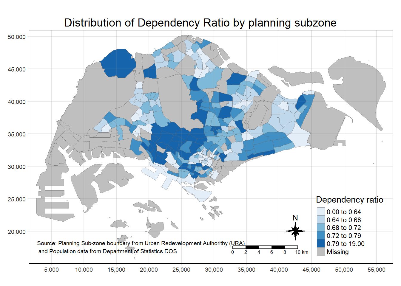
Specifying map legends and style
tm_shape(mpsz_pop2020)+

  tm_fill("DEPENDENCY",
          style = "quantile",
          palette = "-Greens",
          legend.hist = TRUE,
          legend.is.portrait = TRUE,
          legend.hist.z = 0.1) +

  tm_layout(main.title = "Distribution of Dependency Ratio by planning subzone \n(Jenks classification)",
            main.title.position = "center",
            main.title.size = 1,
            legend.height = 0.45,
            legend.width = 0.35,
            legend.outside = FALSE,
            legend.position = c("right", "bottom"),
            frame = FALSE) +

  tm_borders(alpha = 0.5) +

  tmap_style("classic")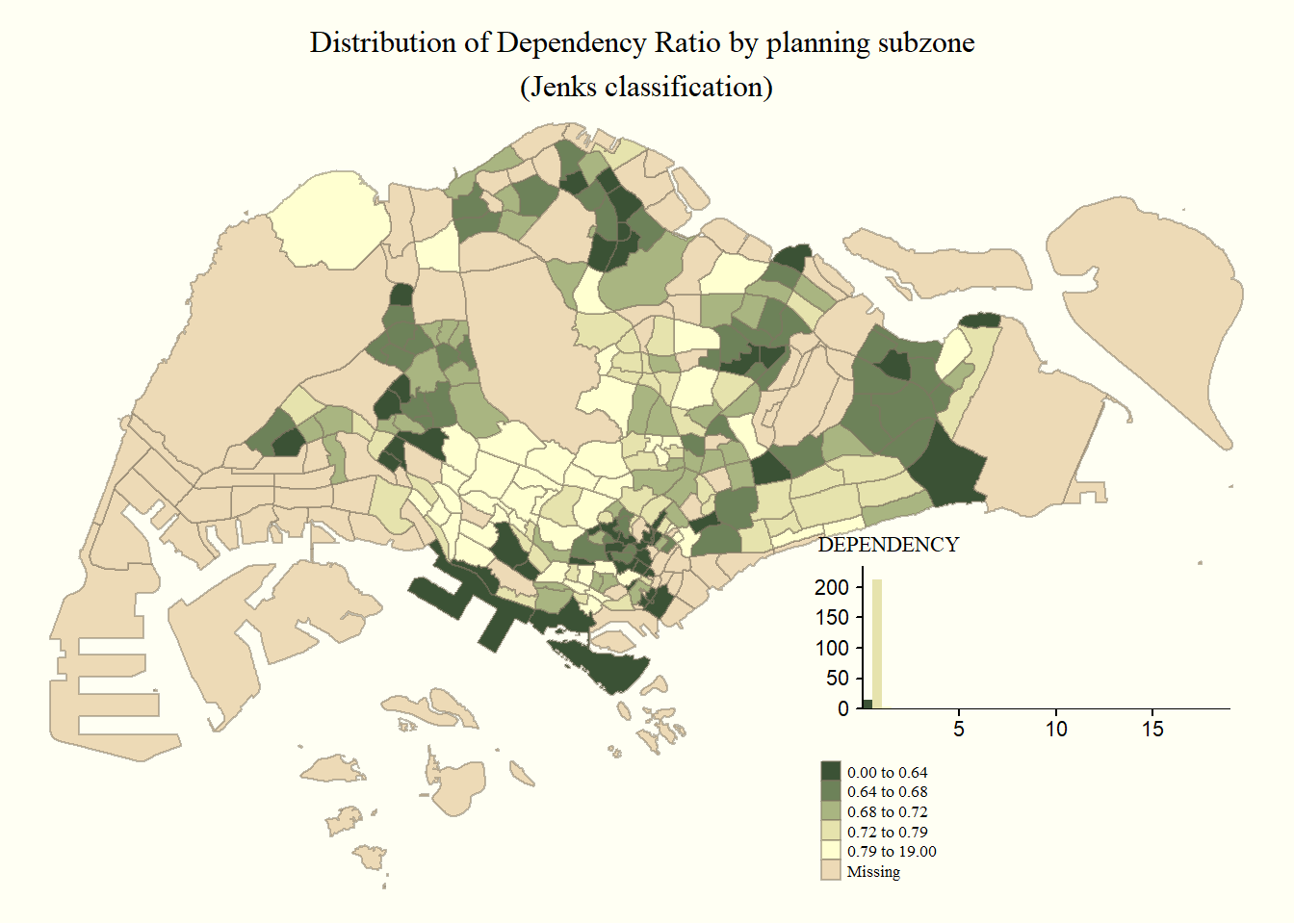
2.3.3 Creating facet choropleth maps
2.3.3.1 By assigning multiple values to at least one of the aesthetic arguments
tm_shape(mpsz_pop2020)+

  #fill by both Young and Aged and specify ncols = 2
  tm_fill(c("YOUNG", "AGED"),
          style = c("equal", "quantile"),
          palette = list("Blues", "Greens"),
          ncols = 2) +
  tm_layout(legend.position = c("right", "bottom")) +
  tm_borders(alpha = 0.5) +
  tmap_style("white")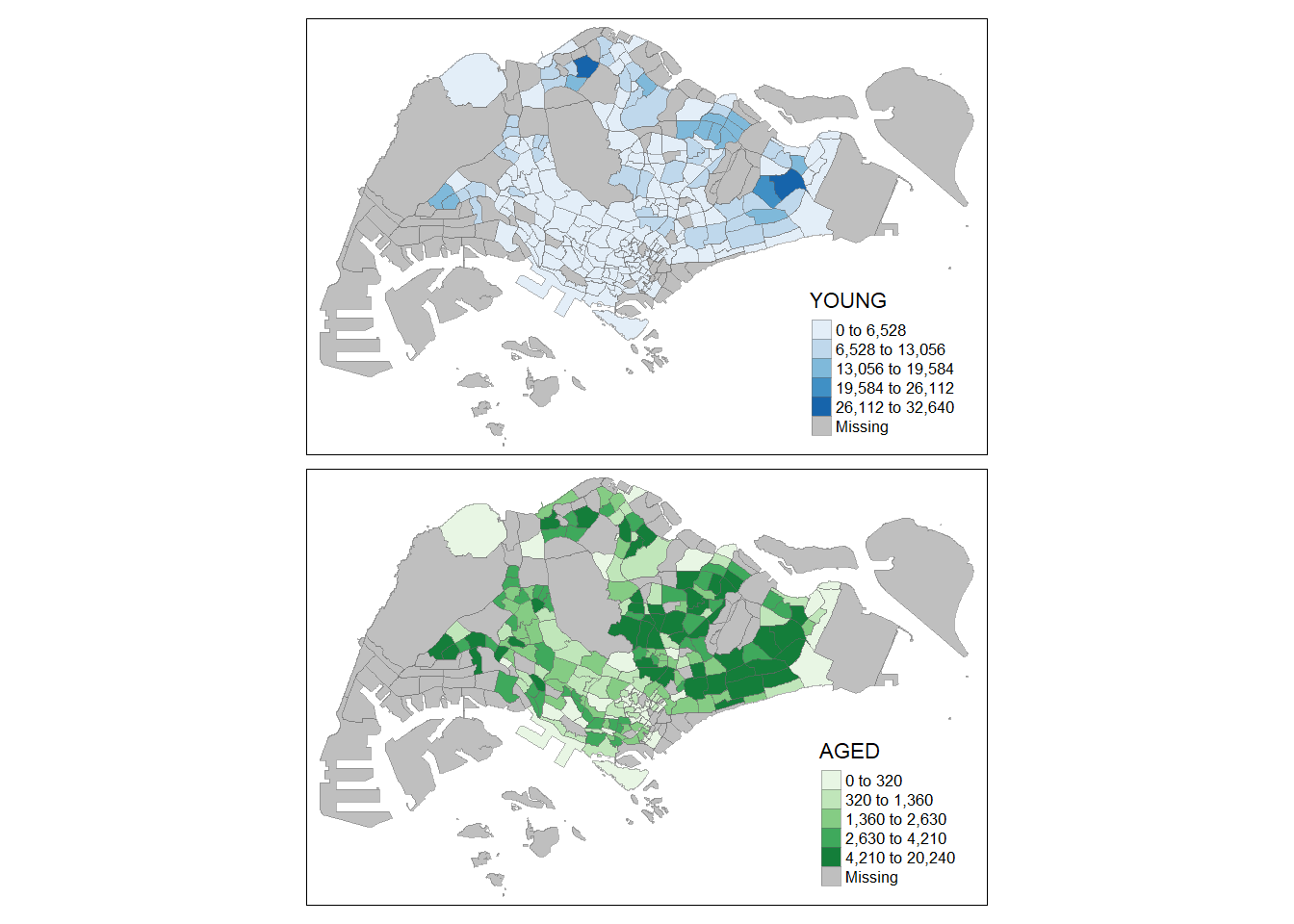
2.3.3.2 By defining a group-by variable in tm_facets()
tm_shape(mpsz_pop2020) +
  tm_fill("DEPENDENCY",
          style = "quantile",
          palette = "Blues",
          thres.poly = 0) +

  #use tm_facets() to facet by REGION_N
  tm_facets(by="REGION_N",
            free.coords=TRUE,
            drop.shapes=TRUE) +

  tm_layout(legend.show = FALSE,
            title.position = c("center", "center"),
            title.size = 20) +

  tm_borders(alpha = 0.5)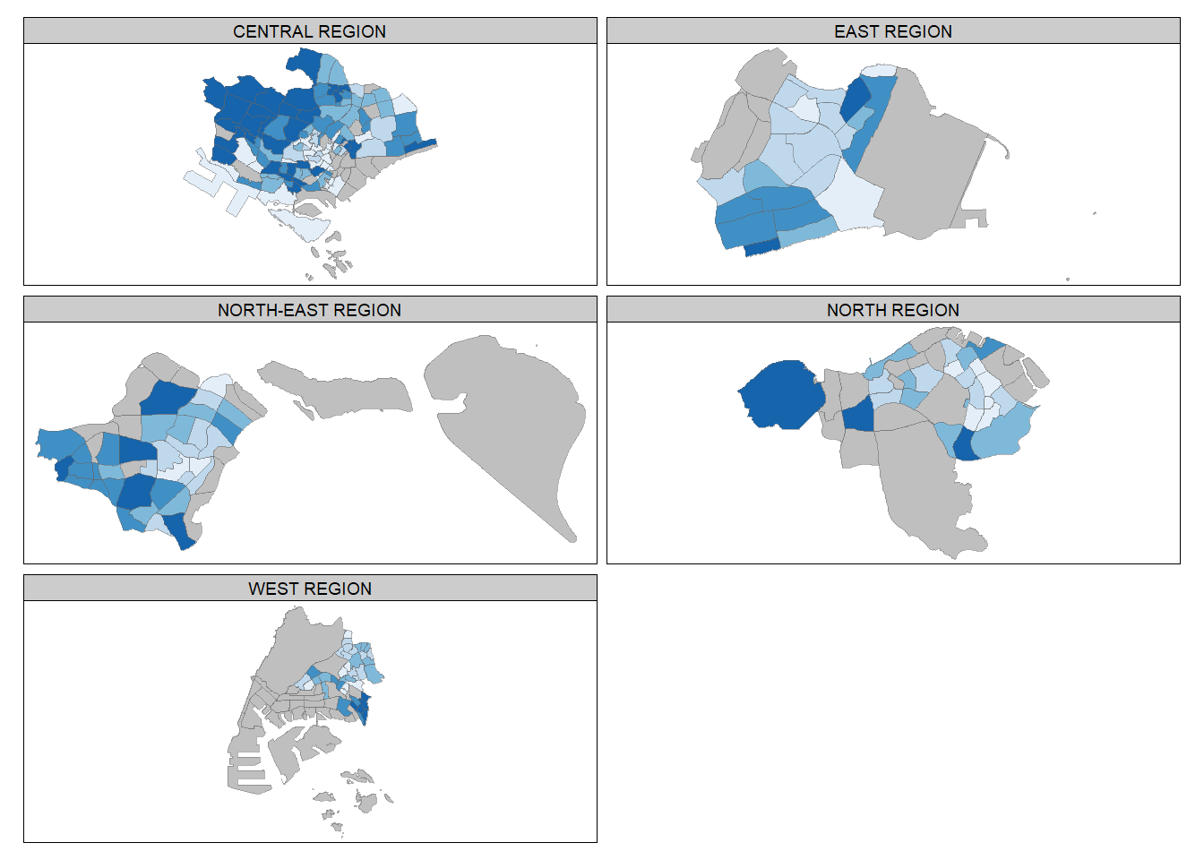
2.3.3.3 By creating multiple stand-alone maps with tmap_arrange()
youngmap <- tm_shape(mpsz_pop2020)+
  tm_polygons("YOUNG",
              style = "quantile",
              palette = "Blues")

agedmap <- tm_shape(mpsz_pop2020)+
  tm_polygons("AGED",
              style = "quantile",
              palette = "Blues")

tmap_arrange(youngmap, agedmap, asp=1, ncol=2)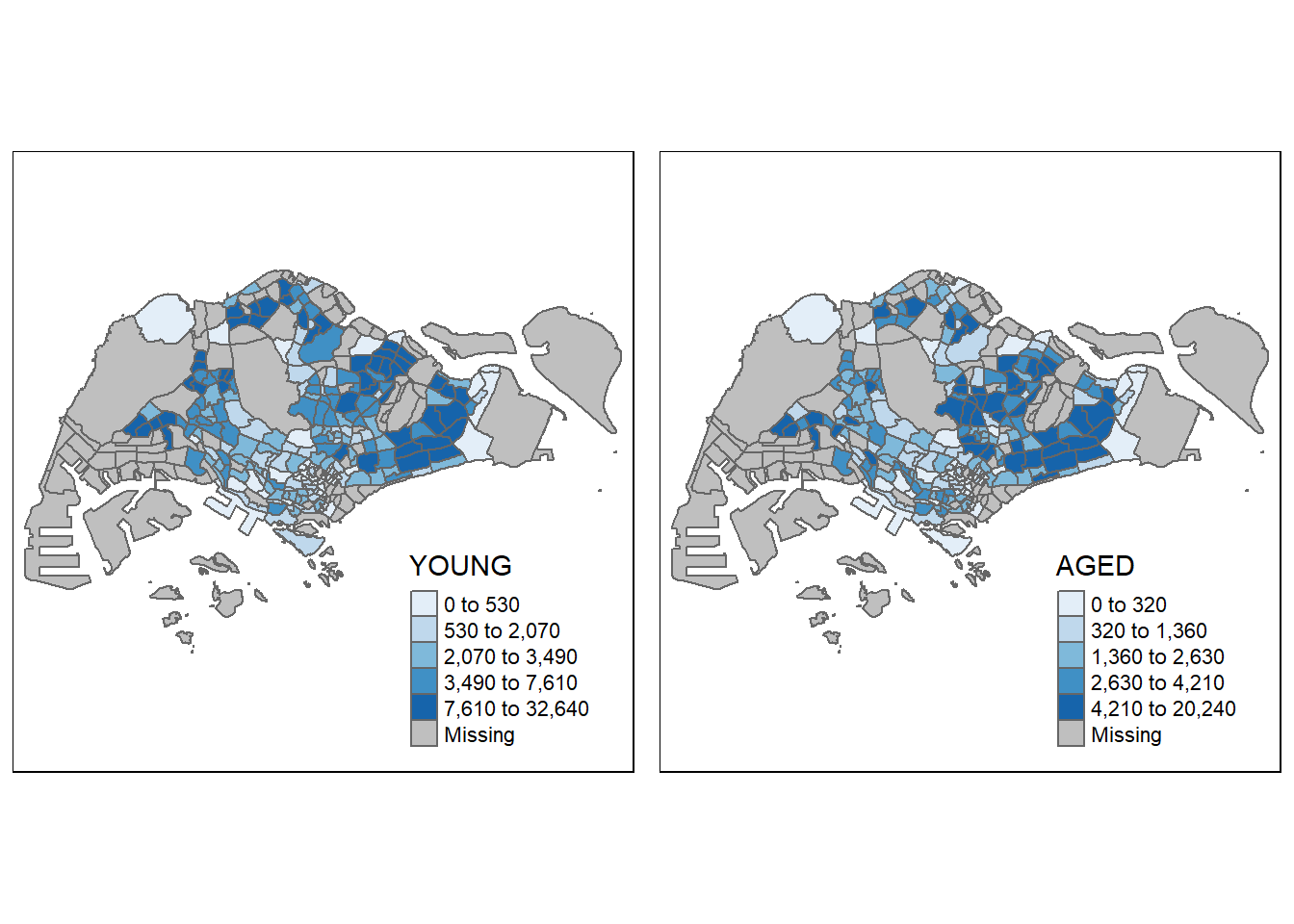
2.3.4 Mappping Spatial Object Meeting a Selection Criterion
Instead of creating small multiple choropleth map, you can also use selection funtion to map spatial objects meeting the selection criterion.
#filter by CENTRAL REGION only
tm_shape(mpsz_pop2020[mpsz_pop2020$REGION_N=="CENTRAL REGION", ])+
  tm_fill("DEPENDENCY",
          style = "quantile",
          palette = "Blues",
          legend.hist = TRUE,
          legend.is.portrait = TRUE,
          legend.hist.z = 0.1) +
  tm_layout(legend.outside = TRUE,
            legend.height = 0.45,
            legend.width = 5.0,
            legend.position = c("right", "bottom"),
            frame = FALSE) +
  tm_borders(alpha = 0.5)
3. Visualising Geospatial Point Data
Proportional symbol maps (also known as graduate symbol maps) are a class of maps that use the visual variable of size to represent differences in the magnitude of a discrete, abruptly changing phenomenon, e.g. counts of people. Like choropleth maps, you can create classed or unclassed versions of these maps. The classed ones are known as range-graded or graduated symbols, and the unclassed are called proportional symbols, where the area of the symbols are proportional to the values of the attribute being mapped. In this hands-on exercise, you will learn how to create a proportional symbol map showing the number of wins by Singapore Pools’ outlets using an R package called tmap.
3.1 Importing the data
The data set use for this hands-on exercise is called SGPools_svy21. The data is in csv file format.
Figure below shows the first 15 records of SGPools_svy21.csv. It consists of seven columns. The XCOORD and YCOORD columns are the x-coordinates and y-coordinates of SingPools outlets and branches. They are in Singapore SVY21 Projected Coordinates System.
Notice that sgpools is aspatial (not based on Geographic Coordinates Systems)
sgpools <- read_csv("data/aspatial/SGPools_svy21.csv")list(sgpools)[[1]]
# A tibble: 306 × 7
NAME ADDRESS POSTC…¹ XCOORD YCOORD OUTLE…² Gp1Gp…³
<chr> <chr> <dbl> <dbl> <dbl> <chr> <dbl>
1 Livewire (Marina Bay Sands) 2 Bayf… 18972 30842. 29599. Branch 5
2 Livewire (Resorts World Sentos… 26 Sen… 98138 26704. 26526. Branch 11
3 SportsBuzz (Kranji) Lotus … 738078 20118. 44888. Branch 0
4 SportsBuzz (PoMo) 1 Sele… 188306 29777. 31382. Branch 44
5 Prime Serangoon North Blk 54… 552542 32239. 39519. Branch 0
6 Singapore Pools Woodlands Cent… 1A Woo… 731001 21012. 46987. Branch 3
7 Singapore Pools 64 Circuit Rd … Blk 64… 370064 33990. 34356. Branch 17
8 Singapore Pools 88 Circuit Rd … Blk 88… 370088 33847. 33976. Branch 16
9 Singapore Pools Anchorvale Rd … Blk 30… 540308 33910. 41275. Branch 21
10 Singapore Pools Ang Mo Kio N2 … Blk 20… 560202 29246. 38943. Branch 25
# … with 296 more rows, and abbreviated variable names ¹POSTCODE,
# ²`OUTLET TYPE`, ³`Gp1Gp2 Winnings`3.2 Creating a sf dataframe from an aspatial data frame
The st_as_sf() function adds a new column called geometry which specify the points
sgpools_sf <- st_as_sf(sgpools,

                       #provide column name of the x-coordinates first, followed by y-coordinates
                       coords = c("XCOORD", "YCOORD"),

                       #provide the coordinate systems in epsg format
                       crs= 3414)
EPSG: 3414 is Singapore SVY21 Projected Coordinate System. You can search for other country’s epsg code by refering to epsg.io.
3.3 Plotting the map
#make this interactive by setting tmap_mode to "view"
tmap_mode("view")

tm_shape(sgpools_sf)+

          #specify colors by the OUTLET TYPE
tm_bubbles(col = "OUTLET TYPE",
          #make the size proportional to Gp1Gp2 Winnings
          size = "Gp1Gp2 Winnings",
          border.col = "black",
          border.lwd = 1)
We can also add tm_facets() which is in sync (zoom and pan settings)
tm_shape(sgpools_sf) +
  tm_bubbles(col = "OUTLET TYPE",
          size = "Gp1Gp2 Winnings",
          border.col = "black",
          border.lwd = 1) +
  tm_facets(by= "OUTLET TYPE",
            nrow = 1,
            sync = TRUE)
Switch back to tmap plot mode
tmap_mode("plot")4. Analytical Mapping
4.1 Importing the data
For the purpose of this hands-on exercise, a prepared data set called NGA_wp.rds will be used. The data set is a polygon feature data.frame providing information on water point of Nigeria at the LGA level. You can find the data set in the rds sub-direct of the hands-on data folder.
NGA_wp <- read_rds("data/rds/NGA_wp.rds")4.2 Basic Choropleth Mapping
Plotting the distribution of water point by LGA
#functional water
p1 <- tm_shape(NGA_wp) +
  tm_fill("wp_functional",
          n = 10,
          style = "equal",
          palette = "Blues") +
  tm_borders(lwd = 0.1,
             alpha = 1) +
  tm_layout(main.title = "Distribution of functional water point by LGAs",
            legend.outside = FALSE)
#non-functional water
p2 <- tm_shape(NGA_wp) +
tm_fill("wp_nonfunctional",
n = 10,
style = "equal",
palette = "Blues") +
tm_borders(lwd = 0.1,
alpha = 1) +
tm_layout(main.title = "Distribution of functional water point by LGAs",
legend.outside = FALSE)#total water
p3 <- tm_shape(NGA_wp) +
tm_fill("total_wp",
n = 10,
style = "equal",
palette = "Blues") +
tm_borders(lwd = 0.1,
alpha = 1) +
tm_layout(main.title = "Distribution of total water point by LGAs",
legend.outside = FALSE)tmap_arrange(p3, p1, p2, ncol = 1)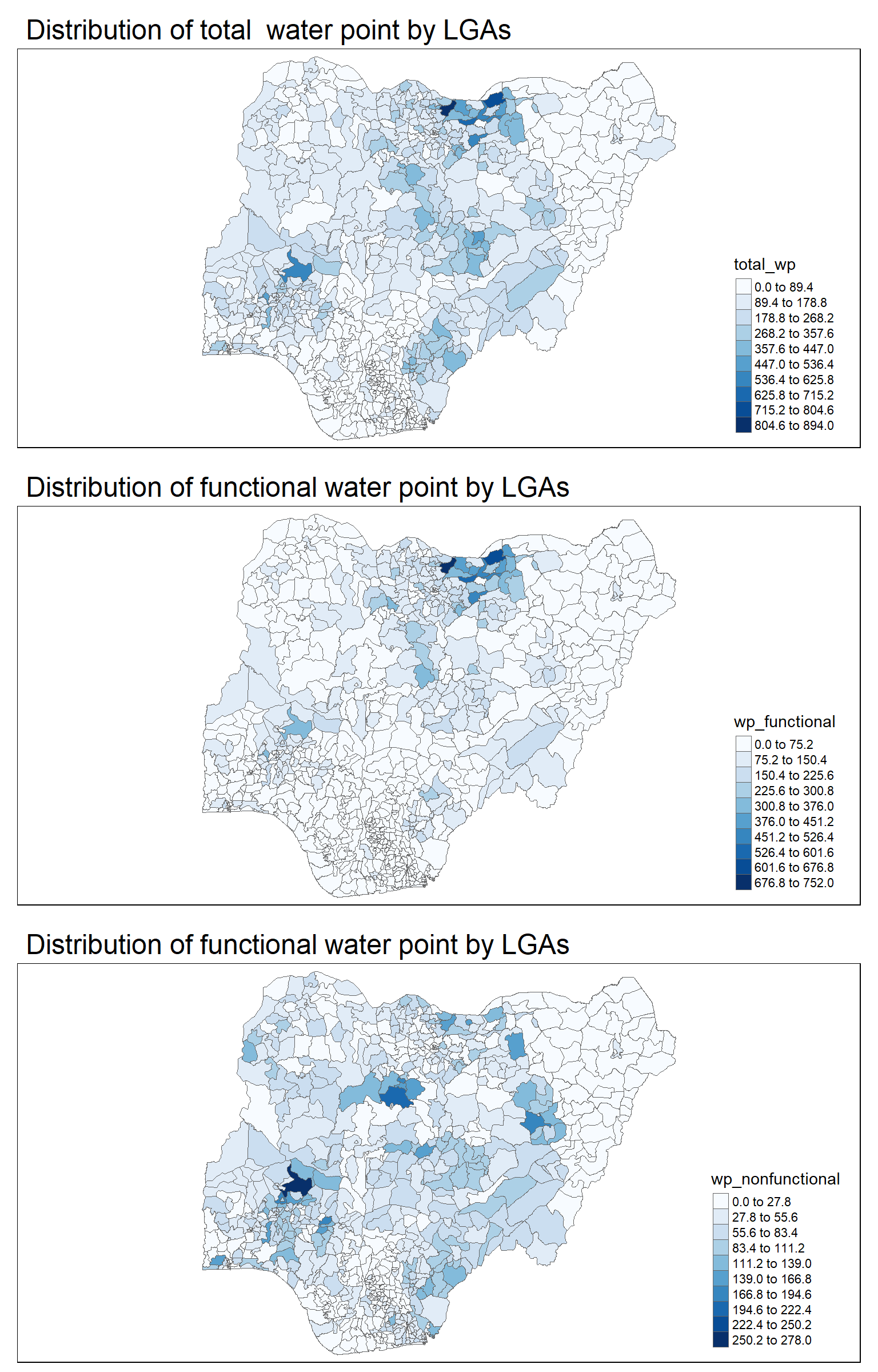
4.3 Choropleth Mapping for Rates
In much of our readings we have now seen the importance to map rates rather than counts of things, and that is for the simple reason that water points are not equally distributed in space. That means that if we do not account for how many water points are somewhere, we end up mapping total water point size rather than our topic of interest.
Deriving proportion of functional water points and non-functional water points
NGA_wp <- NGA_wp |>
  mutate(pct_functional = wp_functional/total_wp) |>
  mutate(pct_nonfunctional = wp_nonfunctional/total_wp)
Plotting the map
tm_shape(NGA_wp) +
  tm_fill("pct_functional",
          n = 10,
          style = "equal",
          palette = "Blues",
          legend.hist = TRUE) +
  tm_borders(lwd = 0.1,
             alpha = 1) +
  tm_layout(main.title = "Rate map of functional water point by LGAs",
            legend.outside = TRUE)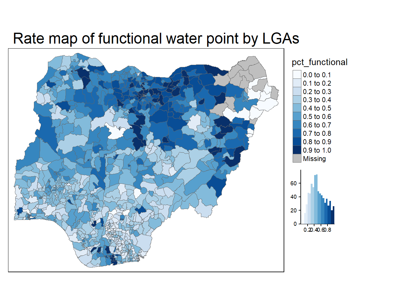
4.4 Extreme Value Maps
Extreme value maps are variations of common choropleth maps where the classification is designed to highlight extreme values at the lower and upper end of the scale, with the goal of identifying outliers. These maps were developed in the spirit of spatializing EDA, i.e., adding spatial features to commonly used approaches in non-spatial EDA (Anselin 1994).
4.4.1 Percentile Map
The percentile map is a special type of quantile map with six specific categories: 0-1%,1-10%, 10-50%,50-90%,90-99%, and 99-100%. The corresponding breakpoints can be derived by means of the base R quantile command, passing an explicit vector of cumulative probabilities as c(0,.01,.1,.5,.9,.99,1). Note that the begin and endpoint need to be included.
4.4.1.1 Data Preparation
Remove NA
NGA_wp <- NGA_wp %>%
  drop_na()
Creating customised classification and extracting values
When variables are extracted from an sf data.frame, the geometry is extracted as well. For mapping and spatial manipulation, this is the expected behavior, but many base R functions cannot deal with the geometry. Specifically, the quantile() gives an error. As a result st_set_geomtry(NULL) is used to drop geometry field.
percent <- c(0,.01,.1,.5,.9,.99,1)
var <- NGA_wp["pct_functional"] %>%
  st_set_geometry(NULL)
quantile(var[,1], percent)
0% 1% 10% 50% 90% 99% 100%
0.0000000 0.0000000 0.2169811 0.4791667 0.8611111 1.0000000 1.0000000 4.4.1.2 Creating get.var function
Firstly, we will write an R function as shown below to extract a variable (i.e. wp_nonfunctional) as a vector out of an sf data.frame. This will achieve the same function as 4.4.1.1
arguments:
vname: variable name (as character, in quotes)df: name ofsfdata frame
returns:
v: vector with values (without a column name)
get.var <- function(vname,df) {
  v <- df[vname] %>%
    st_set_geometry(NULL)
  v <- unname(v[,1])
  return(v)
}
4.4.1.3 Creating function to plot percentile mapping
percentmap <- function(vnam, df, legtitle=NA, mtitle="Percentile Map"){
  percent <- c(0,.01,.1,.5,.9,.99,1)

  #Use the get.var function above to get vector
  var <- get.var(vnam, df)
  bperc <- quantile(var, percent)
  tm_shape(df) +
  tm_polygons() +
  tm_shape(df) +
     tm_fill(vnam,
             title=legtitle,
             breaks=bperc,
             palette="Blues",
          labels=c("< 1%", "1% - 10%", "10% - 50%", "50% - 90%", "90% - 99%", "> 99%"))  +
  tm_borders() +
  tm_layout(main.title = mtitle,
            title.position = c("right","bottom"))
}
4.4.1.4 Drawing the map using the function
percentmap(vnam = "total_wp", df = NGA_wp)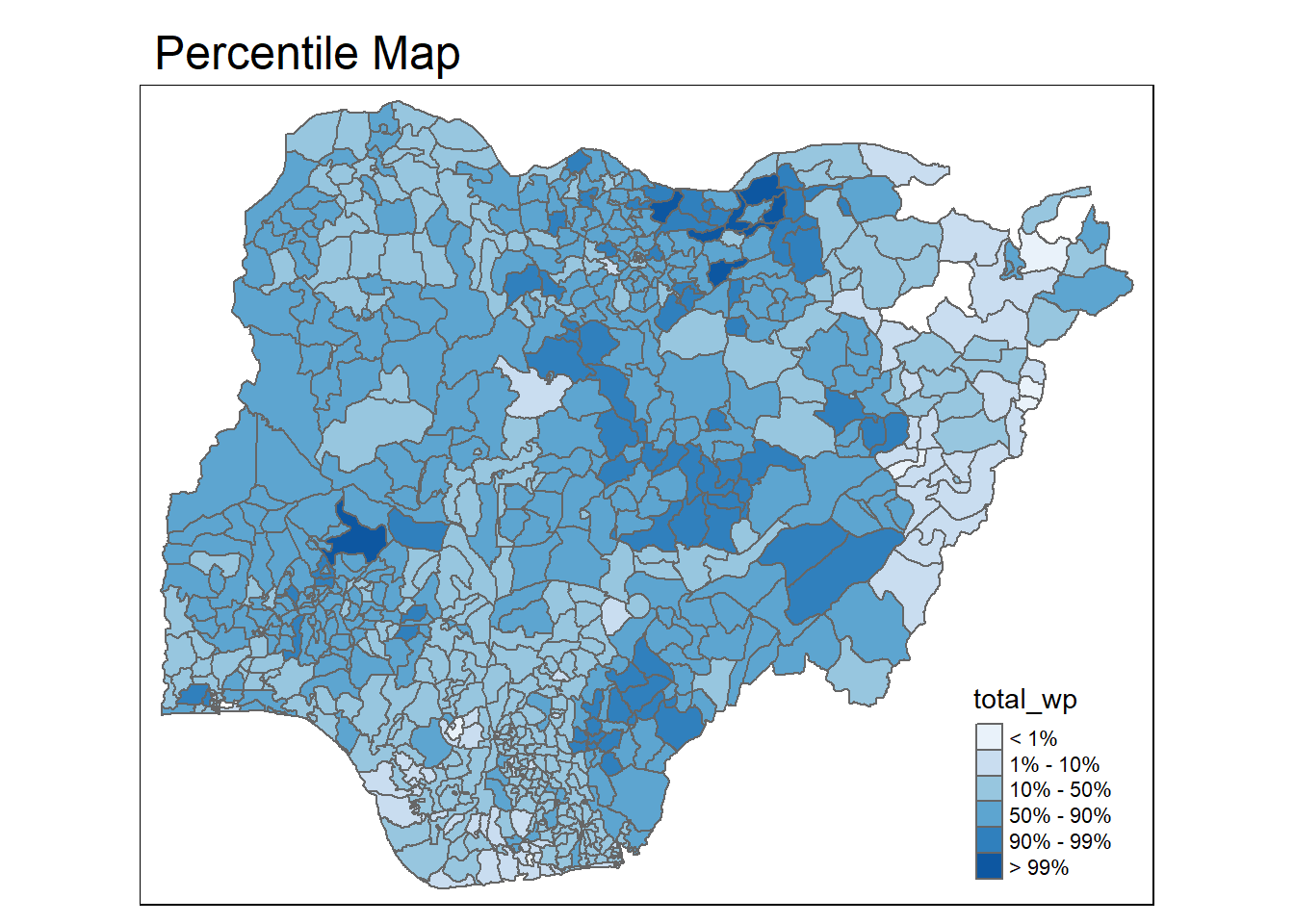
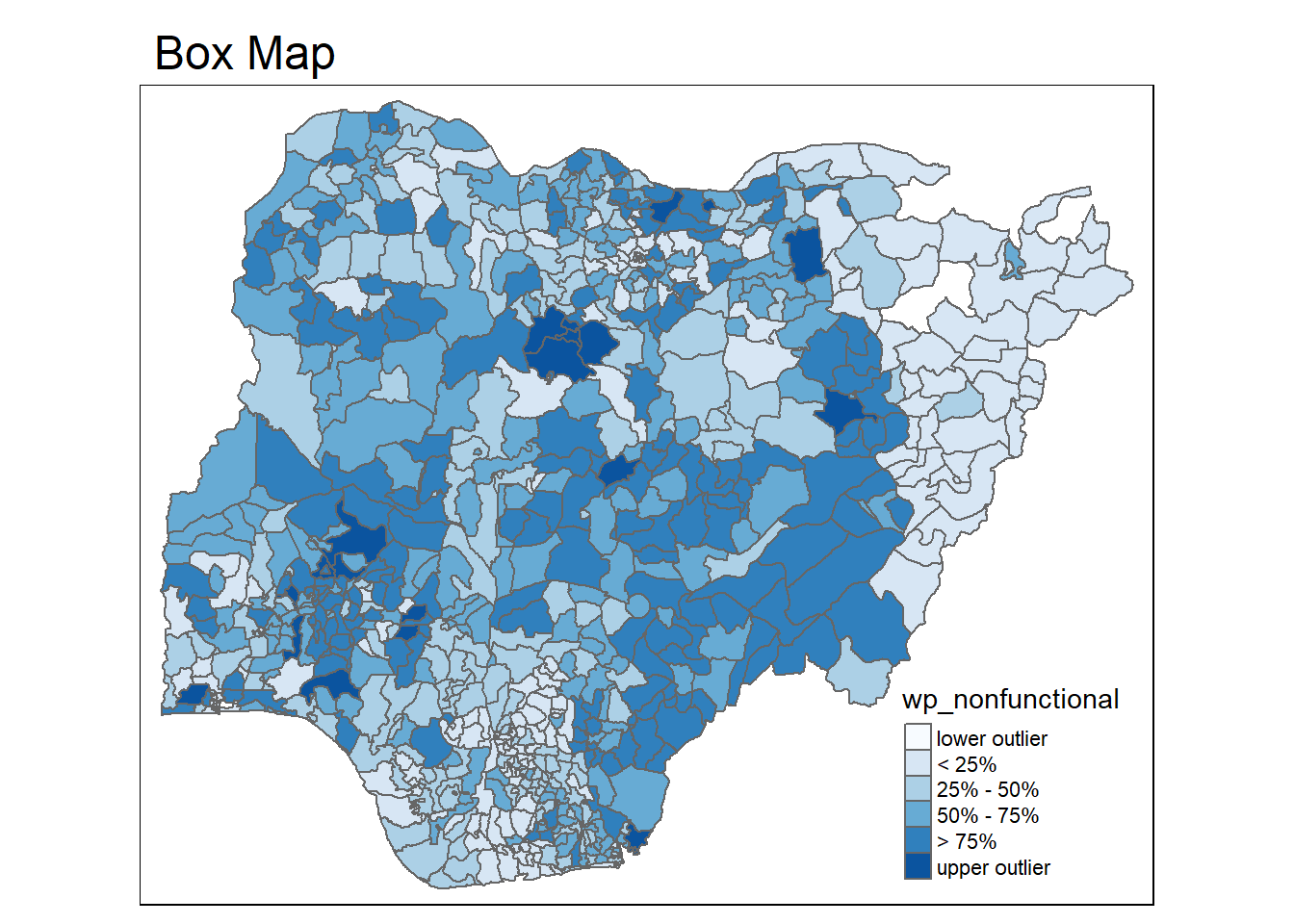
4.4.2 Box Map
In essence, a box map is an augmented quartile map, with an additional lower and upper category. When there are lower outliers, then the starting point for the breaks is the minimum value, and the second break is the lower fence. In contrast, when there are no lower outliers, then the starting point for the breaks will be the lower fence, and the second break is the minimum value (there will be no observations that fall in the interval between the lower fence and the minimum value).
Let’s examine the boxplot distribution of nonfunctional water points
ggplot(data = NGA_wp,
       aes(x = "",
           y = wp_nonfunctional)) +
  geom_boxplot()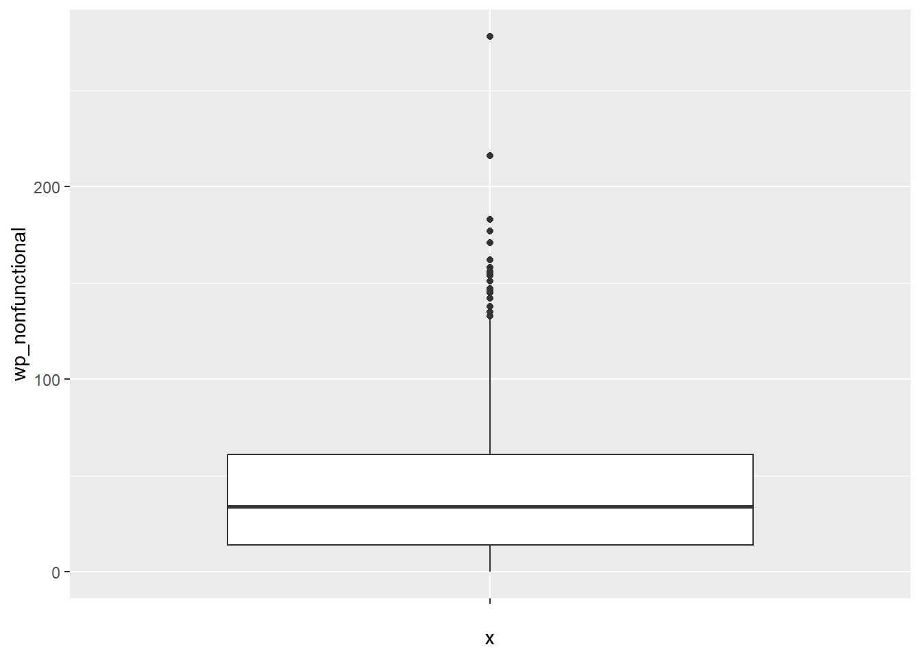
To create a box map, a custom breaks specification will be used. However, there is a complication. The break points for the box map vary depending on whether lower or upper outliers are present.
4.4.2.1 Creating boxbreaks function
The code chunk below is an R function that creating break points for a box map.
arguments:v: vector with observationsmult: multiplier for IQR (default 1.5)
returns:bb: vector with 7 break points compute quartile and fences
boxbreaks <- function(v,mult=1.5) {
  qv <- unname(quantile(v))
  iqr <- qv[4] - qv[2]
  upfence <- qv[4] + mult * iqr
  lofence <- qv[2] - mult * iqr
  # initialize break points vector
  bb <- vector(mode="numeric",length=7)
  # logic for lower and upper fences
  if (lofence < qv[1]) {  # no lower outliers
    bb[1] <- lofence
    bb[2] <- floor(qv[1])
  } else {
    bb[2] <- lofence
    bb[1] <- qv[1]
  }
  if (upfence > qv[5]) { # no upper outliers
    bb[7] <- upfence
    bb[6] <- ceiling(qv[5])
  } else {
    bb[6] <- upfence
    bb[7] <- qv[5]
  }
  bb[3:5] <- qv[2:4]
  return(bb)
}
4.4.2.2 Creating get.var function
Refer to Section 4.4.1.2
4.4.2.3 Testing the function
var <- get.var("wp_nonfunctional", NGA_wp)
boxbreaks(var)
[1] -56.5 0.0 14.0 34.0 61.0 131.5 278.04.4.2.4 Creating function to plot boxmap
The code chunk below is an R function to create a box map.
arguments:
vnam: variable name (as character, in quotes)df: simple features polygon layerlegtitle: legend titlemtitle: map titlemult: multiplier for IQR
returns: - a tmap-element (plots a map)
boxmap <- function(vnam, df,
                   legtitle=NA,
                   mtitle="Box Map",
                   mult=1.5){
  var <- get.var(vnam,df)
  bb <- boxbreaks(var)
  tm_shape(df) +
    tm_polygons() +
  tm_shape(df) +
     tm_fill(vnam,title=legtitle,
             breaks=bb,
             palette="Blues",
          labels = c("lower outlier",
                     "< 25%",
                     "25% - 50%",
                     "50% - 75%",
                     "> 75%",
                     "upper outlier"))  +
  tm_borders() +
  tm_layout(main.title = mtitle,
            title.position = c("left",
                               "top"))
}
4.4.2.5 Drawing the map using the function
tmap_mode("plot")
boxmap("wp_nonfunctional", NGA_wp)