pacman::p_load(lubridate, ggthemes, gtExtras, gt, reactablefmtr, tidyverse)Hands-on Exercise 9: Information Dashboard Design
1. Install and launching R packages
The code chunk below uses p_load() of pacman package to check if packages are installed in the computer. If they are, then they will be launched into R. The R packages installed are:
gtExtras provides some additional helper functions to assist in creating beautiful tables with gt, an R package specially designed for anyone to make wonderful-looking tables using the R programming language.
reactablefmtr provides various features to streamline and enhance the styling of interactive reactable tables with easy-to-use and highly-customizable functions and themes.
2. Importing the data and Data Manipulation
For the purpose of this study, a personal database in Microsoft Access mdb format called Coffee Chain will be used.
library(RODBC)
con <- odbcDriverConnect("Driver={Microsoft Access Driver (*.mdb, *.accdb)};DBQ=data/Coffee Chain.mdb")
coffeechain <- sqlFetch(con, 'CoffeeChain Query')
write_rds(coffeechain, "data/CoffeeChain.rds")
odbcClose(con)head(coffeechain) Profit Margin Sales COGS Total Expenses Marketing Inventory Budget Profit
1 94 130 219 89 36 24 777 100
2 68 107 190 83 39 27 623 80
3 101 139 234 95 38 26 821 110
4 30 56 100 44 26 14 623 30
5 54 80 134 54 26 15 456 70
6 53 108 180 72 55 23 558 80
Budget Margin Budget Sales Budget COGS Date Market State Area Code
1 130 220 90 2012-01-01 Central Colorado 719
2 110 190 80 2012-01-01 Central Colorado 970
3 140 240 100 2012-01-01 Central Colorado 970
4 50 80 30 2012-01-01 Central Colorado 303
5 90 150 60 2012-01-01 Central Colorado 303
6 130 210 80 2012-01-01 Central Colorado 720
Market Size Product Type Product Type
1 Major Market Coffee Amaretto Regular
2 Major Market Coffee Colombian Regular
3 Major Market Coffee Decaf Irish Cream Decaf
4 Major Market Tea Green Tea Regular
5 Major Market Espresso Caffe Mocha Regular
6 Major Market Espresso Decaf Espresso Decafaggregate Sales and Budgeted Sales at the Product Level
product <- coffeechain %>%
  group_by(`Product`) %>%
  summarise(`target` = sum(`Budget Sales`),
            `current` = sum(`Sales`)) %>%
  ungroup()

head(product)
# A tibble: 6 × 3
Product target current
<chr> <dbl> <dbl>
1 Amaretto 27200 26269
2 Caffe Latte 30540 35899
3 Caffe Mocha 84600 84904
4 Chamomile 63840 75578
5 Colombian 134380 128311
6 Darjeeling 57360 731513. Using ggplot2 functions
3.1 Plotting bullet chart
ggplot(product, aes(Product, current)) +
  geom_col(aes(Product, max(target) * 1.01),
           fill="grey85", width=0.85) +
  geom_col(aes(Product, target * 0.75),
           fill="grey60", width=0.85) +
  geom_col(aes(Product, target * 0.5),
           fill="grey50", width=0.85) +
  geom_col(aes(Product, current),
           width=0.35,
           fill = "black") +
  geom_errorbar(aes(y = target,
                    x = Product,
                    ymin = target,
                    ymax= target),
                width = .4,
                colour = "red",
                size = 1) +
  coord_flip()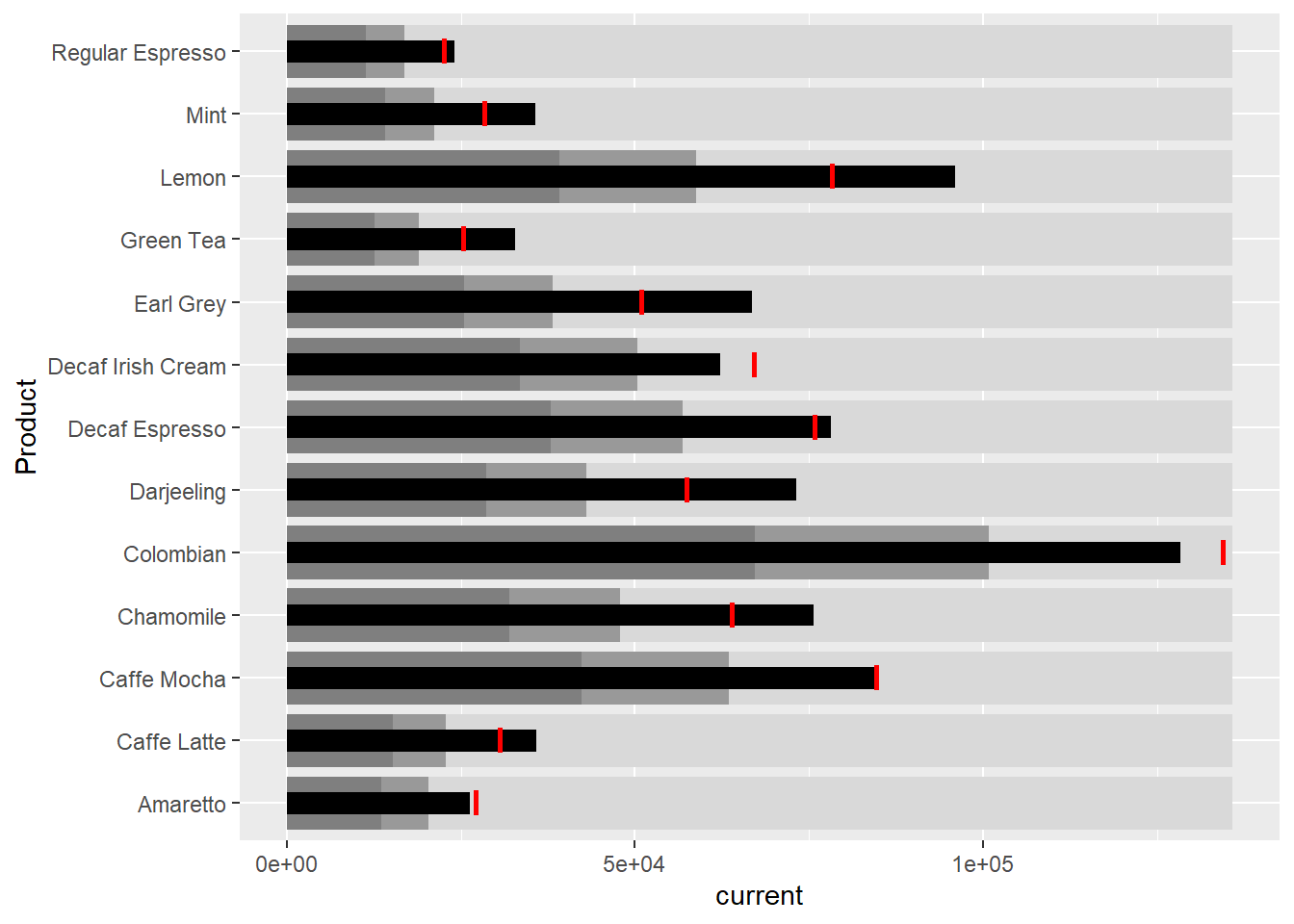
3.2 Plotting sparklines
3.2.1 Data preparation
Group by month and product
sales_report <- coffeechain %>%
  filter(Date >= "2013-01-01") %>%
  mutate(Month = month(Date)) %>%
  group_by(Month, Product) %>%
  summarise(Sales = sum(Sales)) %>%
  ungroup() %>%
  select(Month, Product, Sales)

sales_report
# A tibble: 156 × 3
Month Product Sales
<dbl> <chr> <dbl>
1 1 Amaretto 1210
2 1 Caffe Latte 1653
3 1 Caffe Mocha 3604
4 1 Chamomile 3313
5 1 Colombian 5439
6 1 Darjeeling 3178
7 1 Decaf Espresso 3493
8 1 Decaf Irish Cream 2656
9 1 Earl Grey 2867
10 1 Green Tea 1399
# … with 146 more rowsCompute minimum, maximum, and end of the month sales
mins <- group_by(sales_report, Product) %>%
  slice(which.min(Sales))

maxs <- group_by(sales_report, Product) %>%
  slice(which.max(Sales))

ends <- group_by(sales_report, Product) %>%
  filter(Month == max(Month))
Compute the 25th and 75th quantiles
quarts <- sales_report %>%
  group_by(Product) %>%
  summarise(quart1 = quantile(Sales,
                              0.25),
            quart2 = quantile(Sales,
                              0.75)) %>%
  right_join(sales_report)

quarts
# A tibble: 156 × 5
Product quart1 quart2 Month Sales
<chr> <dbl> <dbl> <dbl> <dbl>
1 Amaretto 1058. 1167 1 1210
2 Amaretto 1058. 1167 2 1144
3 Amaretto 1058. 1167 3 1100
4 Amaretto 1058. 1167 4 1117
5 Amaretto 1058. 1167 5 1057
6 Amaretto 1058. 1167 6 1059
7 Amaretto 1058. 1167 7 1016
8 Amaretto 1058. 1167 8 1039
9 Amaretto 1058. 1167 9 1188
10 Amaretto 1058. 1167 10 1167
# … with 146 more rows3.2.2 Plotting the sparklines
ggplot(sales_report, aes(x=Month, y=Sales)) +
  facet_grid(Product ~ ., scales = "free_y") +
  geom_ribbon(data = quarts, aes(ymin = quart1, max = quart2),
              fill = 'grey90') +
  geom_line(size=0.3) +
  geom_point(data = mins, col = 'red') +
  geom_point(data = maxs, col = 'blue') +
  geom_text(data = mins, aes(label = Sales), vjust = -1) +
  geom_text(data = maxs, aes(label = Sales), vjust = 2.5) +
  geom_text(data = ends, aes(label = Sales), hjust = 0, nudge_x = 0.5) +
  geom_text(data = ends, aes(label = Product), hjust = 0, nudge_x = 1) +
  expand_limits(x = max(sales_report$Month) +
                  (0.25 * (max(sales_report$Month) - min(sales_report$Month)))) +
  scale_x_continuous(breaks = seq(1, 12, 1)) +
  scale_y_continuous(expand = c(0.1, 0)) +
  theme_tufte(base_size = 3, base_family = "Helvetica") +
  theme(axis.title=element_blank(), axis.text.y = element_blank(),
        axis.ticks = element_blank(), strip.text = element_blank())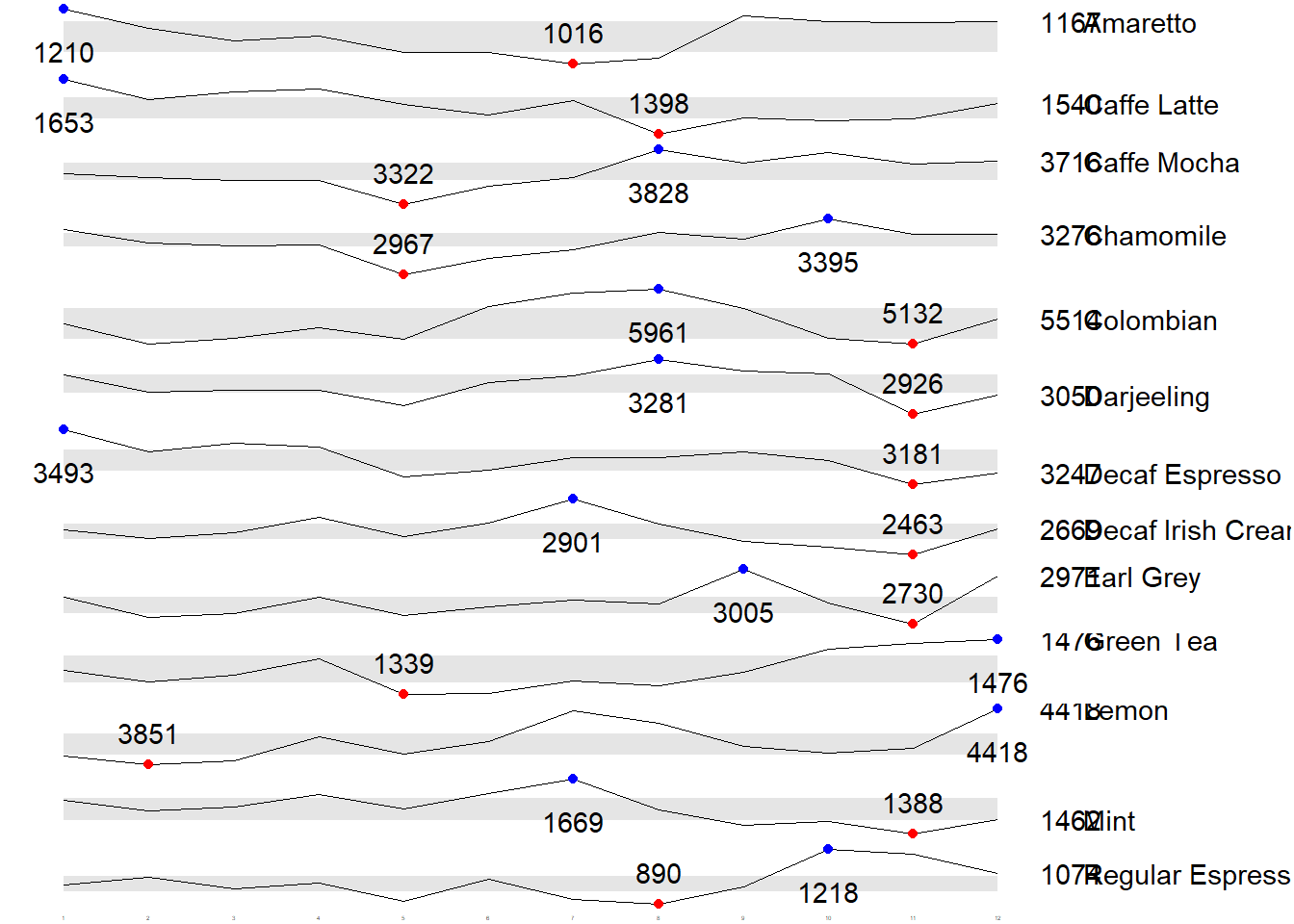
4. Using gt and gtExtras methods
In this section, you will learn how to create static information dashboard by using gt and gtExtras packages.
4.1 Plotting bullet chart
product %>%
  gt::gt() %>%
  gt_plt_bullet(column = current,
              target = target,
              width = 60,
              palette = c("lightblue",
                          "black")) %>%
gt_theme_538()| Product | current |
|---|---|
| Amaretto | |
| Caffe Latte | |
| Caffe Mocha | |
| Chamomile | |
| Colombian | |
| Darjeeling | |
| Decaf Espresso | |
| Decaf Irish Cream | |
| Earl Grey | |
| Green Tea | |
| Lemon | |
| Mint | |
| Regular Espresso |
4.2 Plotting sparklines and create sales report
4.2.1 Preparing the data
Group by product and month
report <- coffeechain %>%
  mutate(Year = year(Date)) %>%
  filter(Year == "2013") %>%
  mutate (Month = month(Date,
                        label = TRUE,
                        abbr = TRUE)) %>%
  group_by(Product, Month) %>%
  summarise(Sales = sum(Sales)) %>%
  ungroup()

report
# A tibble: 156 × 3
Product Month Sales
<chr> <ord> <dbl>
1 Amaretto Jan 1210
2 Amaretto Feb 1144
3 Amaretto Mar 1100
4 Amaretto Apr 1117
5 Amaretto May 1057
6 Amaretto Jun 1059
7 Amaretto Jul 1016
8 Amaretto Aug 1039
9 Amaretto Sep 1188
10 Amaretto Oct 1167
# … with 146 more rowsIt is important to note that one of the requirement of gtExtras functions is that almost exclusively they require you to pass data.frame with list columns. In view of this, code chunk below will be used to convert the report data.frame into list columns.
report %>%
  group_by(Product) %>%
  summarize('Monthly Sales' = list(Sales),
            .groups = "drop")
# A tibble: 13 × 2
Product `Monthly Sales`
<chr> <list>
1 Amaretto <dbl [12]>
2 Caffe Latte <dbl [12]>
3 Caffe Mocha <dbl [12]>
4 Chamomile <dbl [12]>
5 Colombian <dbl [12]>
6 Darjeeling <dbl [12]>
7 Decaf Espresso <dbl [12]>
8 Decaf Irish Cream <dbl [12]>
9 Earl Grey <dbl [12]>
10 Green Tea <dbl [12]>
11 Lemon <dbl [12]>
12 Mint <dbl [12]>
13 Regular Espresso <dbl [12]> 4.2.2 Plotting the sparklines
Use the code above to convert the report data.frame into list columns before applying gt functions
report %>%
  group_by(Product) %>%
  summarize('Monthly Sales' = list(Sales),
            .groups = "drop") %>%
   gt() %>%
gt_plt_sparkline('Monthly Sales')| Product | Monthly Sales |
|---|---|
| Amaretto | |
| Caffe Latte | |
| Caffe Mocha | |
| Chamomile | |
| Colombian | |
| Darjeeling | |
| Decaf Espresso | |
| Decaf Irish Cream | |
| Earl Grey | |
| Green Tea | |
| Lemon | |
| Mint | |
| Regular Espresso |
4.2.3 Create the statistics sales report
Use the code above to create the statistic sales report
report %>%
  group_by(Product) %>%
  summarise("Min" = min(Sales, na.rm = T),
            "Max" = max(Sales, na.rm = T),
            "Average" = mean(Sales, na.rm = T)
            ) %>%
  gt() %>%
  fmt_number(columns = 4,
decimals = 2)| Product | Min | Max | Average |
|---|---|---|---|
| Amaretto | 1016 | 1210 | 1,119.00 |
| Caffe Latte | 1398 | 1653 | 1,528.33 |
| Caffe Mocha | 3322 | 3828 | 3,613.92 |
| Chamomile | 2967 | 3395 | 3,217.42 |
| Colombian | 5132 | 5961 | 5,457.25 |
| Darjeeling | 2926 | 3281 | 3,112.67 |
| Decaf Espresso | 3181 | 3493 | 3,326.83 |
| Decaf Irish Cream | 2463 | 2901 | 2,648.25 |
| Earl Grey | 2730 | 3005 | 2,841.83 |
| Green Tea | 1339 | 1476 | 1,398.75 |
| Lemon | 3851 | 4418 | 4,080.83 |
| Mint | 1388 | 1669 | 1,519.17 |
| Regular Espresso | 890 | 1218 | 1,023.42 |
4.2.4 Combining the sales report and sparklines
Firstly, we need to add the min and max to report tibble in list format
spark <- report %>%
  group_by(Product) %>%
  summarize('Monthly Sales' = list(Sales),
            .groups = "drop")

spark
# A tibble: 13 × 2
Product `Monthly Sales`
<chr> <list>
1 Amaretto <dbl [12]>
2 Caffe Latte <dbl [12]>
3 Caffe Mocha <dbl [12]>
4 Chamomile <dbl [12]>
5 Colombian <dbl [12]>
6 Darjeeling <dbl [12]>
7 Decaf Espresso <dbl [12]>
8 Decaf Irish Cream <dbl [12]>
9 Earl Grey <dbl [12]>
10 Green Tea <dbl [12]>
11 Lemon <dbl [12]>
12 Mint <dbl [12]>
13 Regular Espresso <dbl [12]> sales <- report %>%
group_by(Product) %>%
summarise("Min" = min(Sales, na.rm = T),
"Max" = max(Sales, na.rm = T),
"Average" = mean(Sales, na.rm = T)
)
sales# A tibble: 13 × 4
Product Min Max Average
<chr> <dbl> <dbl> <dbl>
1 Amaretto 1016 1210 1119
2 Caffe Latte 1398 1653 1528.
3 Caffe Mocha 3322 3828 3614.
4 Chamomile 2967 3395 3217.
5 Colombian 5132 5961 5457.
6 Darjeeling 2926 3281 3113.
7 Decaf Espresso 3181 3493 3327.
8 Decaf Irish Cream 2463 2901 2648.
9 Earl Grey 2730 3005 2842.
10 Green Tea 1339 1476 1399.
11 Lemon 3851 4418 4081.
12 Mint 1388 1669 1519.
13 Regular Espresso 890 1218 1023.Combined the two tibbles
sales_data = left_join(sales, spark)
sales_data
# A tibble: 13 × 5
Product Min Max Average `Monthly Sales`
<chr> <dbl> <dbl> <dbl> <list>
1 Amaretto 1016 1210 1119 <dbl [12]>
2 Caffe Latte 1398 1653 1528. <dbl [12]>
3 Caffe Mocha 3322 3828 3614. <dbl [12]>
4 Chamomile 2967 3395 3217. <dbl [12]>
5 Colombian 5132 5961 5457. <dbl [12]>
6 Darjeeling 2926 3281 3113. <dbl [12]>
7 Decaf Espresso 3181 3493 3327. <dbl [12]>
8 Decaf Irish Cream 2463 2901 2648. <dbl [12]>
9 Earl Grey 2730 3005 2842. <dbl [12]>
10 Green Tea 1339 1476 1399. <dbl [12]>
11 Lemon 3851 4418 4081. <dbl [12]>
12 Mint 1388 1669 1519. <dbl [12]>
13 Regular Espresso 890 1218 1023. <dbl [12]> Plotting the updated data.table
sales_data %>%
  gt() %>%
gt_plt_sparkline('Monthly Sales')| Product | Min | Max | Average | Monthly Sales |
|---|---|---|---|---|
| Amaretto | 1016 | 1210 | 1119.000 | |
| Caffe Latte | 1398 | 1653 | 1528.333 | |
| Caffe Mocha | 3322 | 3828 | 3613.917 | |
| Chamomile | 2967 | 3395 | 3217.417 | |
| Colombian | 5132 | 5961 | 5457.250 | |
| Darjeeling | 2926 | 3281 | 3112.667 | |
| Decaf Espresso | 3181 | 3493 | 3326.833 | |
| Decaf Irish Cream | 2463 | 2901 | 2648.250 | |
| Earl Grey | 2730 | 3005 | 2841.833 | |
| Green Tea | 1339 | 1476 | 1398.750 | |
| Lemon | 3851 | 4418 | 4080.833 | |
| Mint | 1388 | 1669 | 1519.167 | |
| Regular Espresso | 890 | 1218 | 1023.417 |
4.3 Combining bullet charts and sparklines
Modify the data as per Section 2 by aggregating Sales and Budgeted Sales at the Product Level
bullet <- coffeechain %>%
  filter(Date >= "2013-01-01") %>%
  group_by(`Product`) %>%
  summarise(`Target` = sum(`Budget Sales`),
            `Actual` = sum(`Sales`)) %>%
  ungroup()

bullet
# A tibble: 13 × 3
Product Target Actual
<chr> <dbl> <dbl>
1 Amaretto 13600 13428
2 Caffe Latte 15270 18340
3 Caffe Mocha 42300 43367
4 Chamomile 31920 38609
5 Colombian 67190 65487
6 Darjeeling 28680 37352
7 Decaf Espresso 37860 39922
8 Decaf Irish Cream 33520 31779
9 Earl Grey 25450 34102
10 Green Tea 12670 16785
11 Lemon 39150 48970
12 Mint 14160 18230
13 Regular Espresso 11310 12281Use the sales_data created in section 4.2.4
sales_data = sales_data %>%
  left_join(bullet)
sales_data
# A tibble: 13 × 7
Product Min Max Average `Monthly Sales` Target Actual
<chr> <dbl> <dbl> <dbl> <list> <dbl> <dbl>
1 Amaretto 1016 1210 1119 <dbl [12]> 13600 13428
2 Caffe Latte 1398 1653 1528. <dbl [12]> 15270 18340
3 Caffe Mocha 3322 3828 3614. <dbl [12]> 42300 43367
4 Chamomile 2967 3395 3217. <dbl [12]> 31920 38609
5 Colombian 5132 5961 5457. <dbl [12]> 67190 65487
6 Darjeeling 2926 3281 3113. <dbl [12]> 28680 37352
7 Decaf Espresso 3181 3493 3327. <dbl [12]> 37860 39922
8 Decaf Irish Cream 2463 2901 2648. <dbl [12]> 33520 31779
9 Earl Grey 2730 3005 2842. <dbl [12]> 25450 34102
10 Green Tea 1339 1476 1399. <dbl [12]> 12670 16785
11 Lemon 3851 4418 4081. <dbl [12]> 39150 48970
12 Mint 1388 1669 1519. <dbl [12]> 14160 18230
13 Regular Espresso 890 1218 1023. <dbl [12]> 11310 12281sales_data %>%
gt() %>%
gt_plt_sparkline('Monthly Sales') %>%
gt_plt_bullet(column = Actual,
target = Target,
width = 28,
palette = c("lightblue",
"black")) %>%
gt_theme_538()| Product | Min | Max | Average | Monthly Sales | Actual |
|---|---|---|---|---|---|
| Amaretto | 1016 | 1210 | 1119.000 | ||
| Caffe Latte | 1398 | 1653 | 1528.333 | ||
| Caffe Mocha | 3322 | 3828 | 3613.917 | ||
| Chamomile | 2967 | 3395 | 3217.417 | ||
| Colombian | 5132 | 5961 | 5457.250 | ||
| Darjeeling | 2926 | 3281 | 3112.667 | ||
| Decaf Espresso | 3181 | 3493 | 3326.833 | ||
| Decaf Irish Cream | 2463 | 2901 | 2648.250 | ||
| Earl Grey | 2730 | 3005 | 2841.833 | ||
| Green Tea | 1339 | 1476 | 1398.750 | ||
| Lemon | 3851 | 4418 | 4080.833 | ||
| Mint | 1388 | 1669 | 1519.167 | ||
| Regular Espresso | 890 | 1218 | 1023.417 |
5. Using reactable and reactablefmtr methods
In this section, we will create interactive information dashboard by using reactable and reactablefmtr packages.
In order to build an interactive sparklines, we need to install dataui R package by using the code chunk below
remotes::install_github("timelyportfolio/dataui")library(dataui)5.1 Plotting sparklines
Use the code to convert the report data.frame into list columns before applying gt functions
report1 <- report %>%
  group_by(Product) %>%
  summarize(`Monthly Sales` = list(Sales))

report1
# A tibble: 13 × 2
Product `Monthly Sales`
<chr> <list>
1 Amaretto <dbl [12]>
2 Caffe Latte <dbl [12]>
3 Caffe Mocha <dbl [12]>
4 Chamomile <dbl [12]>
5 Colombian <dbl [12]>
6 Darjeeling <dbl [12]>
7 Decaf Espresso <dbl [12]>
8 Decaf Irish Cream <dbl [12]>
9 Earl Grey <dbl [12]>
10 Green Tea <dbl [12]>
11 Lemon <dbl [12]>
12 Mint <dbl [12]>
13 Regular Espresso <dbl [12]> Next, react_sparkline will be to plot the sparklines as shown below.
reactable(
  report1,
  defaultPageSize = 13,    #default pagesize is 10
  columns = list(
    Product = colDef(maxWidth = 200),
    `Monthly Sales` = colDef(
      cell = react_sparkline(
        report1,

        #highlight_points is used to show the min and max values points with label argument is used to label firsr and last values
        highlight_points = highlight_points(
          min = "red", max = "blue"),
        labels = c("first", "last"),

        #adding reference line
        statline = "mean"
        )
    )
  )
)
Instead of reference line, we can also add bandline
reactable(
  report1,
  defaultPageSize = 13,    #default pagesize is 10
  columns = list(
    Product = colDef(maxWidth = 200),
    `Monthly Sales` = colDef(
      cell = react_sparkline(
        report1,

        #highlight_points is used to show the min and max values points with label argument is used to label firsr and last values
        highlight_points = highlight_points(
          min = "red", max = "blue"),
        labels = c("first", "last"),
        line_width = 1,

        #adding bands
        bandline = "innerquartiles",
        bandline_color = "green"
        )
    )
  )
)
5.2 Plotting sparkbar
reactable(
  report1,
  defaultPageSize = 13,
  columns = list(
    Product = colDef(maxWidth = 200),
    `Monthly Sales` = colDef(
      cell = react_sparkbar(
        report1,
        highlight_bars = highlight_bars(
          min = "red", max = "blue"),
        bandline = "innerquartiles",
        statline = "mean")
    )
  )
)