#Load packages
pacman::p_load(readxl, knitr, lubridate, ggHoriPlot, ggthemes, patchwork, directlabels, ggbraid, CGPfunctions, ggtext, gganimate, gifski, scales, tidyverse)Take-home Exercise 4
Visualising Singapore bi-lateral trade performance in 2020 to 2022
1. Overview
This exercise aims to uncover the impact of COVID-19, global economic and political dynamic in 2022 on Singapore bi-lateral trade using time-series visualisation. The visualization is designed using ggplot2, its extensions, and tidyverse packages.
The original Merchandise Trade dataset was downloaded from Department of Statistics titled Merchandise Trade by Region/Market
The file downloaded was outputFile.xlsx
The study period is from for January 2020 to December 2022 period.
2. Data Preparation
2.1 Install R packages and import dataset
The code chunk below uses pacman::p_load() to check if packages are installed. If they are, they will be launched into R. The packages installed are
readxl: Used to read data from excel filesknitr: Used for dynamic report generationlubridate: Used to work with date and timeggHoriPlot: Used to creating horizon plotggthemes: Provide additional themes forggplot2patchwork: Used to combine plotsdirectlabels: Add labels directly to plotsggbraid: Used to create braided ribbons plot.remotes::install_github("nsgrantham/ggbraid")is used to install the package.CGPfunctions: Containsnewggslopegraphto plot slope graphggtext: Used to improve text rendering support forggplot2gganimate: Used to create animated plotggifski: Makes smooth GIF animations for rendering ofgganimatescales: Used to rescale and modify labels displaytidyverse: A collection of core packages designed for data science, used extensively for data preparation and wrangling.All packages can be found within CRAN, except for
ggbraid.
Import data from excel file using readxl::read_excel() and store it in tibble sgimport and sgexport.
Note that by choosing the specific range, the period of interest (January 2020 to December 2022) is manually selected.
Warning
Upon inspection of the excel file, it is noted that sgexport rows are smaller than sgimport, extending to row 101 instead of 129.
#Import data
sgimport <- read_excel("data/outputFile.xlsx", sheet = "T1", range = "A10:AK129" )

sgexport <- read_excel("data/outputFile.xlsx", sheet = "T2", range = "A10:AK101" )
Additional data is downloaded from World Bank dataset which lists countries by world regions, which will be mainly used in Section 3.3.
Import data from excel file using readr::read_csv() and store it in tibble regions.
This Entity and World_RegionbyWorld_Bank variable is renamed to Countries and Region for easier interpretation and future joins with other tibble.
regions <- read_csv("data/world-regions-according-to-the-world-bank.csv", show_col_types = FALSE) |>

  rename(Countries = Entity,
         Region = World_RegionbyWorld_Bank) |>
  select(Countries, Region)
2.2 Data cleaning
Scope of the study is to understand bi-lateral trade of Singapore with countries / trade partners around the world. Hence, we will not include regions (i.e., Asia, Africa) or collection of countries (i.e., European Union or Other Countries In Oceania).
2.2.1 Cleaning the countries data for sgimport and sgexport
Looking at the sgimport tibble below, we notice few problems
The layout of the tibble is not apt for time series. Ideally the time period needs to be in rows with the countries in column
The column names are in string format and needs to be converted to datetime format
Data Series contain not only countries/trade partners, but also regions or collection of countries
The countries name contain string suffix ‘(Thousand Dollars)’ and the values are in (’000) format
Note
Similar issue is also observed with sgexport
kable(head(sgimport))| Data Series | 2022 Dec | 2022 Nov | 2022 Oct | 2022 Sep | 2022 Aug | 2022 Jul | 2022 Jun | 2022 May | 2022 Apr | 2022 Mar | 2022 Feb | 2022 Jan | 2021 Dec | 2021 Nov | 2021 Oct | 2021 Sep | 2021 Aug | 2021 Jul | 2021 Jun | 2021 May | 2021 Apr | 2021 Mar | 2021 Feb | 2021 Jan | 2020 Dec | 2020 Nov | 2020 Oct | 2020 Sep | 2020 Aug | 2020 Jul | 2020 Jun | 2020 May | 2020 Apr | 2020 Mar | 2020 Feb | 2020 Jan |
|---|---|---|---|---|---|---|---|---|---|---|---|---|---|---|---|---|---|---|---|---|---|---|---|---|---|---|---|---|---|---|---|---|---|---|---|---|
| Total Merchandise Imports (Thousand Dollars) | 49869770.0 | 50653907.0 | 53182943.0 | 55799312.0 | 58466009.0 | 61029374.0 | 59649162.0 | 57604263.0 | 56116002.0 | 58079982.0 | 44958373.0 | 50026788.0 | 54349357.0 | 50674908.0 | 47945213.0 | 45980374.0 | 44714491.0 | 46107788.0 | 45039845.0 | 41559697.0 | 45169547.0 | 47668437.0 | 37643664.0 | 39028616.0 | 40154550.0 | 38477878.0 | 38173829.0 | 38801413.0 | 36472279.0 | 37843646.0 | 35120892.0 | 31458238.0 | 35878828.0 | 40433029.0 | 39472637.0 | 41180224.0 |
| America (Million Dollars) | 6901.5 | 7529.4 | 7666.4 | 7995.9 | 8633.8 | 7879.7 | 8024.0 | 8521.1 | 7822.1 | 7176.1 | 5385.2 | 5850.9 | 6261.1 | 6127.4 | 6027.6 | 5631.6 | 5750.1 | 5728.6 | 5457.4 | 5191.8 | 6195.9 | 5303.5 | 4164.2 | 4580.0 | 4676.4 | 4588.2 | 4869.7 | 4886.4 | 4132.0 | 4667.3 | 4686.2 | 4259.0 | 5183.5 | 5910.8 | 5314.1 | 5844.1 |
| Asia (Million Dollars) | 33611.7 | 34733.7 | 36120.9 | 37696.3 | 40911.9 | 43214.2 | 42507.2 | 40534.7 | 38735.7 | 42199.9 | 31611.3 | 35014.0 | 39140.3 | 35949.6 | 33552.7 | 32533.4 | 31492.5 | 31645.0 | 31021.0 | 28497.2 | 30623.1 | 31367.8 | 26122.6 | 27413.7 | 28200.4 | 25844.9 | 26127.9 | 27823.2 | 26052.3 | 26767.4 | 24779.3 | 21718.9 | 24534.5 | 26783.6 | 26588.1 | 27128.1 |
| Europe (Million Dollars) | 7541.8 | 7242.8 | 7475.9 | 8167.6 | 7433.2 | 8300.5 | 7300.2 | 7030.8 | 7407.2 | 7203.2 | 6479.0 | 7821.6 | 7586.3 | 6872.0 | 6714.8 | 6882.1 | 5919.4 | 6919.2 | 7011.2 | 6563.5 | 6740.5 | 8964.0 | 5403.7 | 5749.6 | 6087.4 | 6133.5 | 6285.4 | 5316.9 | 5225.0 | 5475.3 | 4960.7 | 4629.0 | 5150.6 | 6333.3 | 6209.6 | 6859.7 |
| Oceania (Million Dollars) | 1399.9 | 664.4 | 1329.8 | 1544.6 | 935.9 | 1060.6 | 1141.8 | 1164.7 | 1559.1 | 863.9 | 814.4 | 810.4 | 744.8 | 994.1 | 1021.2 | 599.8 | 744.0 | 1201.2 | 890.1 | 1001.7 | 1030.5 | 1131.0 | 1134.7 | 705.5 | 540.9 | 1412.8 | 577.3 | 477.7 | 586.5 | 493.1 | 456.4 | 441.8 | 637.6 | 845.9 | 694.7 | 819.7 |
| Africa (Million Dollars) | 414.9 | 483.6 | 589.9 | 395.0 | 551.2 | 574.4 | 675.9 | 352.9 | 591.9 | 636.9 | 668.5 | 529.9 | 616.8 | 731.8 | 628.8 | 333.4 | 808.4 | 613.8 | 660.2 | 305.4 | 579.6 | 902.2 | 818.5 | 579.9 | 649.4 | 498.6 | 313.5 | 297.2 | 476.5 | 440.6 | 238.2 | 409.6 | 372.6 | 559.4 | 666.1 | 528.6 |
Before doing any pivoting, each individual tibble needs to be tidied up to avoid further complications. The code chunks below perform the required data wrangling to
Remove the regions or collection of countries in Data Series variable by filtering the first 7 rows out. This is done using
dplyr::filter()Remove the string ‘(Thousand Dollars)’ from each of the countries’ name in . This is done using
str_remove()function in combination with regular expression" \\(Thousand Dollars\\)". Assign this to new variable Countries usingdplyr::mutate()ImportantIn the next section, we will multiply the values by 1000 to compensate for the loss of string suffix ‘(Thousand Dollars)’
Remove the old Data Series column
The modified tibbles are stored in new tibbles sgimport_ctry and sgexport_ctry respectively
sgimport_ctry <- sgimport |>

  #remove the first 7 rows, which are Total and non-countries
  filter(!row_number() %in% c(1:7)) |>

  #remove the '(Thousand Dollars)' string from column Data Series and call it Countries
  mutate(Countries = str_remove(`Data Series`,
                                " \\(Thousand Dollars\\)"),
         .after = `Data Series`) |>

  #remove 'Data Series' column
  select(-`Data Series`)
sgexport_ctry <- sgexport |>
#remove the first 7 rows, which are Total and non-countries
filter(!row_number() %in% c(1:7)) |>
#remove the '(Thousand Dollars)' string from column Data Series and call it Countries
mutate(Countries = str_remove(`Data Series`,
" \\(Thousand Dollars\\)"),
.after = `Data Series`) |>
#remove 'Data Series' column
select(-`Data Series`) 2.2.2 Pivot and transform tibbles to time-series layout
Transforming sgimport_ctry and sgexport_ctry to time-series layout requires the help of tidyr::pivot_longer(), splitting the column string (i.e., ‘2022 Dec’) to Year and Month variables respectively. To do this, we will use the names_sep argument. The values are assigned to new variable Import_SGD and Export_SGD respectively.
Additionally, dplyr::mutate() will be used to
Convert Month to factors, levelled based on the abbreviation (i.e., ‘Jan’). This will allow easy ordering during plotting
Convert Year to integer for the same purpose as month
Create new variable Month_Year which is in datetime format to allow time-series plotting. This is done using
lubridate::make_date()functionMultiply the Import_SGD and Export_SGD values by 1000 to compensate for the loss of string suffix ‘(Thousand Dollars)’
The modified tibbles are stored in new tibbles sgimport_cln and sgexport_cln respectively
See the resulting tibble below; only sgimport_cln is shown for illustrative purpose as similar treatment is done on sgexport_cln.
sgimport_cln <- sgimport_ctry |>

  #pivot_longer to get year and month timeseries
  pivot_longer(cols = !Countries,
               names_to = c("Year", "Month"),
               names_sep = " ",
               values_to = "Import_SGD"
               ) |>

  #Convert Month to factors and Years to integers for ordering purposes
  mutate(Month = factor(Month, levels = month.abb),
         Year = as.integer(Year),
         Month_Year = make_date(Year, Month),
         .before = 1) |>

  #Multiply values by 1000
  mutate(Import_SGD = Import_SGD*1000)

sgimport_cln
# A tibble: 4,032 × 5
Month_Year Countries Year Month Import_SGD
<date> <chr> <int> <fct> <dbl>
1 2022-12-01 Belgium 2022 Dec 103655000
2 2022-11-01 Belgium 2022 Nov 121773000
3 2022-10-01 Belgium 2022 Oct 88796000
4 2022-09-01 Belgium 2022 Sep 215978000
5 2022-08-01 Belgium 2022 Aug 132917000
6 2022-07-01 Belgium 2022 Jul 224676000
7 2022-06-01 Belgium 2022 Jun 114704000
8 2022-05-01 Belgium 2022 May 116817000
9 2022-04-01 Belgium 2022 Apr 146603000
10 2022-03-01 Belgium 2022 Mar 319393000
# … with 4,022 more rowssgexport_cln <- sgexport_ctry |>
#pivot_longer to get year and month timeseries
pivot_longer(cols = !Countries,
names_to = c("Year", "Month"),
names_sep = " ",
values_to = "Export_SGD"
) |>
#Convert Month and Year to factors for ordering purposes
#Multiply values by 1000
mutate(Month = factor(Month, levels = month.abb),
Year = as.integer(Year),
Month_Year = make_date(Year, Month),
.before = 1) |>
mutate(Export_SGD = Export_SGD*1000) 2.2.3 Finding the discrepancies between sgimport_cln and sgexport_cln
Before joining the two tibbles: sgimport_cln and sgexport_cln, it is important to recognise that their number of rows are not the same. To detect the difference, a tibble called import_vs_export is created below to list the countries which appear in sgimport_cln but not in sgexport_cln.
import_vs_export <- setdiff(sgimport_ctry$Countries, sgexport_ctry$Countries) |>
  enframe(name = NULL, value = "diff") |>
  arrange(diff)

import_vs_export  |>
  kable(caption = "Countries in sgimport_cln that is not in sgexport_cln",
row.names = TRUE)| diff | |
|---|---|
| 1 | Anguilla |
| 2 | Bahamas |
| 3 | Bermuda |
| 4 | Cocos (Keeling) Islands |
| 5 | Commonwealth Of Independent States |
| 6 | Cook Islands |
| 7 | French Guiana |
| 8 | French Southern Territories |
| 9 | Grenada |
| 10 | Guatemala |
| 11 | Honduras |
| 12 | Jamaica |
| 13 | Kiribati |
| 14 | Liechtenstein |
| 15 | Micronesia |
| 16 | Nauru |
| 17 | Netherlands Antilles |
| 18 | Niue |
| 19 | Norfolk Island |
| 20 | Norway |
| 21 | Other Countries In America |
| 22 | Palau |
| 23 | Panama |
| 24 | South Sudan |
| 25 | St Vincent & The Grenadines |
| 26 | Trinidad & Tobago |
| 27 | Tuvalu |
| 28 | Wallis & Fatuna Islands |
Referring to above list, there are 28 countries with available import data, but has no export data.
Warning
We cannot assume that the exports are zero, just because there is no available data.
2.2.4 Joining the two tibbles and calculate trade balance and volume
dplyr::left_join() function is used to join sgimport_cln and sgexport_cln. This is especially useful to avoid unwanted data loss since sgimport_cln has more rows than sgexport_cln.
Tip
left_join() takes all the values from the first tibble, and looks for matches in the second tibble. If it finds a match, it adds the data from the second table; if not, it adds missing values.
Countries with missing values in Export_SGD variable created by left_join() function will be excluded from analysis. As highlighted above, we cannot assume that the exports are zero, just because there is no available data. This is to avoid incomplete data when analysing trade balances. To remove this, import_vs_export tibble created above will be used to filter out the countries using dplyr::filter().
Beside the countries in import_vs_export, it is noted that the import and export values of “Germany, Democratic Republic Of” are zeroes. This is referring to East Germany, a state that no longer exists since German reunification in 1990. This country is in the tibble as the original dataset tracks Singapore import/export data from 1976. Given the scope of the study from January 2020 onward, we will filter out this country as well using dplyr::filter().
Note that “Other Countries In Oceania” is also removed as it is a collection of countries.
Additional data cleaning required :
Shortening the names of some countries like “Germany, Federal Republic Of”, “Vietnam, Socialist Republic Of”, and “Republic Of Korea”.
dplyr::mutate()is used in conjunction withcase_when()Create new variable Trade_Balance_SGD subtracts Import_SGD from Export_SGD to indicate whether there is trade surplus or deficit from Singapore point-of-view
Create new variable Trade_Volume_SGD sums Export_SGD with Import_SGD as indication of total trade activities
sgtrade_cln <- sgimport_cln |>

  #join sgimport_cln with sgexport_cln
  left_join(sgexport_cln, by = c('Countries' = 'Countries', 'Month_Year' = 'Month_Year', 'Month' = 'Month', 'Year' = 'Year')) |>

    #remove countries with non-available export data
  filter(!Countries %in% c(import_vs_export$diff, "Germany, Democratic Republic Of", "Other Countries In Oceania")) |>

  mutate(Countries = case_when(Countries == "Germany, Federal Republic Of" ~ "Germany",
                               Countries == "Vietnam, Socialist Republic Of" ~ "Vietnam",
                               Countries == "Republic Of Korea" ~ "South Korea",
                               TRUE ~ Countries)) |>

  #Calculate trade balance
  mutate(Trade_Balance_SGD = Export_SGD - Import_SGD,
         Trade_Volumes_SGD = Export_SGD + Import_SGD)

kable(head(sgtrade_cln))| Month_Year | Countries | Year | Month | Import_SGD | Export_SGD | Trade_Balance_SGD | Trade_Volumes_SGD |
|---|---|---|---|---|---|---|---|
| 2022-12-01 | Belgium | 2022 | Dec | 103655000 | 432376000 | 328721000 | 536031000 |
| 2022-11-01 | Belgium | 2022 | Nov | 121773000 | 756814000 | 635041000 | 878587000 |
| 2022-10-01 | Belgium | 2022 | Oct | 88796000 | 350565000 | 261769000 | 439361000 |
| 2022-09-01 | Belgium | 2022 | Sep | 215978000 | 386724000 | 170746000 | 602702000 |
| 2022-08-01 | Belgium | 2022 | Aug | 132917000 | 570824000 | 437907000 | 703741000 |
| 2022-07-01 | Belgium | 2022 | Jul | 224676000 | 991586000 | 766910000 | 1216262000 |
2.2.5 Finding top countries by trade volume
Not all countries trade equally with Singapore. Despite performing the extensive data cleaning in the previous sections, there are still 82 countries in the tibble.
n_distinct(sgtrade_cln$Countries)[1] 82In order to limit the scope of the study further, it is desired to calculate the each country trade volume and percentage of total trade volume. This will provide basis to filter out countries that contributed less than 0.05% of total trade volumes to Singapore.
The code chunk below performs:
Group sgtrade_cln by Countries and calculate each country’s Total_Trade_Volumes_SGD using
dplyr::summarise()functionCalculate Pct_Total_Trade_Volumes by dividing each country’s Total_Trade_Volumes_SGD with the sum(Total_Trade_Volumes_SGD) using
dplyr::mutate()functionArrange the countries by Pct_Total_Trade_Volumes in descending order and showcase the data
sgtrade_top_ctry <- sgtrade_cln |>

  #Group by Countries and calculated Total Trade Volumes of Singapore
  group_by(Countries) |>
  summarise(Total_Trade_Volumes_SGD = sum(Trade_Volumes_SGD)) |>

  #Calculate the percentage of trade volume each country contributes to Singapore Total
  mutate(Pct_Total_Trade_Volumes = round(Total_Trade_Volumes_SGD*100/sum(Total_Trade_Volumes_SGD), digits = 1)) |>
  ungroup() |>

  #Arrange the countries based on the percentage
  arrange(desc(Pct_Total_Trade_Volumes))

kable(head(sgtrade_top_ctry))| Countries | Total_Trade_Volumes_SGD | Pct_Total_Trade_Volumes |
|---|---|---|
| Mainland China | 475482628000 | 14.1 |
| Malaysia | 385151258000 | 11.4 |
| United States | 340907625000 | 10.1 |
| Taiwan | 289258502000 | 8.6 |
| Hong Kong | 237874786000 | 7.1 |
| Indonesia | 184262941000 | 5.5 |
Next, we will filter out countries that contribute less that 0.05% of Singapore total trade using dplyr::filter() function from sgtrade_cln.
Tip
The newly created variables : Total_Trade_Volumes_SGD and Pct_Total_Trade_Volumes might be useful for future plots, hence dplyr::left_join() function is again used.
By doing this, the number of countries are reduced to 52
#Filter out the Countries with Pct_Total_Trade_Volumes < 0.05%
top0.05 <- sgtrade_top_ctry |>
  filter(Pct_Total_Trade_Volumes > 0.05)

sgtrade_cln <- sgtrade_cln |>
  filter(Countries %in% top0.05$Countries) |>

#include the Total_Trade_Volumes_SGD and Pct_Total_Trade_Volumes in sgtrade_cln
  left_join(top0.05, by = c('Countries' = 'Countries'))

#finding out the number of distinct countries left
n_distinct(sgtrade_cln$Countries)
[1] 523. Visualisation
3.1 Exploratory Data Visualisation
The plots in this section offer a high-level overview of Singapore’s bilateral merchandise trade performance amid Covid-19 recovery, with the aim of identifying general trends through exploratory analysis. Rather than providing detailed analyses for each country, the focus is on identifying broad patterns and relationships. This approach enables the identification of countries of interest, providing context for more focused analyses in the following section.
3.1.1 Overall Singapore Trade Balance Performance
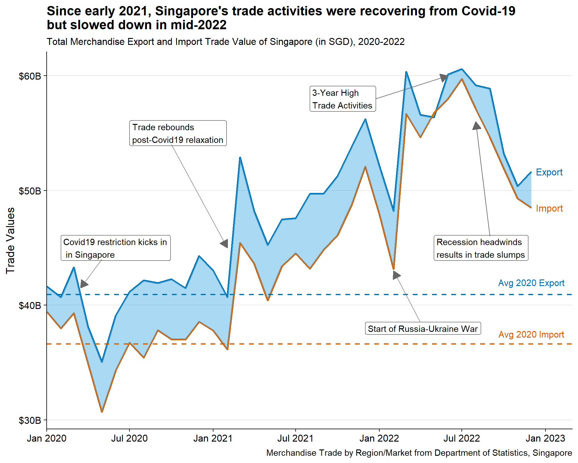
To gain an understanding of import and export trends in Singapore, we will begin with a simple time-series chart covering the period from January 2020 to December 2022.
3.1.1.1 Design Consideration
Instead of using simple line charts, braided ribbon chart is used with the following considerations:
Braided ribbon charts helps to visualise the areas between import and export values, highlighting Singapore trade balance
Reference line will be provided, representing the average import and export values in 2020, which was a year marked by worldwide lockdowns and reduced economic activity due to the Covid-19 pandemic. This time period has been chosen as a relevant benchmark for understanding the impact of the pandemic on import and export trends.
Annotations explaining the events around the world
Tip
Some details in the plot can help to enhance the visual aesthetics, such as:
Using diverging colorblind friendly palette
Display the values in Billions SGD rather than the raw values
Using arrows to aid annotations
Clear intent in title, highlighting the story
Label the lines instead of using legend
3.1.1.2 Preparation of visualisation
Data preparation
Three tibbles are created for the following purpose:
totalsgtrade contains the total import and export values by time, irrespective of countries.
This is created by grouping sgtrade_cln data by Month_Year and Year variables and calculate the total Singapore Import and Export values, irrespective of countries.dplyr::group_by()anddplyr::summarise()functions are used.totalsgtrade_long collapses the Import and Export columns to new variable Type. This is used for geom_line to allow plotting different lines and grouped them by color.
tidyr::pivot_longer()is used to do this.avg_total_2020 creates 1x3 tibble containing the overall average 2020 Singapore import and export values to draw the reference lines. Firstly totalsgtrade is filtered for
Year == 2020. It is then grouped and summarised by mean of Import and Export.
Show the code
#Creating new tibbles to be used for geom_line and geom_braid respectively
totalsgtrade <- sgtrade_cln |>
  group_by(Month_Year, Year) |>
  summarise(Import = sum(Import_SGD),
            Export = sum(Export_SGD))

totalsgtrade_long <- totalsgtrade |>
  pivot_longer(cols = !c(Month_Year, Year),
               names_to = "Type",
               values_to = "Values")

#Creating new tibble to be used for reference line
avg_total_2020 <- totalsgtrade |>
  filter(Year == 2020) |>
  group_by (Year) |>
  summarise(import = mean(Import),
            export = mean(Export))
Plotting the main graph
Steps used to create the plots:
Base plot is created using
ggplot2::geom_lineandggbraid::geom_braidNoteNote that totalsgtrade_long is used in
geom_lineto allow grouping the Type (Import or Export) by color and totalsgtrade is used ingeom_braid. Thefillargument ofgeom_braidis specified asImport<Exportas Trade Surplus happens when Import < Export, andalphaspecified as 0.5 to provide a degree of opacity.Remove the legend using
ggplot2::guides()and add the labels at the end of each line usingdirectlabels:geom_dl(). Note themethodargument specifies gap between the label and the linePlotting the reference line using
ggplot2::geom_hline. Thelinetypeargument is specified as"dashed"to create dashed reference line. Add text on each reference line to indicate “Average 2020” usingggplot2::annotate()Set the colors of the line and ribbons using
scale_color_manual()andscale_color_fill()TipThe color choice for colorblind-friendly is based on this article
As the x-axis is datetime,
scale_x_date()needs to be used, indicating thelimitsof plots,date_breaks, anddate_labelsformat. It is good to set the limit on the first time frame (January 2020) to remove gap on the left-hand side of the graph, henceexpandargument is specified as c(0,0)In order to convert the y-axis in terms of Billions SGD, we need to specify it in the
labelsargument ofscale_y_continuousSet the theme and add titles, subtitles, and captions using
theme()andlabs()functions
Show the code
#Plotting the base plot
br_plot <- ggplot() +
  geom_line(data = totalsgtrade_long,
            aes(x = Month_Year,
                y = Values,
                group = Type,
                color = Type),
            linewidth = 1.2) +

  geom_braid(data = totalsgtrade,
             aes(x = Month_Year,
                 ymin = Import,
                 ymax = Export,
                 fill = Import < Export),
             alpha = 0.5) +

#Remove the legend
  guides(linetype = "none", fill = "none") +

#Adding the 'Import' and 'Export' labels at the end of the line charts
  geom_dl(data = totalsgtrade_long,
          aes(x = Month_Year,
              y = Values,
              label = Type,
              color = Type),
          method = list(dl.trans(x = x + 0.2), "last.points", cex = 1)) +

  geom_dl(data = totalsgtrade_long,
          aes(x = Month_Year,
              y = Values,
              label = Type,
              color = Type),
          method = list(dl.trans(x = x - 0.2), "first.points", cex = 1)) +

#Plotting the reference lines with annotations
  geom_hline(aes(yintercept = avg_total_2020$export),
             col="#0072B2",
             linewidth=0.8,
             linetype = "dashed") +

  annotate(geom = "text",
           x=as.Date("2022-12-01"),
           y=42000000000,
           label="Avg 2020 Export",
           size=4,
           color="#0072B2") +

  geom_hline(aes(yintercept = avg_total_2020$import),
             col="#D55E00",
             linewidth=0.8,
             linetype = "dashed") +

  annotate(geom = "text",
           x=as.Date("2022-12-01"),
           y=37500000000,
           label="Avg 2020 Import",
           size=4,
           color="#D55E00") +

#Setting the colors for the main plot
  scale_color_manual(values = c("#0072B2", "#D55E00"),
                     labels = c("Export", "Import"),
                     name = NULL,
                     guide = "none") +

  scale_fill_manual(values = c("#E69F00", "#56B4E9")) +

#Adjusting the scale
  scale_x_date(expand = c(0,0),
               limits = c(as.Date("2020-01-01"),as.Date("2023-03-01")),
               date_breaks = "6 month",
               date_labels = "%b %Y") +

  scale_y_continuous("Trade Values",
                     labels = function(x){paste0('$', abs(x/1000000000),'B')}) +

#Setting the theme
  cowplot::theme_cowplot() +

  theme(axis.title.x = element_blank(),
        legend.position = 'top',
        legend.justification = 'center',
        panel.grid.major.y = element_line(color = "grey90", linetype = "solid")) +

#Adding title, subtitle, and captions
  labs(title = "Since early 2021, Singapore's trade activities were recovering from Covid-19\nbut slowed down in mid-2022",
         subtitle = "Total Merchandise Export and Import Trade Value of Singapore (in SGD), 2020-2022",
         caption = "Merchandise Trade by Region/Market from Department of Statistics, Singapore")

br_plot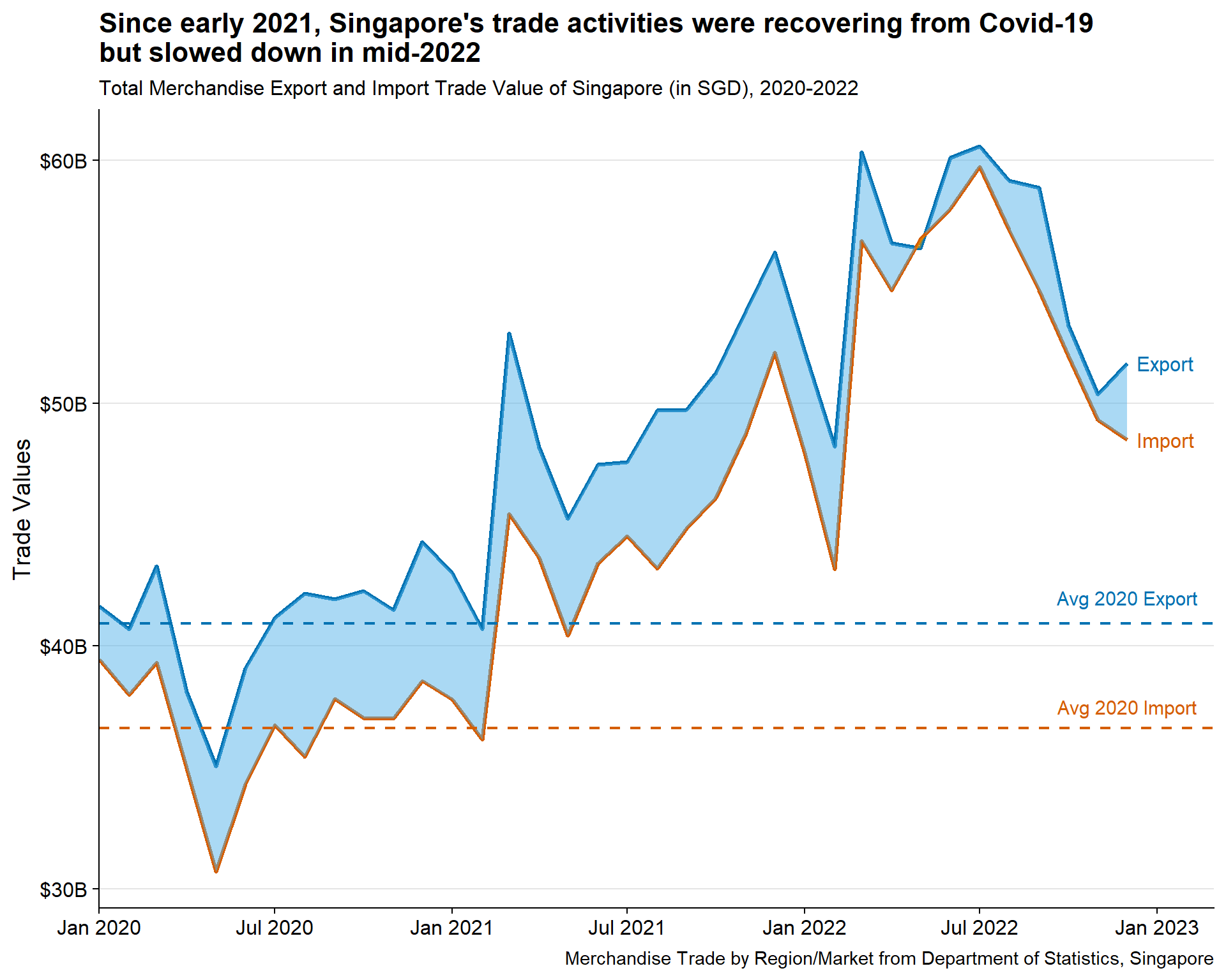
3.1.1.3 Insights
Overall, Singapore maintains trade surplus throughout the duration, except for brief period in May 2022
In March 2020, both Singapore import and export fell further, coinciding with announcement of further Covid-19 restrictions (i.e., circuit breaker)
With gradual reopening of economy (i.e., Phase 3 reopening) in Dec 2020 to February 2021, trade seems to rebound back above the 2020 average. Throughout 2021, both import and export continues to rise
Sudden dip observed around February 2022, coinciding with the start of Russia-Ukraine War
Trade surplus seems to be thinning in 2022, but activities remain high, reaching its peak in August/September 2022
Gradual decline of trade happens after the 3-year peak marking recession headwinds post Q3 2022
With interesting insights observed above, it makes sense to include them in the plot as well. Hence annotate() functions are used to add the text label and arrows. Refer to code below for more details.
Show the code
#Add relevant annotations
br_plot + annotate(geom = "label",
           x = as.Date("2020-02-01"),
           y = 45000000000,
           label = "Covid19 restriction kicks in\n in Singapore",
           hjust = "left",
           color = "black"
           ) +

  annotate(geom = "segment",
           x = as.Date("2020-05-01"),
           y = 44000000000,
           xend = as.Date("2020-03-15"),
           yend = 41500000000,
           color = "grey40",
           arrow = arrow(type = "closed",
                         length = unit(0.15, "inches"))
           ) +

  annotate(geom = "label",
           x = as.Date("2020-07-01"),
           y = 55000000000,
           label = "Trade rebounds\npost-Covid19 relaxation",
           hjust = "left",
           color = "black"
           ) +

  annotate(geom = "segment",
           x = as.Date("2020-10-01"),
           y = 54000000000,
           xend = as.Date("2021-02-01"),
           yend = 45000000000,
           color = "grey40",
           arrow = arrow(type = "closed",
                         length = unit(0.15, "inches"))
           ) +

  annotate(geom = "label",
           x = as.Date("2021-12-01"),
           y = 38000000000,
           label = "Start of Russia-Ukraine War",
           hjust = "left",
           color = "black"
           ) +

  annotate(geom = "segment",
           x = as.Date("2022-04-01"),
           y = 38500000000,
           xend = as.Date("2022-02-01"),
           yend = 43000000000,
           color = "grey40",
           arrow = arrow(type = "closed",
                         length = unit(0.15, "inches"))
           ) +

  annotate(geom = "label",
           x = as.Date("2021-08-01"),
           y = 58000000000,
           label = "3-Year High\nTrade Activities",
           hjust = "left",
           color = "black"
           ) +

  annotate(geom = "segment",
           x = as.Date("2021-12-25"),
           y = 58000000000,
           xend = as.Date("2022-06-01"),
           yend = 60000000000,
           color = "grey40",
           arrow = arrow(type = "closed",
                         length = unit(0.15, "inches"))
           ) +

  annotate(geom = "label",
           x = as.Date("2022-05-01"),
           y = 45000000000,
           label = "Recession headwinds\nresults in trade slumps",
           hjust = "left",
           color = "black"
           ) +

  annotate(geom = "segment",
           x = as.Date("2022-09-01"),
           y = 46000000000,
           xend = as.Date("2022-08-01"),
           yend = 56000000000,
           color = "grey40",
           arrow = arrow(type = "closed",
                         length = unit(0.15, "inches"))
) 
3.1.2 Overview of Singapore Trade Balance by Countries
After data wrangling, the main tibble sgtrade_cln still contains data for 52 countries, making it challenging to identify which ones show interesting trends. A horizon graph provides a solution by allowing for the visualization of massive time-series data, providing an overview of the Singapore trade balance for all countries. This is a better alternative than using a trellis line graph which requires the same scale for all countries and may skew user perspective.
ggHoriPlot::geom_horizon() is used to create the horizon graph.
3.1.2.1 Design Consideration
The dataset poses a challenge due to the large disparity in trading volume between the largest (Mainland China) and smallest (Cyprus) trading partners. Such imbalanced data can draw focus away from smaller partners, which may offer valuable insights. To strike a balance between the scale of importance (i.e., volume) and patterns, we need to be mindful of these differences. Considerations:
There are two options to reduce data imbalance to be considered in this plot :
Plotting by normalised trade balance
Plotting by rate of change of trade balance
Remove outliers when setting the cutpoints to avoid distorting the horizon graph
TipSetting the right cutpoints for horizon graph is important. Hence careful considerations need to be taken with outliers. As such, cutpoints should be set on outlier-free data. This can be done by removing values below the 0.25 quantile - 1.5 times the interquartile range and above the 0.75 quantile + 1.5 times the interquartile range.
Refer to this article for more details on handling outliers from horizon graph
Legends should be removed as the intent of the graph is to detect patterns, hence absolute values are not critical
Other improvements to enhance visual aesthetics like - having clear title, choosing diverging colorblind-friendly pallete
3.1.2.2 Preparation of visualisation
Creating normalisation function
Min-max normalisation is used to convert the data to 0 to 1 scale by applying the following formula
\[ (m - min(m)) / (max(m)-min(m)) \]
As such, simple function called normalit can be created below
#Creating the normalising function
normalit<-function(m){
   (m - min(m))/(max(m)-min(m))
 }
Data preparation
A new tibble called sgtrade_cln_hor is created with two new variables:
Normalised_Trade_Balance is created by applying
normalitfunction to Trade_Balance_SGDPct_Trade_Balance_Change represents the rate of change (%), is created by calculating the difference between adjacent time-series data for each country.
arrange()function is first used to order the tibble based on Countries and Month_Year. The tibble is then grouped by Countries before the new variable is calculated usingmutate()
Show the code
sgtrade_cln_hor <- sgtrade_cln |>

  #Calculating the normalised trade balance
  mutate(Normalised_Trade_Balance = normalit(Trade_Balance_SGD)) |>

  #Calculating the Rate of Change
  arrange(Countries, Month_Year) |>
  group_by(Countries) |>
  mutate(Pct_Trade_Balance_Change = round((Trade_Balance_SGD - lag(Trade_Balance_SGD))*100/lag(Trade_Balance_SGD), 2)) |>
  ungroup()
Setting the cutpoints
ggHoriPlot::geom_horizon() requires two important arguments: origin and horizonscale.
The code chunks below remove the outliers (defined above) from the sgtrade_cln_hor and store them in new tibble cutpoints or curpoints_roc for normalised plot and rate of change plot respectively.
Origin point (ori and ori_roc) is defined as :
For normalised plot, it is defined when absolute trade balance is zero
For rate of change plot, it is defined when the rate of change of trade balance is zero
The scales (sca and sca_roc) are then defined by dividing range of variables to 8 segments. This is done by using seq() function, specifying length.out argument to be 9; removing the 5th element ([-5]) (to be replaced by origin point).
Refer to code chunk below for normalised plot
Show the code
#Removing the outliers from cutpoints
cutpoints <- sgtrade_cln_hor  |>
  mutate(
    outlier = between(
      Normalised_Trade_Balance,
      quantile(Normalised_Trade_Balance, 0.25, na.rm=T)-
        1.5*IQR(Normalised_Trade_Balance, na.rm=T),
      quantile(Normalised_Trade_Balance, 0.75, na.rm=T)+
        1.5*IQR(Normalised_Trade_Balance, na.rm=T))) %>%
  filter(outlier)

#Calculating origin point - when trade balance is 0
ori <- (0 - min(sgtrade_cln_hor$Trade_Balance_SGD))/(max(sgtrade_cln_hor$Trade_Balance_SGD)-min(sgtrade_cln_hor$Trade_Balance_SGD))

#Setting the scales for horizon graph
sca <- seq(range(cutpoints$Normalised_Trade_Balance)[1],
           range(cutpoints$Normalised_Trade_Balance)[2],
           length.out = 9)[-5]
Refer to code chunk below for rate of change plot
Show the code
#Removing the outliers from cutpoints
cutpoints_roc <- sgtrade_cln_hor  |>
  mutate(
    outlier = between(
      Pct_Trade_Balance_Change,
      quantile(Pct_Trade_Balance_Change, 0.25, na.rm=T)-
        1.5*IQR(Pct_Trade_Balance_Change, na.rm=T),
      quantile(Pct_Trade_Balance_Change, 0.75, na.rm=T)+
        1.5*IQR(Pct_Trade_Balance_Change, na.rm=T))) %>%
  filter(outlier)

#Calculating origin point
ori_roc <- 0

#Setting the scales for horizon graph
sca_roc <- seq(range(cutpoints_roc$Pct_Trade_Balance_Change, na.rm=T)[1],
           range(cutpoints_roc$Pct_Trade_Balance_Change, na.rm=T)[2],
           length.out = 9)[-5]
Plotting the main graph
Steps used to create the two plots:
Convert the Countries variable to factor, ordered by trade volumes in descending order using
forcats::fct_reorder()Base plot is created using
ggHoriPlot::geom_horizon(), specifying theoriginandhorizonscalearguments as defined above. Theshow.legendis also specified asFALSESetting the colorblind-friendly diverging palette using
scale_fill_hcl()Facet the plots by rows using
facet_grid()As the x-axis is datetime,
scale_x_date()needs to be used, indicating thedate_breaksanddate_labelsformat.Set the theme and add titles, subtitles, and captions using
theme()andlabs()functions
Show the code
#Converting countries to factor, ordered by trade volumes in descending order
sgtrade_cln_hor$Countries <- fct_reorder(sgtrade_cln_hor$Countries, sgtrade_cln_hor$Total_Trade_Volumes_SGD, .desc = TRUE)

#Plotting the base plot
sgtrade_cln_hor |> ggplot() +
  geom_horizon(aes(x = Month_Year,
                   y = Normalised_Trade_Balance,
                   fill = after_stat(Cutpoints)),
               origin = ori, horizonscale = sca,
               show.legend = FALSE) +

#Setting the color palette
  scale_fill_hcl(palette = 'RdBu') +

#faceted based on Countries
  facet_grid(Countries~.) +

#Adjusting the scale
  scale_x_date(expand=c(0,0),
               date_breaks = "6 month",
               date_labels = "%b\n%Y") +

#Setting the theme
  theme_few() +
  theme(
    panel.spacing.y=unit(0, "lines"),
    axis.title.x = element_blank(),
    strip.text.y = element_text(size = 7, angle = 0, hjust = 0),
    axis.text.y = element_blank(),
    axis.title.y = element_blank(),
    axis.ticks.y = element_blank(),
    panel.border = element_blank(),
    plot.title = element_text(face = "bold")
    ) +

#Adding title, subtitle, and captions
  labs(title = "Singapore's trade surplus is decreasing against major partners post Covid-19 recovery, except with\nHong Kong, Indonesia and Thailand",
         subtitle = "Singapore's trade balance against trading partners arranged by trade volumes, 2020 to 2022",
caption = "Merchandise Trade by Region/Market from Department of Statistics, Singapore") 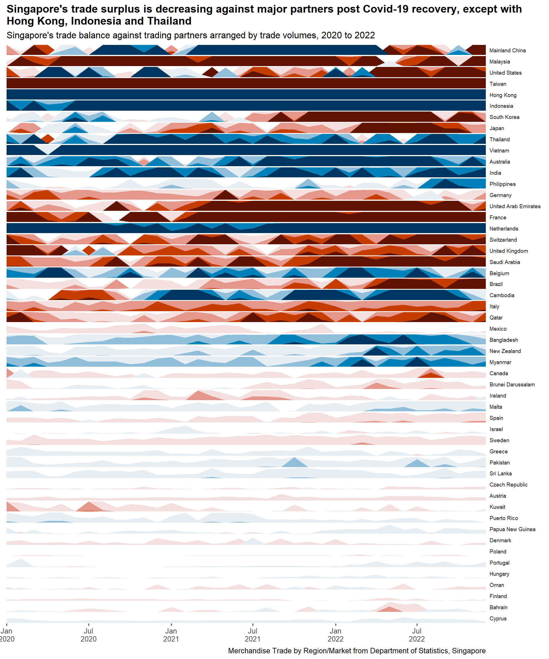
Show the code
#Converting countries to factor, ordered by trade volumes in descending order
sgtrade_cln_hor$Countries <- fct_reorder(sgtrade_cln_hor$Countries, sgtrade_cln_hor$Total_Trade_Volumes_SGD, .desc = TRUE)

#Plotting the base plot
sgtrade_cln_hor |>
  na.omit() |>
  ggplot() +
  geom_horizon(aes(x = Month_Year,
                   y = Pct_Trade_Balance_Change,
                   fill = after_stat(Cutpoints)),
               origin = ori_roc, horizonscale = sca_roc,
               show.legend = FALSE) +

#Setting the color palette
  scale_fill_hcl(palette = 'RdBu') +

#faceted based on Countries
  facet_grid(Countries~.) +

#Adjusting the scale
  scale_x_date(expand=c(0,0),
               date_breaks = "6 month",
               date_labels = "%b\n%Y") +

#Setting the theme
  theme_few() +
  theme(
    panel.spacing.y=unit(0, "lines"),
    axis.title.x = element_blank(),
    strip.text.y = element_text(size = 7, angle = 0, hjust = 0),
    axis.text.y = element_blank(),
    axis.title.y = element_blank(),
    axis.ticks.y = element_blank(),
    panel.border = element_blank(),
    plot.title = element_text(face = "bold")
    ) +

#Adding title, subtitle, and captions
  labs(title = "Volatile changes in Singapore's trade balance against major partners, except with\nTaiwan, Hong Kong, and Indonesia",
         subtitle = "Singapore's trade balance change (MoM%) against trading partners arranged by trade volumes, 2020 to 2022",
caption = "Merchandise Trade by Region/Market from Department of Statistics, Singapore") 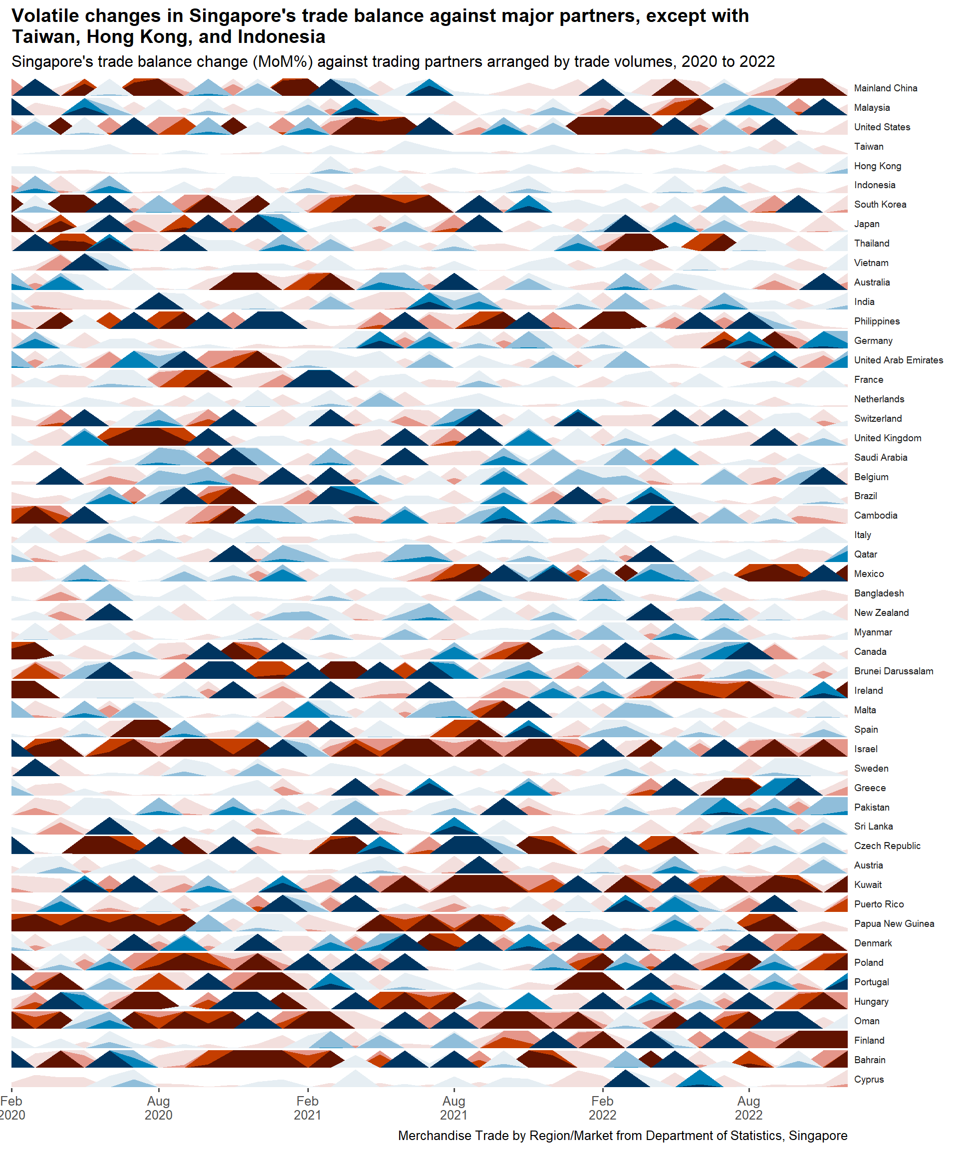
3.1.2.3 Insights
Normalised Trade Balance Plot
- Despite normalization, smaller partners can still be overshadowed by larger ones. To balance the scale of importance and patterns, the plot can guide the filtering out of certain trading partners. Based on the graph, we should not consider trading partners with lower trading volumes than Sri Lanka.
Rate of Change of Trade Balance Plot
- This plot provides a more balanced visualization between smaller and larger trading partners. However, it’s important to note that smaller trading partners exhibit higher intensity, which is expected as small changes in trading balance are overexaggerated due to their smaller volume
3.1.2.4 Selecting Countries for further analysis
Singapore’s trading partners are diverse and can be broadly categorized into Major Partners, Other Regional Partners, European Partners, and Other Minor Partners. For this analysis, 16 countries were selected around the categories based on the following interesting observations:
| Category | Country | Normalised Plot | Rate of Change Plot |
|---|---|---|---|
| Major Partners | Mainland China (Largest partner) |
Prominent swing from surplus to deficit in Q2 2022 | High volatility before mid-2021 and after 2022 |
| Major Partners | Malaysia (Largest ASEAN partner) |
Constant trade deficit but starts to reduce in Q2 2022 | Similar observation |
| Major Partners | United States (Largest Western partner) |
Swing from surplus to deficit from Q2 2021 | High volatility throughout with dominant negative rate of change in Q2 2021 and 2022 |
| Major Partners | South Korea | Large trade deficit starts in Q3 2021 | Prominent negative change preceding the deficit in Q2 2021 |
| Other Regional Partners | Australia | Strong trade surplus recovery from Q2 2021 | Strongly turns positive preceding the trade surplus few months before |
| Other Regional Partners | India | Two major dips in early 2020 and mid 2021 | Stronger trade balance recovery post 2020 dip vs 2021 |
| Other Regional Partners | Philippines | Prominent trade surplus from Q3 2022 | High volatility prior to Q3 2022 |
| Other Regional Partners | Cambodia | Large three export gains in Q1, Q3 2021, and Q2 2022 | Similar observation with negative change prior to that |
| European Partners | Germany (Largest European partner) |
Reducing trade deficit from Q3 2022 | Same observation with prominent single positive change in Q2 2021 |
| European Partners | France | Turns dominant deficit since Q1 2021 | …but preceded by largely positive change |
| European Partners | Switzerland | Turns dominant deficit since Q2 2021 | …but there are spikes of positive change, indicating volatility in trade balance |
| European Partners | United Kingdom | Slight trade surplus in Q2 2020 aside from deficit in other period | …followed by dominant negative change |
| Other Minor Partners | Mexico | Maintaining very close trade balance | … but marked by high volatility post Q2 2021 |
| Other Minor Partners | New Zealand | Prominent trade surplus since Q2 2022 | Same observation |
| Other Minor Partners | Canada | Small deficit peak in Q3 2022 | Same observation in Q3 2022 with opposite impact in Q3 2020 |
| Other Minor Partners | Brunei Darussalam | Turns slight negative post Q2 2021 with small deficit peak in Q2 2022 | High volatility from end 2020 to mid 2021 |
Note
Other countries are not selected because of two possible conditions : 1) their trade volumes are too small (i.e., Bahrain) or 2) there is no interesting patterns (i.e., Indonesia).
3.2 Bi-lateral Trade of Singapore with selected partners
In the previous section, 16 Singapore’s trading partners have been identified to be further examined. This section aims to dissect the general overview further to see whether the patterns identified above can be explained by individual country.
3.2.1 Singapore Trade Performance on Monthly basis
Having a line plot depicting Singapore trade activities are useful, but it might not be obvious enough to spot patterns at the monthly level. As such, calendar heatmap will be used.
3.2.1.1 Design Consideration
Three heatmaps will be generated: two for the entire Singapore’s trade volume and trade balance and one depicting trade balance faceted by each country (16 countries). It does not make sense to depict trade volume by country as the major partners will dominate the map.
Grid design with months in x-axis and year in y-axis. They have to be ordered with the earliest year (2020) being on top
No text will be displayed as the calendar map is to show pattern instead of showing absolute values
For Plot 2 and 3: As Singapore overall trade balance is mostly positive, a imbalanced color scale needs to be used to ensure the neutral color remains at zero.
Tip
Some details in the plot can help to enhance the visual aesthetics, such as:
Using colorblind friendly palette - sequential for Plot1 and diverging for Plot2 and 3
Display the values in Billions SGD rather than the raw values
Clear intent in title, highlighting the story with colored text for highlight
3.2.1.2 Preparation of visualisation
Data preparation
Two tibbles are created for the following purpose:
totalsgtrade_calmap will be used to plot the first map displaying the entire Singapore trade balance. Hence, we can utilise totalsgtrade (refer to Section 3.1.1.2 ) which already contains the total Singapore import and export values, irrespective of countries. However, the Month, Trade_Balance, and Trade Volumes variables need to be regenerated
sgtrade_calmap will be used to plot the second map which is faceted by selected countries. The countries will need to be ordered based on total trade volumes using
forcats::fct_reorder()
Create variable called selected_countries to contain string of the 16 countries
Important
It is important to divide the newly calculated Trade Balance by 1B to display the values in Billions SGD
Show the code
#Creating new tibbles to be used for geom_tile
totalsgtrade_calmap <- totalsgtrade |>
  mutate(Month = factor(format(Month_Year,"%b")), .after = Year) |>
  mutate(Trade_Balance = (Export - Import)/1000000000,
         Trade_Volumes = (Export + Import)/1000000000)

sgtrade_calmap <- sgtrade_cln |>
  mutate(Trade_Balance = Trade_Balance_SGD/1000000000)

#Converting countries to factor, ordered by trade volumes in descending order
sgtrade_calmap$Countries <- fct_reorder(sgtrade_calmap$Countries, sgtrade_calmap$Total_Trade_Volumes_SGD, .desc = TRUE)

#Select the chosen 16 countries
selected_countries = c("Mainland China", "Malaysia", "United States", "South Korea", "Australia", "India", "Philippines", "Cambodia", "Germany", "France", "Switzerland", "United Kingdom", "Mexico", "New Zealand", "Canada", "Brunei Darussalam")
Plotting the main graph
Steps used to create the two plots:
Base plot is created using
ggplot2::geom_tile(), specifying thefillargument by Trade_Volumes (Plot 1) or Trade_Balance (Plot 2 and 3) andcolor(tile border) argument as white. For the second plot, the data is further filtered by selected_countriesTipThe Year variable is converted to factor to be manually ordered to ensure that it appears in ascending order from the top to bottom
For Plot1:
scale_fill_gradient()is used to specify high and low within sequential color scheme.For Plot2 and 3: Setting imbalanced color scale using
scale_fill_gradientn(), specifying that midpoint is 0. The color chosen is colorblind-friendly diverging palettecoord_equal()is used to ensure equal scales for both x and y coordinates. This will create square gridsOnly for second plot : Facet the plots in two columns using
facet_wrap()Set the theme and add titles, subtitles, and captions using
theme()andlabs()functions. Note thataxis.ticksargument is specified aselement_blank()to remove them.Tiptheme_tufte()is chosen as it does not have axis lines and grids, avoiding further requirement to specify them intheme()Tipelement_markdown()argument is set intheme()for the second plot to enable markdown text to be specified in thelabs(title). This will allow specific color to be set on certain word.
Show the code
#Plotting the base plot
ggplot(totalsgtrade_calmap |>
         mutate(Year = factor(Year, levels =c(2022,2021,2020))),
       aes(x = Month,
           y = Year,
           fill = Trade_Volumes)) +

  geom_tile(color = "white") +

#Setting the colors for the main plot
  scale_fill_gradient(name = "Trade Volume (Billions SGD)",
                    low = "#D0E6F3",
                    high = "#0072B2") +

#Ensure equal scales for both coordinates
  coord_equal() +

#Setting the theme to remove the x and y axis
  theme_tufte(base_family = "Helvetica") +

  theme(axis.ticks = element_blank(),
      legend.title = element_text(size = 8),
      legend.text = element_text(size = 6),
      plot.title = element_text(face = "bold")) +

#Adding title, subtitle, and captions
  labs(x = NULL,
     y = NULL,
     title = "Singapore's trade volume rebounds amid Covid recovery from March 2021, peaking in July 2022;\nslight slowdown observed from Oct 2022",
     subtitle = "Singapore Trade Volume by calendar months, 2020-2022",
caption = "Merchandise Trade by Region/Market from Department of Statistics, Singapore") 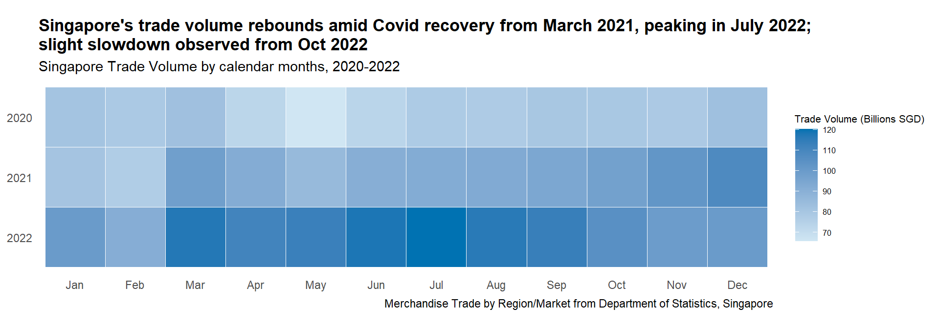
Show the code
#Plotting the base plot
ggplot(totalsgtrade_calmap |>
         mutate(Year = factor(Year, levels =c(2022,2021,2020))),
       aes(x = Month,
           y = Year,
           fill = Trade_Balance)) +

  geom_tile(color = "white") +

#Setting the colors for the main plot
  scale_fill_gradientn(name = "Trade Balance (Billions SGD)",
                     colors=c("#D55E00","grey90","#0072B2"),
                     values=rescale(c(min(totalsgtrade_calmap$Trade_Balance),0,max(totalsgtrade_calmap$Trade_Balance))),
                     limits=c(min(totalsgtrade_calmap$Trade_Balance),max(totalsgtrade_calmap$Trade_Balance))) +

#Ensure equal scales for both coordinates
  coord_equal() +

#Setting the theme to remove the x and y axis
  theme_tufte(base_family = "Helvetica") +

  theme(axis.ticks = element_blank(),
      legend.title = element_text(size = 8),
      legend.text = element_text(size = 6),
      plot.title = element_text(face = "bold")) +

#Adding title, subtitle, and captions
  labs(x = NULL,
     y = NULL,
     title = "Singapore's trade surplus declines in 2022; turning slightly negative in May 2022",
     subtitle = "Singapore Trade Balance by calendar months, 2020-2022",
caption = "Merchandise Trade by Region/Market from Department of Statistics, Singapore") 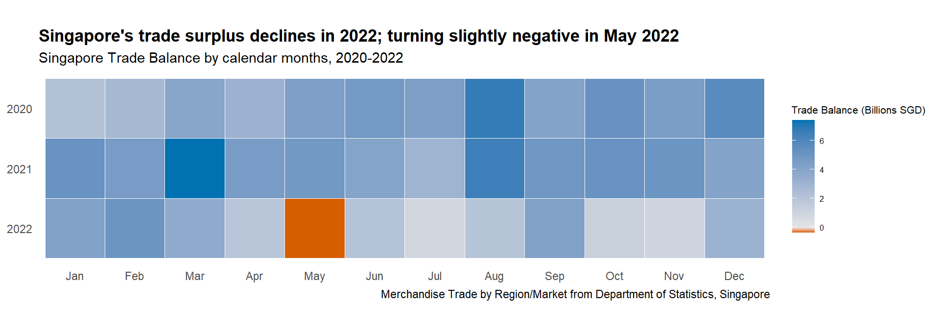
Show the code
#Plotting the base plot
ggplot(sgtrade_calmap |>
         mutate(Year = factor(Year, levels =c(2022,2021,2020))) |>
         filter(Countries %in% selected_countries),
       aes(x = Month,
           y = Year,
           fill = Trade_Balance)) +

  geom_tile(color = "white") +

#Setting the colors for the main plot
  scale_fill_gradientn(name = "Trade Balance (Billions SGD)",
                     colors=c("#D55E00","grey90","#0072B2"),
                     values=rescale(c(min(sgtrade_calmap$Trade_Balance),0,max(sgtrade_calmap$Trade_Balance))),
                     limits=c(min(sgtrade_calmap$Trade_Balance),max(sgtrade_calmap$Trade_Balance)),
                     guide = guide_colorbar(barheight = unit(105, units = "mm"))) +

#Ensure equal scales for both coordinates
  coord_equal() +

#faceted based on Countries
  facet_wrap(~Countries, ncol = 2) +

#Setting the theme to remove the x and y axis
  theme_tufte(base_family = "Helvetica") +

  theme(axis.ticks = element_blank(),
      legend.title = element_text(size = 8),
      legend.text = element_text(size = 8),
      plot.title = element_markdown(face = "bold")) +

#Adding title, subtitle, and captions
  labs(x = NULL,
     y = NULL,
     title = "Singapore's trade balance post Covid recovery: Turns <span style = 'color:#D55E00'>Negative</span> with China, USA, and South Korea;<br><span style = 'color:#0072B2'>Positive</span> with Cambodia",
     subtitle = "Singapore Trade Balance against selected partners by calendar months, 2020-2022",
caption = "Merchandise Trade by Region/Market from Department of Statistics, Singapore") 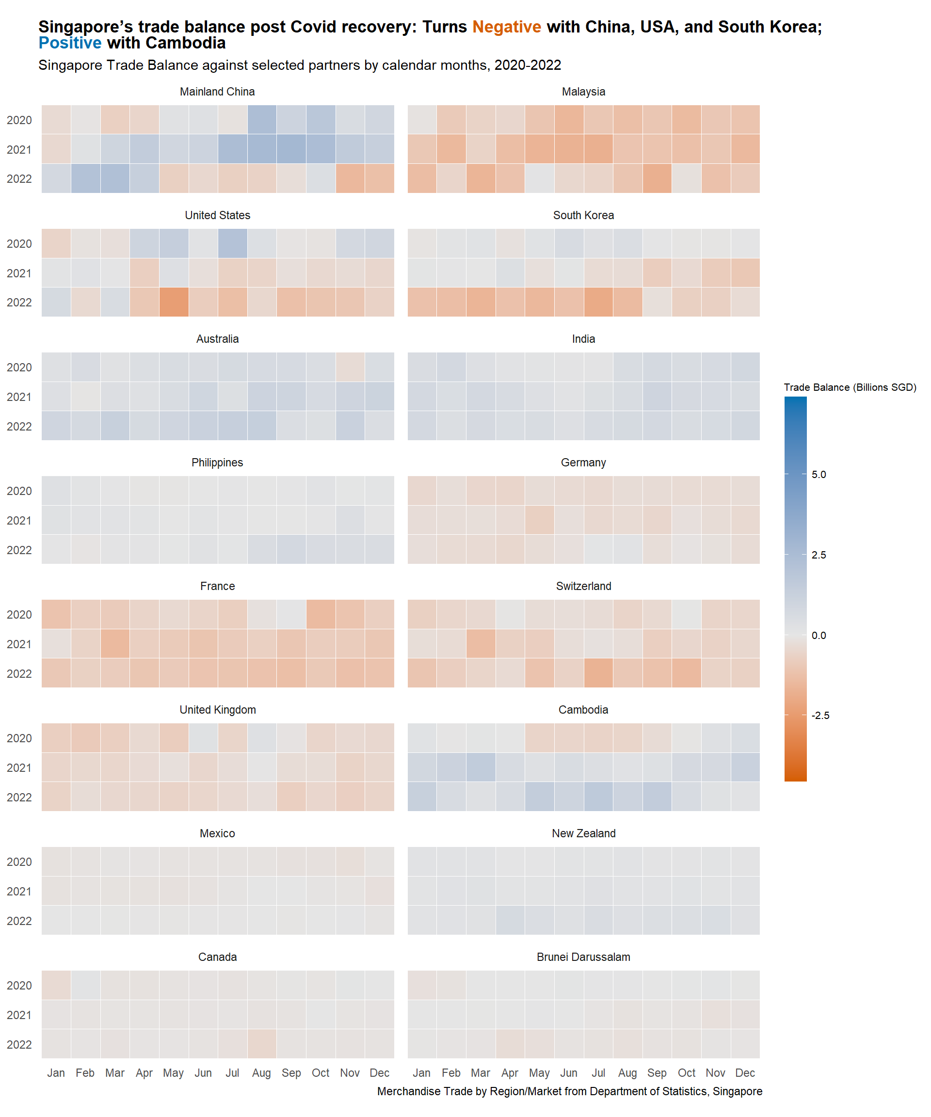
3.2.1.3 Insight
Overall Singapore Calendar Heatmap
Trade Volumes: Continue to recover from March 2021 onward post Covid-restriction throughout 2020. The volumes reached peak in March and July 2022. However, slight slowdown is observed from October 2022 following the onset of recession
Trade Balance: Similar insight can be garnered from Section 3.1.1.3 with Singapore maintaining trade surplus throughout the duration, except for brief period in May 2022. Clear peaks in trade surplus were observed in August 2021, as well as in March and August 2022
No other clear seasonality observed, hence eliminating the need to use cycle plots in this study
Selected Countries Calendar Heatmap
There are a lot of insights to be garnered from here, but only few will be highlighted
Major Partners: Trade surplus turning deficit for all major partners, especially with Mainland China, United States, and South Korea from end 2021 to 2022, explaining the thinning overall trade surplus
Other regional partners: Singapore seems to be maintaining thin surplus with Philippines, which evidently improving from Aug 2022 onward. It is interesting to see the three peaks of trade surplus with Cambodia happening in Mar and Dec 2021, and Jul 2022
European partners: Singapore maintains slight trade deficit with Germany and United Kingdom which seems to be reducing towards end 2022. However the same is not true with France and Switzerland, with worsening trade deficit in 2022
Other minor partners: The calendar heatmap still favors bigger trading partners as smaller partners are overshadowed by the rest.
3.2.2 Singapore Trade Performance with Selected Countries
With insights from the previous sections, it makes sense to focus more on Singapore’s trading performance with selected trading partners. Using the same braided ribbon plot from Section 3.1.1, we can gain a better understanding of import and export trends with individual trading partners.
3.2.2.1 Design Consideration
Braided ribbon charts helps to visualise the areas between import and export values, highlighting Singapore trade balance with each partner organised in trellis chart.
To reduce clutter, the words “Export” and “Import” will be color-coded in the title instead of using legend
Referring to Section 3.1.2.4 , the selected partners are categorised into four groups. Each category will have its own subtitle, and the insights for each group will be further expounded upon
Reference line will be provided, representing the average import and export values in 2020 as explained above in Section 3.1.1.1
To help users understand the scale, the contribution of each trading partner to the total Singapore trade volume will be displayed. This allows each group to have different y-axis scale, helping to bring the minor partners trend to prominence.
Annotations explaining the events around the world
Tip
Some details in the plot can help to enhance the visual aesthetics, such as:
Using diverging colorblind friendly palette
Display the values in Billions SGD rather than the raw values
Using arrows to aid annotations
3.2.2.2 Preparation of visualisation
Creating the plot function
Given the design consideration to have individual subtitle for each group of countries, it makes sense patch the title together using patchwork library. As such, the codes to process the data and plot the graph are wrapped in R function, taking in the list of countries for each group as input.
Steps used to create the function:
Create function called
plot_braid_ctry, taking selected_countries as inputConvert the Countries variable to factor, ordered by trade volumes in descending order using
forcats::fct_reorder()Create new tibble sgtrade_cln_long which collapses the Import_SGD and Export_SGD columns to new variable Type. This is used for geom_line to allow plotting different lines and grouped them by color.
tidyr::pivot_longer()is used to do this.avg_total_ctry_2020 creates 1x3 tibble containing the average 2020 Singapore import and export values by country to draw the reference lines. Firstly sgtrade_cln is filtered for
Year == 2020. It is then grouped and summarised by mean of Import_SGD and Export_SGD.NoteNote that min_import_export variable is created as reference variable to place the “Avg 2020” text in the plot
To create dynamic labels in each facet, another function called
appenderis defined to append the country’s name with eachPct_Total_Trade_VolumesTippaste0()function is used to combine the Pct_Total_Trade_Volumes and string “% of Total Volumes”The rest of the steps mimic the same braided ribbon plot codes created in Section 3.1.1.2 Plotting the main graph with the addition of faceting the plots by column using
facet_wrap()Tipthe
appenderfunction is used in thelabellerargument offacet_wrap()to create the dynamic labels
Show the code
#Write function so the plots can be patched separately
plot_braid_ctry <- function(selected_countries) {

#Converting countries to factor, ordered by trade volumes in descending order
sgtrade_cln$Countries <- fct_reorder(sgtrade_cln$Countries, sgtrade_cln$Total_Trade_Volumes_SGD, .desc = TRUE)

#Creating new tibble to be used for geom_line
sgtrade_cln_long <- sgtrade_cln |>
  select(Month_Year, Countries, Year, Import_SGD, Export_SGD, Pct_Total_Trade_Volumes) |>
  pivot_longer(cols = c(Import_SGD, Export_SGD),
               names_to = "Type",
               values_to = "Values")

#Creating new tibble to be used for reference line
avg_total_ctry_2020 <- sgtrade_cln |>
  filter(Year == 2020) |>
  group_by (Year, Countries) |>
  summarise(import = mean(Import_SGD),
            export = mean(Export_SGD)) |>
  mutate(Year_date = as.Date(paste(Year, "-01-01", sep = ""))) |>
  rowwise() |> mutate(min_import_export = min(import, export))


#Creating additional label to display % of total trade for every country
label_ctry <- sgtrade_top_ctry |>
  filter(Countries %in% selected_countries)

Ctry_labels <- paste0("\n",label_ctry$Pct_Total_Trade_Volumes,"% of Total Volumes")

appender <- function(string, suffix = Ctry_labels) paste0(string, suffix)


#Plotting the base plot
ggplot(data = sgtrade_cln_long |>
         filter(Countries %in% selected_countries)) +

  geom_line(data = sgtrade_cln_long |>
              filter(Countries %in% selected_countries),
            aes(x = Month_Year,
                y = Values,
                color = Type),
            linewidth = 1.2,
            show.legend = FALSE) +

  geom_braid(data = sgtrade_cln |>
              filter(Countries %in% selected_countries),
             aes(x = Month_Year,
                 ymin = Import_SGD,
                 ymax = Export_SGD,
                 fill = Import_SGD < Export_SGD),
             alpha = 0.5) +

#Remove the legend
  guides(linetype = "none", fill = "none") +

#Plotting the reference lines with annotations
  geom_hline(data = avg_total_ctry_2020|>
              filter(Countries %in% selected_countries),
             aes(yintercept = export),
             col = "#0072B2",
             linewidth=0.8,
             linetype = "dashed") +

  geom_hline(data = avg_total_ctry_2020|>
               filter(Countries %in% selected_countries),
             aes(yintercept = import),
             col = "#D55E00",
             linewidth=0.8,
             linetype = "dashed") +

  geom_text(data = avg_total_ctry_2020|>
               filter(Countries %in% selected_countries),
            aes(x = Year_date,
                y = min_import_export - 0.25*min_import_export,
                label = "Avg 2020"),
            size = 3.5,
            nudge_x = +920) +

#Setting the colors for the main plot
  scale_color_manual(values = c("#0072B2", "#D55E00"),
                     labels = c("Export", "Import"),
                     name = NULL) +

  scale_fill_manual(values = c("#E69F00", "#56B4E9")) +

#Adjusting the scale
  scale_x_date(expand = c(0,0),
               limits = c(as.Date("2020-01-01"),as.Date("2022-12-31")),
               date_breaks = "1 year",
               date_labels = "%Y") +

  scale_y_continuous("Trade Values",
                     labels = function(x){paste0('$', abs(x/1000000000),'B')}) +

#Faceted based on Countries
  facet_wrap(vars(Countries), ncol=4, labeller=as_labeller(appender)) +

#Setting the theme
  cowplot::theme_cowplot() +

  theme(axis.title.x = element_blank(),
        panel.grid.major.y = element_line(color = "grey90", linetype = "solid"),
        panel.border = element_rect(color = "grey60", linetype = "solid", linewidth = 0.5),
        panel.spacing.x = unit(0,"line"),
        panel.spacing.y = unit(0,"line"))

}
Plotting the main visualisation
As there are four groups of countries, we will create four separate plots, namely p1, p2, p3 and p4, representing Major Partners, Other Regional Partners, European Partners, and Other Minor Partners respectively.
Steps used to create the visualisation:
To allow individual annotations in each facet, we need to specify the annotations for each plot, defining the label and arrows arguments. Each label and arrow arguments are combined into dataframe, created using
data.frame()function to combine thelabel, Countries,x, andycoordinates of the text.Each plot is created using the
plot_braid_ctry()function defined above with list of countries from each group as input. After which, the following functions are usedgeom_label() is used to display the annotation in label format, taking input of label dataframe created above
geom_segment() is used to display the arrow, taking input of arrow dataframe created above
Set the theme and add titles, subtitles, and captions using
theme()andlabs()functionsTipelement_markdown()argument is set intheme()to enable markdown text to be specified in thelabs(title). This will allow specific color to be set on “Export” and “Import”.
Show the code
#Specifying the annotation for p1
p1_text <- data.frame(label = c("Major lockdown\nin Shanghai", "", "War in Ukraine", "Covid recovery"),
Countries = c("Mainland China", "Malaysia", "United States", "South Korea"),
x = c(as.Date("2021-01-01"), 0, as.Date("2021-01-01"), as.Date("2020-10-01")),
y = c(1500000000, 0, 1500000000, 7500000000))
arrowp1<- data.frame(Countries = c("Mainland China", "Malaysia", "United States", "South Korea"),
x = c(as.Date("2021-01-01"), 0, as.Date("2021-01-01"), as.Date("2020-10-01")),
y = c(2700000000, 0, 2100000000, 7000000000),
xend = c(as.Date("2022-02-01"), 0, as.Date("2022-02-01"), as.Date("2021-04-01")),
yend = c(4500000000, 0, 4100000000, 2500000000))
p1_text$Countries <- factor(c("Mainland China", "Malaysia", "United States", "South Korea"))
arrowp1$Countries <- factor(c("Mainland China", "Malaysia", "United States", "South Korea"))
#Specifying the annotation for p2
p2_text <- data.frame(label = c("Start of\nrecession", "Covid Waves", "Start of\nrecession", "Reversal in\nBalance"),
Countries = c("Australia", "India", "Philippines", "Cambodia"),
x = c(as.Date("2020-08-01"), as.Date("2020-10-01"), as.Date("2020-08-01"), as.Date("2020-09-01")),
y = c(2000000000, 2000000000, 2000000000, 2000000000))
arrowp2<- data.frame(Countries = c("Australia", "India", "Philippines", "Cambodia"),
x = c(as.Date("2021-02-01"), as.Date("2020-10-01"), as.Date("2021-02-01"), as.Date("2020-09-01")),
y = c(2000000000, 1850000000, 2000000000, 1700000000),
xend = c(as.Date("2022-07-01"), as.Date("2020-04-01"), as.Date("2022-07-01"), as.Date("2020-10-01")),
yend = c(2000000000, 600000000, 1400000000, 200000000))
arrowp2a<- data.frame(Countries = c("Australia", "India", "Philippines", "Cambodia"),
x = c(as.Date("1970-01-01"), as.Date("2020-10-01"), 0, 0),
y = c(0, 1850000000, 0, 0),
xend = c(as.Date("1970-01-01"), as.Date("2021-06-01"), 0, 0),
yend = c(0, 1100000000, 0, 0))
p2_text$Countries <- factor(c("Australia", "India", "Philippines", "Cambodia"))
arrowp2$Countries <- factor(c("Australia", "India", "Philippines", "Cambodia"))
arrowp2a$Countries <- factor(c("Australia", "India", "Philippines", "Cambodia"))
#Specifying the annotation for p3
p3_text <- data.frame(label = c("Surge in\nExports", "", "", "Surge in\nExports"),
Countries = c("Germany", "France", "Switzerland", "United Kingdom"),
x = c(as.Date("2020-9-01"), 0, 0, as.Date("2022-6-01")),
y = c(1700000000, 0, 0, 1700000000))
arrowp3<- data.frame(Countries = c("Germany", "France", "Switzerland", "United Kingdom"),
x = c(as.Date("2021-02-01"), 0, 0, as.Date("2022-01-01")),
y = c(1700000000, 0, 0, 1700000000),
xend = c(as.Date("2022-08-01"), 0, 0, as.Date("2020-09-01")),
yend = c(1300000000, 0, 0, 1200000000))
p3_text$Countries <- factor(c("Germany", "France", "Switzerland", "United Kingdom"))
arrowp3$Countries <- factor(c("Germany", "France", "Switzerland", "United Kingdom"))
#Specifying the annotation for p4
p4_text <- data.frame(label = c("Reduced Trade\nDeficit", "Enhanced\nPartnership", "Surge in\nImports", "Surge in\nImports"),
Countries = c("Mexico", "New Zealand", "Canada", "Brunei Darussalam"),
x = c(as.Date("2020-12-01"), as.Date("2020-10-01"), as.Date("2020-10-01"), as.Date("2020-10-01")),
y = c(600000000, 600000000, 600000000, 600000000))
arrowp4<- data.frame(Countries = c("Mexico", "New Zealand", "Canada", "Brunei Darussalam"),
x = c(as.Date("2021-9-01"), as.Date("2021-05-01"), as.Date("2021-03-15"), as.Date("2021-03-15")),
y = c(600000000, 600000000, 600000000, 600000000),
xend = c(as.Date("2022-02-01"), as.Date("2022-03-01"), as.Date("2022-05-01"), as.Date("2022-07-01")),
yend = c(250000000, 300000000, 400000000, 550000000))
p4_text$Countries <- factor(c("Mexico", "New Zealand", "Brunei Darussalam", "Canada"))
arrowp4$Countries <- factor(c("Mexico", "New Zealand", "Brunei Darussalam", "Canada"))
#Plotting the graph
p1a <- plot_braid_ctry(c("Mainland China", "Malaysia", "United States", "South Korea"))
p1 <- p1a +
geom_label(data = p1_text,
aes(x = x,
y = y,
label = label)) +
geom_segment(data = arrowp1,
aes(x = x, xend = xend, y = y, yend = yend),
colour = "black", alpha=0.9, arrow = arrow(type = "closed",length = unit(0.1, "inches"))) +
labs(subtitle = "Singapore merchandise trade volume with ***major partners*** rebounds amid Covid-19 recovery, but deficit worsens;<br>recession shrinks trade further in mid-2022") +
theme(plot.subtitle = element_markdown())
p2a <- plot_braid_ctry(c("Australia", "India", "Philippines", "Cambodia"))
p2 <- p2a +
geom_label(data = p2_text,
aes(x = x,
y = y,
label = label)) +
geom_segment(data = arrowp2,
aes(x = x, xend = xend, y = y, yend = yend),
colour = "black", alpha=0.9, arrow = arrow(type = "closed",length = unit(0.1, "inches"))) +
geom_segment(data = arrowp2a,
aes(x = x, xend = xend, y = y, yend = yend),
colour = "black", alpha=0.9, arrow = arrow(type = "closed",length = unit(0.1, "inches"))) +
labs(subtitle = "<span style = 'color:#0072B2'>Exports</span> bounced back with ***other regional partners*** with Covid-19 recovery; but hit by recession in 2022") +
theme(plot.subtitle = element_markdown())
p3a <- plot_braid_ctry(c("Germany", "France", "Switzerland", "United Kingdom"))
p3 <- p3a +
geom_label(data = p3_text,
aes(x = x,
y = y,
label = label)) +
geom_segment(data = arrowp3,
aes(x = x, xend = xend, y = y, yend = yend),
colour = "black", alpha=0.9, arrow = arrow(type = "closed",length = unit(0.1, "inches"))) +
labs(subtitle = "<span style = 'color:#D55E00'>Imports</span> rise and volatility worsens amid Covid-19 recovery, but exports to ***major European partners*** stay sluggish") +
theme(plot.subtitle = element_markdown())
p4a <- plot_braid_ctry(c("Mexico", "New Zealand", "Canada", "Brunei Darussalam"))
p4 <- p4a +
geom_label(data = p4_text,
aes(x = x,
y = y,
label = label)) +
geom_segment(data = arrowp4,
aes(x = x, xend = xend, y = y, yend = yend),
colour = "black", alpha=0.9, arrow = arrow(type = "closed",length = unit(0.1, "inches"))) +
labs(subtitle = "Trade volume also makes recovery with ***minor partners*** in 2022, with <span style = 'color:#0072B2'>exports</span> growing to Mexico and New Zealand") +
theme(plot.subtitle = element_markdown())
#Patching everything together
final_plot <- p1 / p2 / p3 / p4
final_plot + plot_annotation(
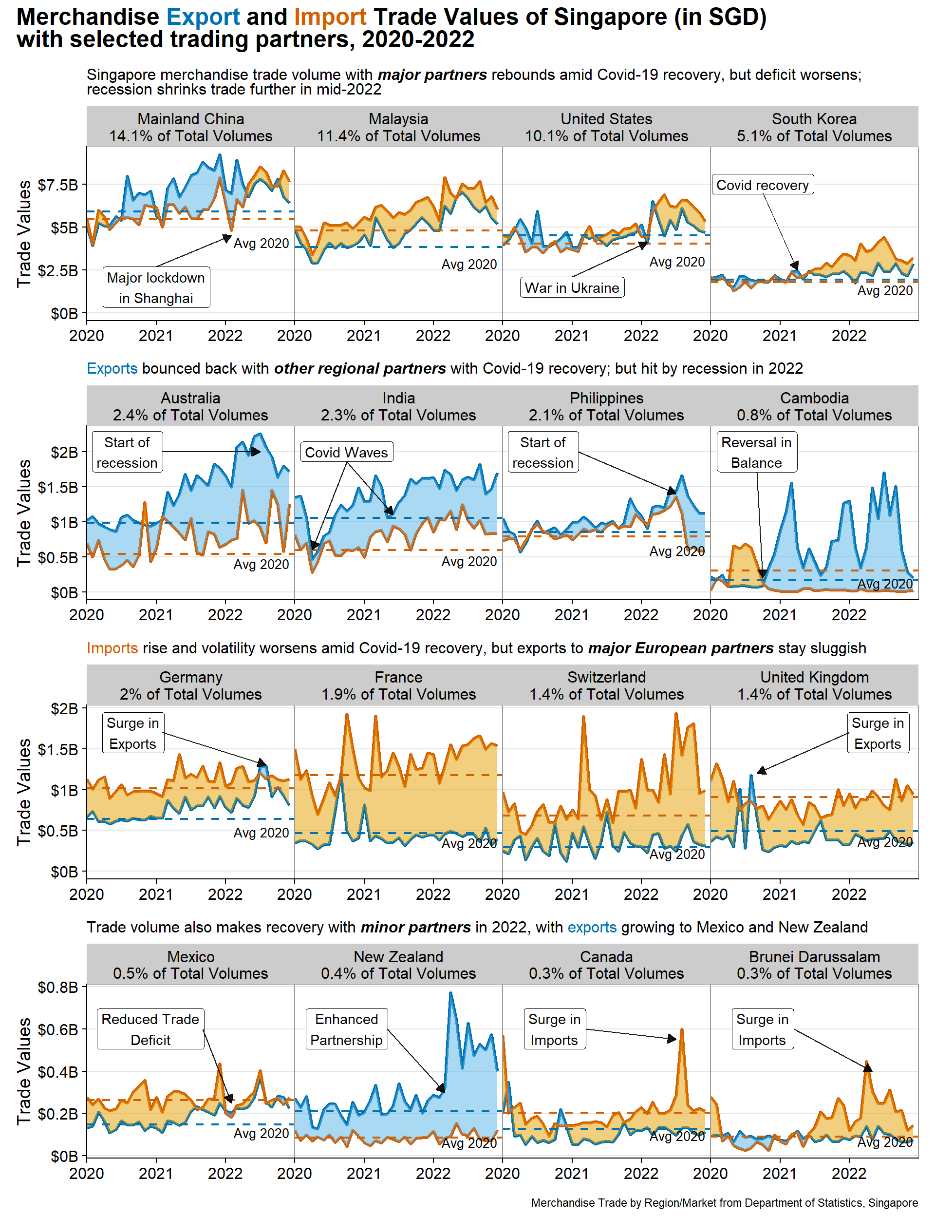
title = "Merchandise <span style = 'color:#0072B2'>Export</span> and <span style = 'color:#D55E00'>Import</span> Trade Values of Singapore (in SGD)<br>with selected trading partners, 2020-2022",
caption = "Merchandise Trade by Region/Market from Department of Statistics, Singapore",
theme = theme(plot.title = element_markdown(face = "bold", size = 18))
)
3.2.2.3 Insights
Major partners: Trade volume has rebounded since Covid-19, but the trade deficit worsened from 2022. A sudden drop in trade with China, Malaysia, and the USA occurred in early 2022 due to major Shanghai lockdown and the start of the war in Ukraine. Trade volume shrinks in mid-2022 likely due to the recession
Other regional partners: Exports rebounded after Covid-19, resulting in a surplus. However, trade starts to drop in mid-2022 due to the recession. The impact of two major Covid waves in India is evident, and trade with Cambodia showed a major surplus from Q3 2020
European partners: There is high volatility in trade amid Covid-19 recovery, with a rise in imports and sluggish exports, worsening Singapore’s trade deficit. There was a surge in exports to France, the UK, and Germany in 2020/2022
Other minor partners: Trade volume has rebounded, with rising exports to New Zealand (signed Enhanced Partnership) and reduced deficit with Mexico. However, there was a large surge of imports from Canada and Brunei in Q2/Q3 2022.
3.2.3 Year-over-Year changes between 2020 and 2022
So far, we have examined Singapore trade performance with the selected partners from monthly basis (calendar heatmap) and from overall timeline (trellis braided ribbon chart). However, an additional perspective is Year-over-Year (Y-o-Y) comparison, which shows how trade performance has changed for the same period in different years. We are interested to examine how Singapore’s trade performance with selected countries has evolved from 2020 to 2022.
3.2.3.1 Design Consideration
Slopegraph is the perfect visualisation method for this purpose as it helps to compare the change from different points in time. The steeper the slope, the bigger the change; and, if one thing is going up more dramatically than its neighbors, a slopegraph will make that easier to see than a traditional line graph would
The parameters to compare would be trade volume, trade balance, imports and exports
NoteNormalised parameter will not make sense here as the data label is important for slopegraph for users to visualise actual change. Hence it is expected that this graph might overemphasize large trading partners.
We will compare Q3 2020 with Q3 2022 based on the previous section’s analysis. This period in 2020 marked the settling of major lockdowns around the world, while in 2022, it is just before the recession, providing stability in the data
The lines will be color-coded to highlight significant changes in exports and imports or increase and decrease in trade volume
Tip
Some details in the plot can help to enhance the visual aesthetics, such as:
Using colorblind friendly palette
Display the values in Billions SGD rather than the raw values
Clear intent in title, highlighting the story with colored text for highlight
3.2.3.2 Preparation of visualisation
Data preparation
A new tibble called sgtrade_cln_qtr is created by deriving Quarter variable from Month_Year and convert it to factor. This is achieved using Base R paste0() and factor() functions and lubridate::quarter() function. The tibble is then filtered only for period of interest which is Q3 2020 and Q3 2022 using dplyr::filter(). The tibble is then further grouped by Countries and Quarter to summarise the trade balance, volumes, import and exports.
New variable called selected_countries is also created to contain string of the 16 countries
Show the code
#Creating new tibble to group time to quarter and summarise the data in quarter
sgtrade_cln_qtr <- sgtrade_cln |>
  mutate(Quarter = factor(paste0("Q", quarter(Month_Year), " ", year(Month_Year))), .after = Month) |>
  filter(Quarter %in% c("Q3 2020", "Q3 2022")) |>
  group_by(Countries, Quarter) |>
  summarise(Total_Trade_Balance_BSGD = round(sum(Trade_Balance_SGD)/1000000000, 2),
            Total_Trade_Volumes_BSGD = round(sum(Trade_Volumes_SGD)/1000000000, 2),
            Total_Import_BSGD = round(sum(Import_SGD)/1000000000, 2),
            Total_Export_BSGD = round(sum(Export_SGD)/1000000000, 2))

#Select the chosen 16 countries
selected_countries = c("Mainland China", "Malaysia", "United States", "South Korea", "Australia", "India", "Philippines", "Cambodia", "Germany", "France", "Switzerland", "United Kingdom", "Mexico", "New Zealand", "Canada", "Brunei Darussalam")
Plotting the main graph
Steps used to create the four plots:
A new tibble to specify the color coding of lines is created. Firstly, sgtrade_cln_qtr needs to be reformat using
tidyr::pivot_wider()to move the two periods (Q3 2020 and Q3 2022) to column.dplyr::mutate()is then used to calculate the difference between the two periods andcase_when()is used to assign color to each difference depending on the significance level manually specifiedTipThe new tibble is then converted to vector using
tibble::deframe(), using Country column as name and the color column as value. This allows it to be used as input toLineColorargument inCGPfunctions::newggslopegraph()The base plot is created using
CGPfunctions::newggslopegraph()to create Tufte style slopegraph. Thedataframeused is sgtrade_cln_qtr filtered by selected_countries,Timesis specified as Quarter, andGroupingas Countries. The Title, Subtitle, and Caption are also specified accordinglyTipWiderLabelsargument is set asTRUEas theGroupingvariable values are long. This setting gives them more room in the same plot size.
Show the code
#Creating custom colors based on difference in parameters
custom_colors_tradevol <- sgtrade_cln_qtr |>
  pivot_wider(id_cols = Countries,
              names_from = Quarter,
              values_from = Total_Trade_Volumes_BSGD) |>

  mutate(diff_Total_Trade_Volumes = `Q3 2022` - `Q3 2020`) |>

  mutate(col_Total_Trade_Volumes = case_when(
    diff_Total_Trade_Volumes > 3 ~"#332288",
    diff_Total_Trade_Volumes <= -0.5 ~"#CC6677",
      TRUE ~ "grey"
    )) |>

#Convert the tibble to vector
    select(Countries, col_Total_Trade_Volumes) |>
    deframe()

#Plotting the base plot
  newggslopegraph(dataframe = sgtrade_cln_qtr |>
                    filter(Countries %in% selected_countries),
                  Times = Quarter,
                  Measurement = Total_Trade_Volumes_BSGD,
                  Grouping = Countries,
                  Title = "Y-o-Y Change in Singapore Merchandise Trade Volumes (Billion SGD)",
                  SubTitle = "Q3 2020 to Q3 2022",
                  Caption = "Merchandise Trade by Region/Market from Department of Statistics, Singapore",
                  LineColor = custom_colors_tradevol, #The vector is used here
                  LineThickness = 0.7,
                  ThemeChoice = "gdocs",
                  WiderLabels = TRUE)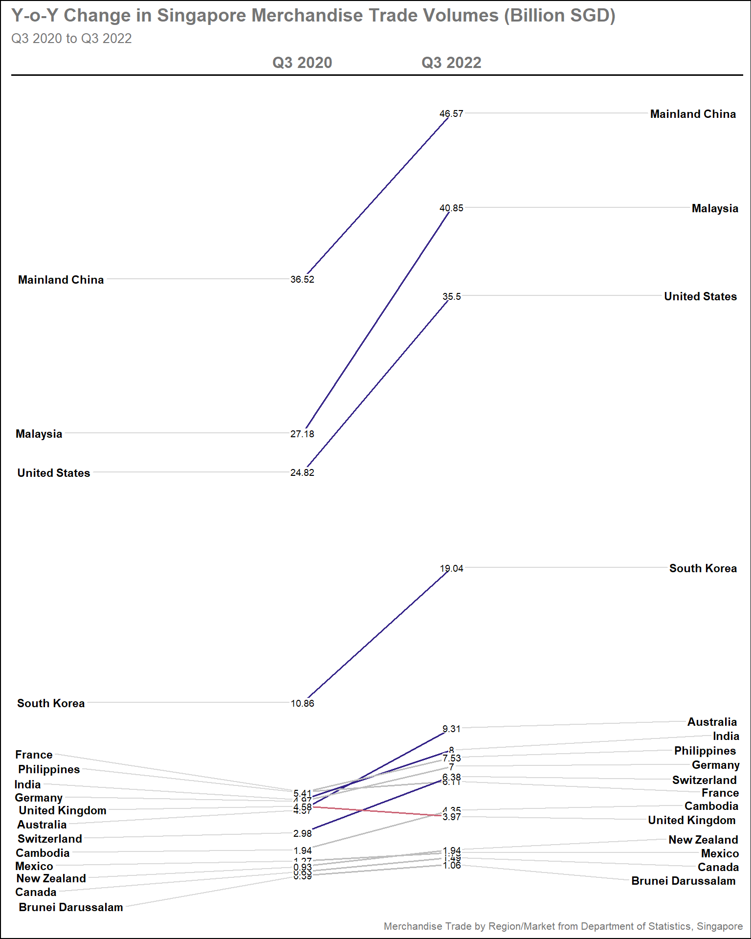
Show the code
#Creating custom colors based on difference in parameters
custom_colors_tradebal <- sgtrade_cln_qtr |>

  pivot_wider(id_cols = Countries,
                names_from = Quarter,
                values_from = Total_Trade_Balance_BSGD) |>

  mutate(diff_Total_Trade_Balance = `Q3 2022` - `Q3 2020`) |>

  mutate(col_Total_Trade_Balance = case_when(
      diff_Total_Trade_Balance > 0.5 ~"#0072B2",
      diff_Total_Trade_Balance <= -0.5 ~"#D55E00",
      TRUE ~ "grey"
    )) |>

#Convert the tibble to vector
    select(Countries, col_Total_Trade_Balance) |>
    deframe()

#Plotting the base plot
  newggslopegraph(dataframe = sgtrade_cln_qtr |>
                    filter(Countries %in% selected_countries),
                  Times = Quarter,
                  Measurement = Total_Trade_Balance_BSGD,
                  Grouping = Countries,
                  Title = "Y-o-Y Change in Singapore Merchandise Trade Balance (Billion SGD)",
                  SubTitle = "Q3 2020 to Q3 2022",
                  Caption = "Merchandise Trade by Region/Market from Department of Statistics, Singapore",
                  LineColor = custom_colors_tradebal, #The vector is used here
                  LineThickness = 0.7,
                  ThemeChoice = "gdocs",
                  WiderLabels = TRUE)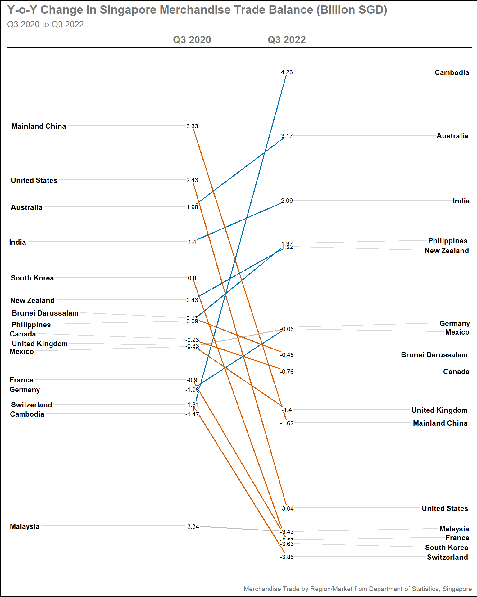
Show the code
#Creating custom colors based on difference in parameters
custom_colors_import <- sgtrade_cln_qtr |>
  pivot_wider(id_cols = Countries,
              names_from = Quarter,
              values_from = Total_Import_BSGD) |>

  mutate(diff_Total_Import = `Q3 2022` - `Q3 2020`) |>

  mutate(col_Total_Import = case_when(
      diff_Total_Import > 1 ~"#D55E00",
      diff_Total_Import <= -1 ~"#0072B2",
      TRUE ~ "grey"
    )) |>

#Convert the tibble to vector
    select(Countries, col_Total_Import) |>
    deframe()

#Plotting the base plot
  newggslopegraph(dataframe = sgtrade_cln_qtr |>
                    filter(Countries %in% selected_countries),
                  Times = Quarter,
                  Measurement = Total_Import_BSGD,
                  Grouping = Countries,
                  Title = "Y-o-Y Change in Singapore Merchandise Import Values (Billion SGD)",
                  SubTitle = "Q3 2020 to Q3 2022",
                  Caption = "Merchandise Trade by Region/Market from Department of Statistics, Singapore",
                  LineColor = custom_colors_import, #The vector is used here
                  LineThickness = 0.7,
                  ThemeChoice = "gdocs",
                  WiderLabels = TRUE)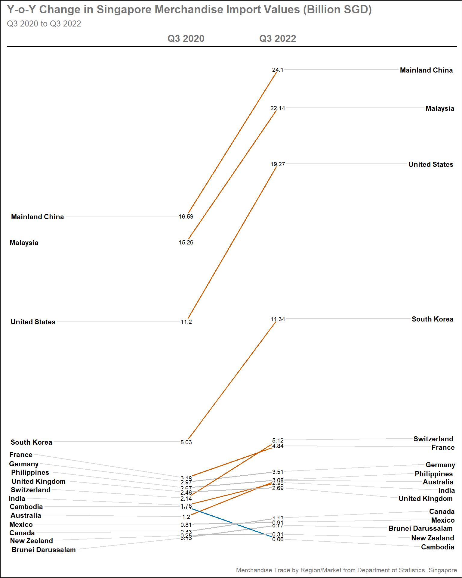
Show the code
#Creating custom colors based on difference in parameters
custom_colors_export <- sgtrade_cln_qtr |>
  pivot_wider(id_cols = Countries,
                names_from = Quarter,
                values_from = Total_Export_BSGD) |>

  mutate(diff_Total_Export = `Q3 2022` - `Q3 2020`) |>

  mutate(col_Total_Export = case_when(
      diff_Total_Export > 1 ~"#0072B2",
      diff_Total_Export <= -1 ~"#D55E00",
      TRUE ~ "grey"
    )) |>

#Convert the tibble to vector
    select(Countries, col_Total_Export) |>
    deframe()

#Plotting the base plot
  newggslopegraph(dataframe = sgtrade_cln_qtr |>
                    filter(Countries %in% selected_countries),
                  Times = Quarter,
                  Measurement = Total_Export_BSGD,
                  Grouping = Countries,
                  Title = "Y-o-Y Change in Singapore Merchandise Export Values (Billion SGD)",
                  SubTitle = "Q3 2020 to Q3 2022",
                  Caption = "Merchandise Trade by Region/Market from Department of Statistics, Singapore",
                  LineColor = custom_colors_export, #The vector is used here
                  LineThickness = 0.7,
                  ThemeChoice = "gdocs",
                  WiderLabels = TRUE)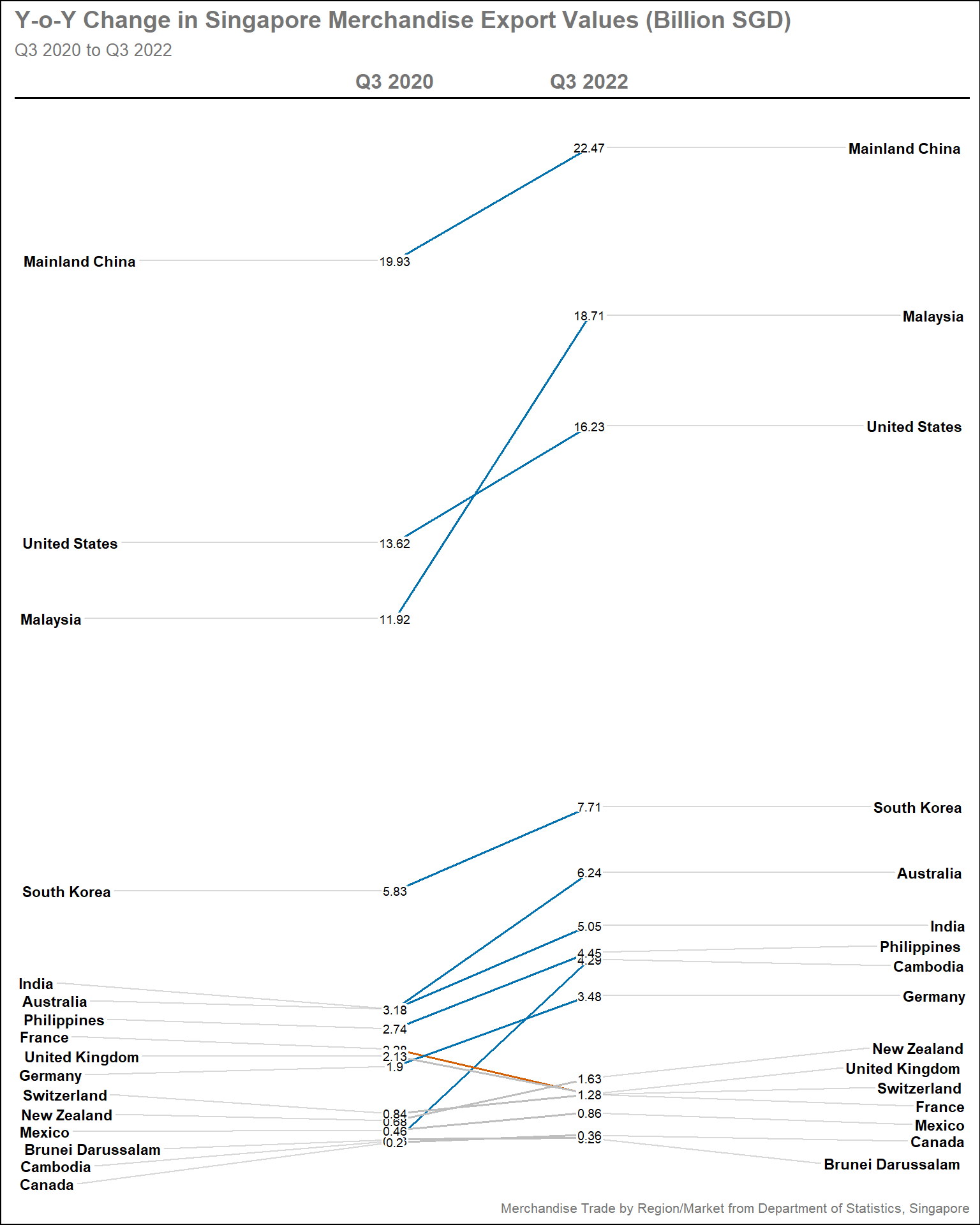
3.2.3.3 Insights
As expected the smaller trading partners are overshadowed, purely due to the different scale of volumes that they are trading. However, there are interesting trends
Trade Volume: Trading volumes grow with all trading partners, except with UK which seems to shrink. It is noted that this is due to large export surge in Q2/3 2020
Trade Balance: Biggest trade surplus is achieved with Cambodia, which is significant given its status as minor partners. Largest trade deficits are seen with major partners like China, USA, and South Korea.
Imports: This graph complement the Trade Balance, highlighting significant imports gain with the trading partners, explaining the large trade deficits. Imports fell with Cambodia, partially explaining the large gain in surplus
Exports: Exports grow with major partners, with Malaysia and Cambodia having the steepest increase. Exports remain sluggish with European partners, except with Germany
3.3 Changes in Import and Export over time
A lot of emphasis in above sections are placed in trade balance and volume individually, yet there is an interactive way to see both in the same plot in relation to import and export values by using animation. The purpose of this plot is to display how Singapore trading performance fare with each countries over the period of study.
3.3.1 Design Consideration
In order to have more data points, all countries with trade volume larger than Sri Lanka (refer to Section 3.1.2.3 ) will included
The basic shape of the plot is bubble plot with Export in y-axis and Import in x-axis, each bubble represents a country
To include the trading volume dimension, the size of the bubble should be proportional to its trade volume
As there are 52 countries, the color of each bubble could represent regions as defined by World Bank, explained in Section 2.1 . Setting the
colorto countries will lead to overly colorful plot which is meaningless. To distinguish the countries, data label will be provided in each bubbleTo reduce disproportion between large trading partners and small ones, both axis needs to be scaled logarithmically
Plot reference line diagonally between x and y-axis to show the division between Trade Surplus and Trade Deficit
Tip
Some details in the plot can help to enhance the visual aesthetics, such as:
Using colorblind friendly palette
Display the values in Billions SGD rather than the raw values
Display the period of interest in the subtitle
3.3.2 Preparation of visualisation
Data Preparation
filtered_countries contain the list of countries with trade volume larger than Sri Lanka. This is manually selected by removing the bottom 13 countries from sgtrade_top_ctry
Clean the regions tibble by changing the names of countries manually to match with those in sgtrade_cln. In this case, “Brunei”, “Czechia” and “China” need to be changed accordingly using
dplyr::mutate()function. Store this in new tibble called regions_clnCreate new tibble called sgtrade_cln_ani by joining sgtrade_cln with regions_cln tibble.
dplyr::left_join()is used to avoid unwanted data loss since sgtrade_cln has more rows than regions_clnImportantIt is important to divide the Import_SGD, Export_SGD, and Trade_Volumes_SGD by 1B to display the values in Billions SGD
Use
dplyr::filter()to filter the countries in sgtrade_cln_ani based on the newly defined filtered_countries
Show the code
#Remove countries with trade volume below Sri Lanka
#52-13 = 39
filtered_countries <- sgtrade_top_ctry$Countries [1:39]

#Clean the region tibble by matching the name with Countries in sgtrade_cln
regions_cln <- regions |>
    mutate(Countries = case_when(Countries == "Brunei" ~ "Brunei Darussalam",
                                 Countries == "Czechia" ~ "Czech Republic",
                                 Countries == "China" ~ "Mainland China",
                                 TRUE~Countries))

#Create new tibble by joining sgtrade_cln with regions_cln
sgtrade_cln_ani <- sgtrade_cln |>
  select(Month_Year, Countries, Import_SGD, Export_SGD, Trade_Volumes_SGD) |>

  mutate(Import_SGD = round(Import_SGD/1000000000, 1),
         Export_SGD = round(Export_SGD/1000000000, 1),
         Trade_Volumes_SGD = round(Trade_Volumes_SGD/1000000000, 1)) |>

  left_join(regions_cln, by = c('Countries' = 'Countries')) |>

#Filter the countries as per filtered_countries
  filter(Countries %in% filtered_countries)
Plotting the main graph
Steps used to create the plot
Base plot is created using
ggplot2::geom_point(), specifying the color argument by RegionReference line is created using
ggplot2::geom_abline()to draw diagonal line. Thelinetypeargument is specified as"dashed"The country label in each bubble is created using
ggplot2::geom_label()The size of the bubble is scaled using
scale_size()function, specifying the smallest and largest sizescale_color_manual()is used to manually set the color schemeTipThe color choice for colorblind-friendly is based on this article
guides()is used to customise the legends. Here, thesizeargument is set at"none"as the main purpose of the animated plot is to see how the trade performance with other countries evolves over time, rather than looking at the details of trade volume. This helps to avoid overcrowding the plot with too many legends. On the other hands, thecolorargument is important as explained above and specified to have 2 rows.coord_equal()is used to ensure equal scales for both x and y coordinates to ensure balancescale_x_log10()andscale_y_log10()are used to set both axis in logarithmic scalesSet the theme and add titles, subtitles, and captions using
theme()andlabs()functions. The legends are placed at the bottom of the plots by specifyinglegend.positionargument to avoid shrinking the plot area further.TipWe can specify the
subtitlewith{format(frame_time, '%b %Y')}to display the period on%b %Yformat (i.e., Jan 2020)gganimate::transition_time()specifies the datetime variable to base its animation from. In this case, we use the Month_Year variablegganimate::ease_aes()controls the easing of the aesthetics. By specifying it aslinear, the animation will progress linearly
The entire plot above is stored to new variable called pa, which is a gganim object
gganimate::animate() takes the pa variable and render it to animation. In this case, we can specify the
durationandfpsTipIn addition to above argument, number of frames (
nframes) could also be specified. But only 2oo3 could be specified. In this case, thedurationis specified as 25 second (1/3 sec per month) and thefpsis set as 30 to improve smoothness (default is 10)
Show the code
#Plotting the base plot
pa <- ggplot(data = sgtrade_cln_ani,
       aes(x = Import_SGD,
           y = Export_SGD,
           color = Region)) +

  geom_point(aes(size = Trade_Volumes_SGD),
             alpha = 0.5,
             show.legend = T) +

#Plotting the reference line
  geom_abline(intercept = 0,
              slope = 1,
              linewidth = 0.7,
              alpha = 0.7,
              linetype = "dashed",
              col = "grey40") +

#Display the label of each country
  geom_label(aes(label = Countries,
                      group = Countries),
                  show.legend = FALSE,
                  size = 3) +

#Set the bubble size range
  scale_size(range = c(5,45)) +

#Setting the colors for the main plot
  scale_color_manual(values = c("#DC3220", "#76C2E8", "#009E73", "#E69F00", "#332288", "#AA4499")) +

#Customsie the legend
  guides(size = "none",
         fill = guide_legend("Regions", nrow = 2,
                              override.aes = list(size = 2))) +

#Ensure equal coordinates between x and y-axis
  coord_equal() +

#Convert the x and y-axis to log10 coordinates
  scale_x_log10(limits= c(0.05, 10)) +
  scale_y_log10(limits= c(0.05, 10)) +

#Adding title, subtitle, and captions
  labs(title = 'Singapore Merchandise Export vs Import Trade Values from 2020 to 2022',
       subtitle = "Period: {format(frame_time, '%b %Y')}",
       x = 'Imports (Billion SGD)',
       y = 'Exports (Billion SGD)') +

#Setting the theme
  theme_bw() +

  theme(plot.title = element_text(size = 20, face = "bold"),
        plot.subtitle = element_text(size = 16),
        axis.line.x = element_line(color="black", size = 1),
        axis.line.y = element_line(color="black", size = 1),
        axis.title.x = element_text(size = 16),
        axis.title.y = element_text(size = 16),
        axis.text.x = element_text(size = 13),
        axis.text.y = element_text(size = 13),
        legend.position = "bottom",
        legend.direction = "horizontal",
        legend.text = element_text(size = 13)) +

#Specify the transition time
  transition_time(Month_Year) +

#Specify the ease aesthetics
  ease_aes('linear')

#Specify the animation parameters
animate(pa,
        duration = 25, #12 months/Year x 3 years x 0.33 sec/months = 25 seconds
        height = 900,
        width = 900,
fps = 30) 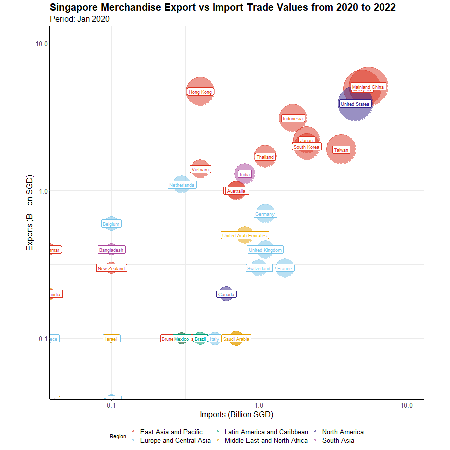
3.3.3 Insights
There were a lot of discussions about China, Malaysia, and the USA, but not much about other major partners like Taiwan and Hong Kong. This plot shows how little they move in trade surplus and trade deficit zone respectively, which makes it less interesting
As expected, the majority of Singapore’s trading partners are from the East Asia and Pacific region, with only the United States and India being non-members
European trade partners, particularly Switzerland and the United Kingdom, have shown a lot of volatility. Singapore has only consistently achieved a trade surplus with the Netherlands and Belgium.
Smaller partners have tended to be more volatile, with frequent shifts between surplus and deficit zones, particularly with Canada and Ireland.